

This is the sixth, and penultimate, installment of the essay series, Vaccine Evangelists, Apostates and Apologists. These essays are a study of the vaccine debate itself, using historical mortality questions as the focal point of this analysis. Here are the links to the earlier installments:
Part 3 – The Red Herring: A Tour of the Motte
We have so far in this essay series looked at two case examples of vaccine apologetics. Those were:
Case Example #1 of Vaccine Apologetics Isabella B’s article Graphical Proof that Vaccines Work.
&
Case Example #2 of Vaccine Apologetics: Dr. David Gorski’s articles.
Both these case examples we reviewed and deconstructed in depth in Part 3 and 5 of this essay series.
Now we will look at many more case examples of vaccine apologetics, but we will spend far less time with each as most of them are very similar in their core strategies to what we have already reviewed. I will mostly give brief commentary for each case example of vaccine apologetics, often no more than a few At a glance bullet points, with the occasional more elaborate demonstration mixed in.
The purpose of this selection of case examples of vaccine apologetics, spanning two decades, is to provide us a basis for identifying and studying the principal strategies used by the vaccine apologists, which I’ll summarize in the 7th and final installment of this essay series The Vaccine Apologists’ Playbook.
On top of this survey of vaccine apologetics we will also explore some infectious disease mortality declines in Ireland at the beginning of this essay, and in Norway, and Sweden at the end.
Table of Contents for Part 6
- Direct Defense of the Narrative, Vaccine Apologetics
- Case example 3: Emerald Isle Shenanigans – MMR Information Pack
- They still preach the same message in Ireland today
- Three questions concerning the Irish vaccine info
- What really happened in Ireland?
- Case Example 4: Ian A. York’s post – Measles deaths, pre-vaccine
- Evasion and Diversion Vaccine Apologetics – Case Examples 5 through 15
- Case Example 5: The CDC’s – Some Common Misconceptions about vaccination and how to respond to them
- The Whooping Cough Warning Story (yet again)
- Case Example 6 – Webb’s – Analysis of Anti-Vaccine Graphs
- Case Example 7 – Vaccinate Your Children’s – Graphs and Data page
- Case Example 8 – Anna Kata’s – An overview of tactics and tropes used online by the anti-vaccination movement Published in Vaccine
- Case Example 9: The Australian Government’s – Myths and Realities – Responding to arguments against vaccination – a guide for providers by the Department of Health and Ageing
- Case Example 10: Gallagher’s Measles Vaccination: make an informed choice
- Case Example 11: – The Logic of Science’s – Yes, vaccines did save us from disease: a graphic analysis
- Case Example 12: When Anti-Vaccine Activists Falsely Dismiss Polio and Measles Harm Published on Debunking Denialism
- Case Example 13: Vincente Iannelli’s – Graphs That Show Vaccines Don’t Work
- Case Example 14: Naturopathic Doctors for Vaccines’ – The Mortality Gambit
- Case Example 15: Northern Rivers Vaccination Supporters’ – Weren’t the death rates from these diseases dropping before vaccines came along?
- End note for this section
- Postscript: Measles Mortality in Norway and Sweden
- Norway 1874 – 2016
- Sweden 1861 – 2018
-
Direct Defense of the Narrative – Vaccine Apologetics in Ireland
Here is what I mean by direct defense of the narrative. Last essay (Part 5 of this series) I deconstructed a deceptive English measles mortality chart from Ian A. York’s post Measles deaths, pre-vaccine. That post of York’s is an instance of directly defending the belief that vaccines played the major role in the historical infectious disease mortality declines (though in this case measles specific). York claimed:
“Obviously, there’s no 95% drop. Measles deaths were pretty much constant for over 100 years, until the vaccine was introduced.”
That is the sort of belief that the vaccine evangelists are promoting for infectious diseases in general and specific diseases in particular (as we have seen in Exhibits A through T in Part 1 and 4 of this series). York tried to defend that belief directly.
That’s what I mean by direct defense.
Most vaccine apologists do not attempt direct defense, they instead reroute the conversation to vaccine efficacy questions, or some equivalent.
But we can see that sometimes they do attempt direct defense. Here we will look at an example of direct defense in Ireland. There are also hybrid examples that use a combination of rerouting the conversation, but later still try to defend the idea that vaccines played the major role in historical infectious disease mortality declines (such as Case Example 9 from later in this essay).
Vaccine Apologetics – Case Example 3 – Emerald Isle Shenanigans
This case example of vaccine apologetics will be one of the earliest examples that we review. It will also provide a nice opportunity to explore some Irish historical mortality declines.
We have here some year 2000 Irish vaccine apologetics from the “Vaccination – Your Child’s Best Shot” section of the MMR Information Pack published by a health board of the Irish Government’s then Department of Health.
They (the Irish health board that produced this information pack) exhibit an awareness that the belief that – vaccines are primarily responsible for the historical infectious disease mortality declines – is a belief that some have questioned, and they try to shore it up beginning with the following paragraph:
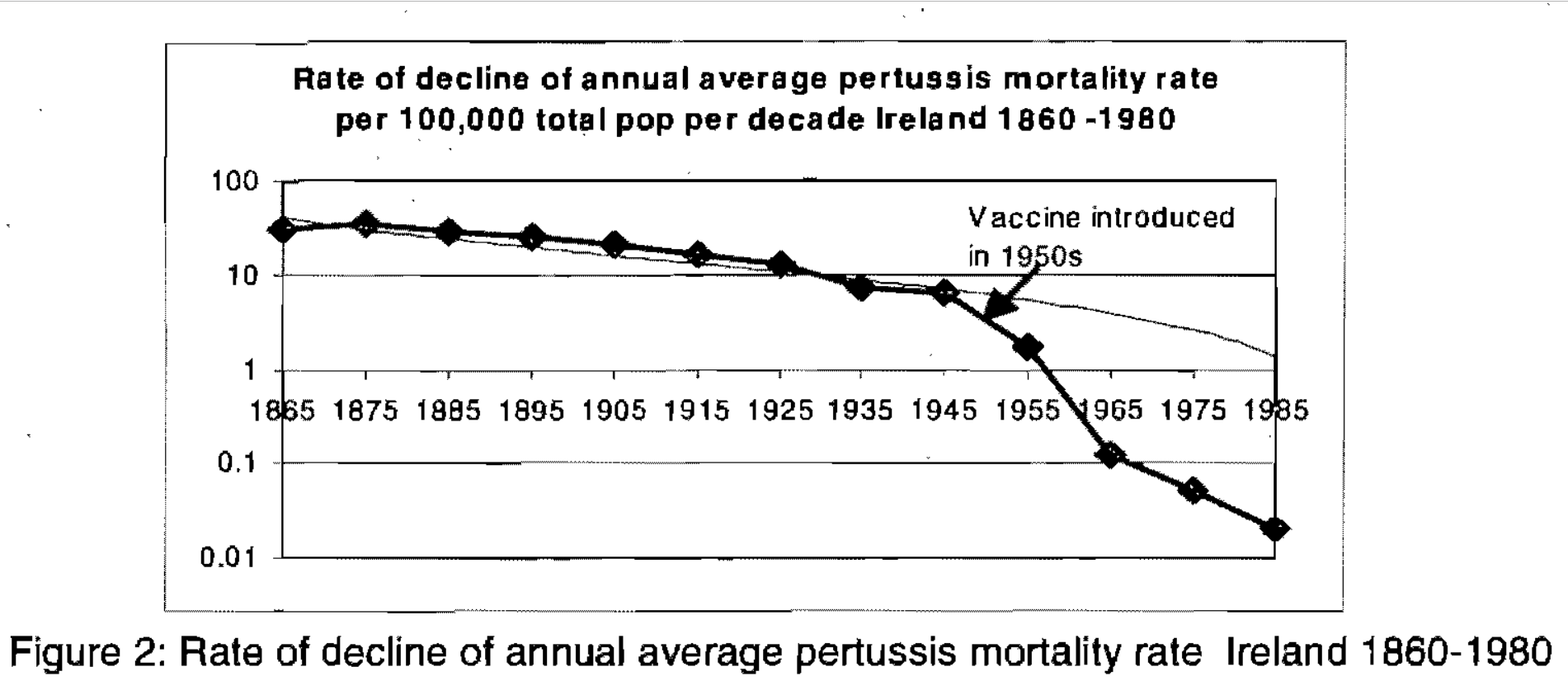
“It is often stated that the numbers of deaths from childhood infectious disease were declining before the introduction of vaccines. This is true for some diseases. It is also true that the introduction of vaccines has accelerated this decline, (for example see figure 3, rate of decline of pertussis deaths in Ireland).” [sic – they meant figure 2, figure 3 in the document is case notifications]
Then they show you this graph:
Figure 2 From Irish Health Board’s MMR Information Pack.
After showing you this graph, they continue:
“The value of whooping cough vaccine is demonstrated clearly in Ireland in Figure 3 [sic, again Figure 2 in their document is the deaths, Figure 3 is notifications]. While deaths from pertussis were declining from the late 19th century, the rate of this decline was dramatically accelerated in the 1950s following the introduction of pertussis vaccine.”
Let’s pause a moment and observe what they have done. They have conceded that Okay, yes, fine, pertussis deaths were declining before the vaccine, BUT! The real dramatic decline came with vaccination. And then they do what they (vaccinationists) almost never do, they provide us with a death rate graph, using the whole entire data set!? Astonishing, it’s both a death rate graph, and it goes all the way back into the 19th century. That’s the sort of historical perspective you would usually expect from anti-vaccinationists.
I have pointed out before that vaccine evangelists much prefer to tell you about the death data rather than showing it to you. They tell you how bad it was before the vaccine in the 19th and early 20th centuries, and how many people died, and then they talk about the low rates at some point after the vaccine. But here they are actually showing us the death data, the whole data set, they didn’t chop off the first part of the graph. This is an unusual find.
A quick glance at the graph they provided (and keep that glance quick, don’t look too closely) reveals that it beautifully illustrates their point; there is only a gradual, unimpressive, decline in whooping cough mortality pre-vaccine followed by a spectacular plummet post vaccine. This supports the popular, regularly promoted belief, that vaccines played the primary role in the decline of infectious disease mortality.
To really hammer home their point and demonstrate that yes, it was the vaccine that caused that decline, and that the decline wouldn’t have happened without the vaccine, they give us a powerful verbal illustration of what happens if you stop vaccinating:
“The value of pertussis vaccine was more recently demonstrated following a concern about the safety of pertussis vaccine in the 1970s. In many countries this scare led to a marked decline in public confidence and vaccine uptake. This was followed by outbreaks of disease in all of these countries and many deaths ensued, (see Table 1 for experience in Japan). Pertussis incidence was 10-100 times lower in those countries where high vaccine coverage was maintained.”
Then they provide you a table with ten years of pertussis deaths and cases data for Japan which shows a definite jump in both recorded cases and deaths following the pertussis vaccine scare in the mid-1970s. This supports their case.
The same message is preached in Ireland today
Before I get to deconstructing the Irish case example, I want to take just a moment to bring you up to speed with the preaching in Ireland now. The Irish Health Service Executive Immunization Office is still pushing a message that gives the impression that pertussis vaccines played the primary role in reducing pertussis deaths in Ireland:
“The 1950s saw the introduction of two vaccines which would transform child and adult health in Ireland.
“Prior to the introduction of a Pertussis (whooping cough) vaccine in 1953 there were up to 200 deaths each year from whooping cough. Following the introduction of the vaccine, cases and deaths from whooping cough fell rapidly.”
That is from their web page History of Vaccines in Ireland. You can see them promoting the same message on their twitter account too. In some ways they’ve gotten worse over the last two decades. Now they no longer provide any visualization of the historical mortality data, and they no longer even bother mentioning pre-vaccine mortality decline.
Whether today or two decades ago, unwary and trusting readers of this information from Ireland’s health services would no doubt believe vaccines to be the primary reason for the whooping cough mortality decline in Ireland.
Three Questions
After reading the “Vaccination – Your Child’s Best Shot” section of this MMR Information Pack MMR Information Pack from one of Ireland’s health boards, I had three questions about the information they had presented.
1st Question: Their graph of pertussis mortality uses a scale in which the upper range of the data from 10 to 100, occupies no more of the vertical/Y axis than the range from 0.1 to 0.01. That’s called a logarithmic scale. Scroll up and take another look at it if you didn’t notice that.
Presenting the mortality profile on a logarithmic scale was an inappropriate choice for the point they were making, because it does not allow you to easily see whether or not the rate of decline had in fact “dramatically accelerated.” They could have simply used a standard linear scale, which would have provided an easy visual for understanding if the rate had accelerated and by how much. This is what raises the first question: what was their reason for using a logarithmic scale where it was both unnecessary and unhelpful?
2nd Question: To drive home the value of pertussis vaccination they pointed to the rise in cases and deaths that occurred when pertussis vaccination rates fell in various countries in the mid-‘70s. They provided limited details for one of these countries – Japan, and no specifics for any of the others.
But Ireland itself was one of the countries where pertussis vaccination rates fell in the mid 70s. If they were only going to use one case example to show what happens when pertussis vaccination rates fall, why didn’t they just use Ireland as the example? We are after all talking about an Irish health board, writing a story to convince Irish parents of the value of vaccinating their Irish children. Wouldn’t pointing to what happened in Ireland have hit closest to home for their Irish audience? Why did they pass up the example that was literally right under their feet?
3rd Question: If they had wanted to use multiple examples of historical infectious disease mortality rates, that would have been good, but if they were only going to use one example, and that is all that they used for this particular point, it would be logical for them to have used measles, not pertussis, to illustrate their point, because it’s in an MMR information pack, not DTP. Why did they use only pertussis, and provide no such graph of measles deaths in an MMR Information Pack?
What really happened in Ireland
Now we’ll look at what their own data actually shows, and then these mysteries will be solved: the reasoning behind why they used a logarithmic scale on their graph, as well as likely reasons behind why they used pertussis deaths instead of measles deaths, and why they switched to Japan as their example instead of Ireland, will all become apparent.
Let’s start by showing the same mortality data that they presented on a logarithmic graph. We will look at it on a straightforward linear scale, and we will also look at the yearly data rather than ten-year averages. I want to see if they glossed over any critical details in the yearly data.
Figure 56
[Links to – the Registrar-General Annual Reports of Marriages, Births and Deaths in Ireland, and the WHO Mortality Database]
Once we see the full Irish whooping cough mortality data set presented on a straightforward linear scale, it becomes obvious that the Irish health board was lost deep in wishful thinking when they stated:
“While deaths from pertussis were declining from the late 19th century, the rate of this decline was dramatically accelerated in the 1950s following the introduction of pertussis vaccine.” – the MMR Information Pack
The dramatic decline began well over a half century before the introduction of pertussis vaccines. The decline did slow down and appeared to level out in the 1930s, but then resumed a steep decline again in the late 1940s, before the vaccine. The low in 1950 and the high in 1951, both pre-vaccine data points, are both substantially lower than even just the previous low in 1946, and the previous high in 1947.
(The low year for whooping cough deaths in 1950 of 2.2 deaths per 100,000 was 43% lower than the previous low of 3.9 in 1946.
The high year for whooping cough deaths in 1951 at 3.6 deaths per 100,000 was 64% lower than the previous high of 10.0 in 1947.
The acceleration in the rate of decline in whooping cough mortality in Ireland began right after 1947, not after the introduction of the pertussis vaccine in 1952/53.)
The vaccine came just a few years too late to take credit for the resumption of the steep decline. Not like that stopped this publication from an Irish health board from crediting the vaccine anyway; but had they been honest and frank they would not have done that.
Our first question is answered. We can now see why they chose a logarithmic scale for something that they could have so easily provided on a linear scale.
Without the logarithmic scale there is simply nothing there in that Irish whooping cough mortality data set to support their narrative. Most of the mortality decline occurred in a spectacular pre-vaccine plummet, and even the last portion of steep decline had set in before the vaccine.
To be clear, a logarithmic scale is perfectly fine in and of itself, but their use of it was deceptive, in the same way that a Mercator projection map (world map where the projection makes Greenland look bigger than Australia) is not inherently deceptive, but if you were to use a Mercator projection map to convince people that Greenland is bigger than Australia, then that would be deceptive.
Returning to the whooping cough mortality decline in Ireland: if there is any doubt about whether or not that last bit of mortality decline would have occurred with or without the vaccine, then what happened next should lay such doubts to rest.
According to the abstract (which is all of it that I can find online) of Epidemiology of Pertussis in the Republic of Ireland, adverse publicity in 1973 caused a decline in pertussis vaccine coverage to just 30% coverage in 1976 and still only 40 to 45% coverage in “recent years” which for the 1992 paper would work out to the late 80s/early ‘90s.
So, what happened when the pertussis vaccination rates took a nose dive in Ireland? Were the morgues filled? The graveyards planted with heartbreaking rows of those proverbial Graveyard Gambit children’s headstones? No, the pertussis mortality simply continued to decline (see Figure 56 above).
Now we have a probable reason for why that Irish health board ignored the example that was right under their feet and instead used Japan for their story about the horrors that unfold if you let vaccination rates fall: What happened in Japan provided support for their narrative, while what happened in Ireland directly contradicted their narrative.
We still have our third question to answer though: Why did they use pertussis instead of measles as their case example in this MMR Information Pack?
Figure 57
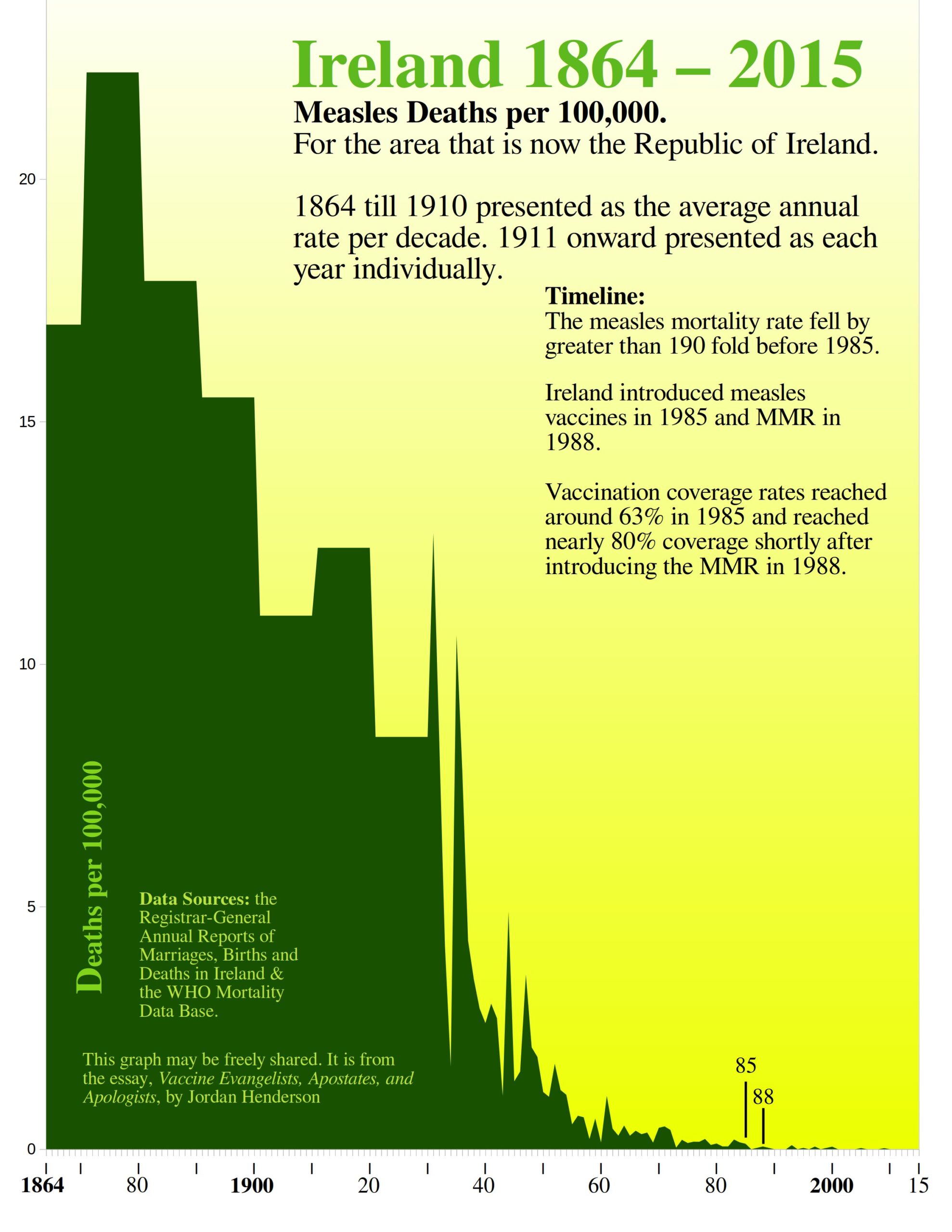
And there we have a likely answer. Though the measles mortality profile for Ireland is very similar to the whooping cough mortality profile, the measles vaccine was introduced three decades later, so even with a logarithmic scale presented to an audience unaccustomed to logarithmic graphs, that still would not have hidden the reality of all the dramatic decline occurring pre-vaccine.
The initial 1985 measles vaccine introduction coincides nicely with a slight drop at the very tail end of the mortality decline, so they could have chopped off the first 120 years of the data set to get something that would look okay for the vaccine, but they were making an effort to make it seem as though the vaccine played a major role in the mortality decline in the big picture, so the chop-off-the-portion-where-most-the-decline-occurs-strategy would not have met their need.
While deconstructing this example was a good opportunity to gain some historical perspective on mortality declines and vaccines in Ireland, it is also an unusual and instructive example of vaccine apologetics. They did not try to retreat into a Motte by dismissing mortality data and rerouting the conversation to case notifications data. They did not try to gaslight their audience into thinking that the vaccinationists hadn’t been making all their claims about lives saved, deaths averted, mortality reduced.
The Irish health board attempted to defend the idea that the vaccinationists regularly promote: that vaccines played the major role in the historical infectious disease mortality declines.
Their means may have been deceptive and dishonest, but I appreciate that they fought in the Bailey and didn’t flee to a Motte (see Part 1. if you need a refresher on Motte and Bailey doctrines).
Vaccine Apologetics – Case Example 4 – Ian A. York’s post Measles deaths, pre-vaccine
The deceptive English measles mortality graph from Ian. A York’s post Measles deaths, pre-vaccine is the most interesting part of York’s post and we already reviewed it last essay (Part 5. under the pro-vaccine deceptive graphs section). All I’m doing here is simply including York’s post in the list of Vaccine Apologetics Case Examples, and labeling it Case Example 5, for easy reference.
The deceptive graphs that we reviewed last essay from France and Spain I consider to properly belong in the category of vaccine evangelism not apologetics, and so I’m not including them as Vaccine Apologetics Case Examples. York’s post on the other hand is clearly apologetics, and specifically directed against anti-vaccine mortality rate graphs which places it solidly within the scope of this essay. York’s post also clearly belongs in the direct defense of the narrative section.
-
Evasion and Diversion – Vaccine Apologetics – Case Examples 5 through 15
These case examples all employ some degree of evasion, and they all act as if the vaccine evangelists have not been preaching the messages that they have been preaching: messages which give the idea that vaccines played the primary role in the historical infectious disease mortality declines (for examples of vaccine evangelist preaching see Exhibits A through T in Part 1 and 4 of this series).
These remaining case examples are presented in chronological order (most recent last). Wherever I could sum up all that I wanted to note or criticize about the case example with a simple bullet pointed “At a Glance” section I did. Even where I offer more in-depth deconstruction, I still have provided an “At a Glance” section to summarize for those who wish to skim through these.
Every case example has a hyperlink that will take you right to the case example being discussed, so that you may easily examine these case examples for yourself. Those links are below the “At a Glance” sections.
Case Example 5 – The CDC’s Some Common Misconceptions about vaccination and how to respond to them
At a glance:
- Considers historical arguments concerning the role of vaccination in the context of notifications of incidence data only, and does not acknowledge let alone address mortality-based
- Invokes the whooping cough warning story.
We looked at part of this example last essay actually, as it is an instance of invoking the Swedish whooping cough warning story. The CDC put this up on their website at least. back in the 2000s, but the publication goes back further still to the ‘90s. It is titled,
Some Common Misconceptions about vaccination and how to respond to them
Sections of this have been widely reproduced on the web ever since. It’s up on the WHO’s website to this day. The only section of particular interest for this essay is under the subheading,
Diseases had already begun to disappear before vaccines were introduced, because of better hygiene and sanitation.
The subheading appears as though it might address anti-vaccine mortality-based arguments, because disease could involve mortality, and mortality is the most consequential and complete of the available historical data for measuring the disease toll.
Furthermore the CDC itself regularly tries to give the impression that vaccines are the principal reason for mortality declines from, for example, whooping cough and diphtheria (see Exhibits G and H, in Part 1. of this series). So, it would be reasonable to expect the CDC to try to shore up the belief it promotes regarding mortality declines.
One more point concerning that subheading is that it creates a false dilemma as if what isn’t attributable hygiene/sanitation must then be attributable to vaccines, or vice versa. But who is to say that hygiene/sanitation and vaccines are the only factors? The CDC later under that subheading at least mentions nutrition, so why they would have used a false dilemma in the subheading is strange – possibly lazy thinking on their part or an intentional effort to make the anti-vaccine standpoint easy to attack.
Additionally, the rubric of hygiene/sanitation, while often used, is so broad as to be unhelpful. Hygiene/sanitation brings to mind both factors that are totally unimportant to the historical mortality declines (such as wearing deodorant, and spritzing Lysol on handrails), while also including factors like clean drinking water that are especially important to historical mortality declines for some major causes of death (like cholera, typhoid fever, and dysentery).
Now back to the matter at hand; does the CDC address historical mortality-based arguments? This is the only section in that publication where the CDC could plausibly be responding to historical arguments against the beliefs promoted by vaccine evangelists.
In this publication that is supposedly hitting the main anti-vaccine talking points, the CDC does not acknowledge, let alone address, any mortality based historical arguments. They focus exclusively on notifications of incidence when dealing with pre-vaccine declines.
In this same publication, when the CDC has left the topic of the pre-vaccine declines and it is once again safe for them to bring mortality into the discussion, they do. This is when they invoke the examples of countries where pertussis vaccination rates fell and then they talk about both cases and deaths:
“The effect was dramatic and immediate. In Great Britain, a drop in pertussis vaccination in 1974 was followed by an epidemic of more than 100,000 cases of pertussis and 36 deaths by 1978.”
At various other points in this publication the CDC continues to invoke death for the purpose of emphasizing the danger of the diseases and the alleged benefits of the vaccines.
So, we can see that the CDC in that very same publication was intent on pushing the idea that both morbidity and mortality would soar up without vaccines, even though they wouldn’t even mention, let alone address, historical mortality-based arguments concerning the majority of the declines occurring before the vaccines.
I included this as a case example not because the CDC addressed the pre-vaccine mortality declines, but because they didn’t, but appeared as though they might – this little shell game is extremely common. The apologist puts on as if they are going to address the anti-vaccine historical mortality arguments head on but then lifts up the shell after shuffling them around, and what’s there underneath the shell is something like notifications data or efficacy questions instead.
The Pertussis Warning Story (Again)
About those deaths in the UK that the CDC is talking about, let’s take a moment to debunk that. It is unclear the precise time frame to which the CDC is referring. Are they including deaths beginning in 1974 or only after ‘74? Are they stopping the count at the end of 1977 or including part of ‘78? I can’t tell due to their imprecise wording and lack of citations, but I can tell that they are definitely trying to give us the impression that pertussis deaths went up in the UK when the vaccination rates fell. They are being deceptive. Deaths went down:
According to the data tables over at the user friendly WHO Mortality Data Base: In the UK in the early 1970s – the five years of 1970 through 74, there were 73 deaths. In the late ‘70s – the five years 1975 – 79, there were 48 deaths. So notably fewer pertussis deaths in the late ‘70s after vaccination rates fell.
The UK pertussis example is used frequently by many others besides the CDC, and they almost always, just like the CDC, try to give you the impression that deaths went up when pertussis vaccine coverage fell, but again, deaths went down. Here is another example:
“The media excitement and public concern after a Lancet report linking measles, mumps, and rubella (MMR) vaccine with autism1kindles a sense of déjà vu. It is highly reminiscent of similar scares over pertussis in the 1970s,2 which resulted in much suffering and many deaths from pertussis both in Britain and internationally] . . .
. . . [national immunisation rates fell from 80% to 30%. The number of susceptible children rose, and in the 12 years after 1976 three major pertussis epidemics accounted nationally for over 300 000 notifications and at least 70 deaths.” – MMR vaccination and autism 1998
In this other example, invoking the same UK pertussis warning story, they give you the impression that 70 deaths (79 all told) in the 12 years following 1976 was some kind of an increase, but it is definitely a decrease; because in the 12 years before 1976 (1964 – 75) there were 264 pertussis deaths recorded in the UK (which you can verify through the WHO Mortality Portal).
Taking this back to the CDC: of the examples the CDC provided then, only in Japan did a drop in pertussis vaccination rates coincide with an uptick in reported pertussis mortality. In the UK deaths went down when vaccination rates fell. In Sweden, as we reviewed in Part 5, pertussis deaths stayed at an extremely low rate when vaccination rates fell, and then pertussis deaths actually went up slightly when pertussis vaccines were brought back in.
Two out of three of the CDC’s own chosen examples directly contradict the point that they are trying to make. On top of that we have also seen, as we reviewed just a moment ago, that vaccination rates went quite low during this time in the Republic of Ireland, too, and there also, pertussis deaths did not spike when the vaccination rates fell; instead the mortality just kept dropping.
Only for case notifications does the data consistently support them, but as we saw with Sweden in the last essay, this created a strange teeter totter situation where, when case notifications fell after the vaccine’s reintroduction, case fatality rates jumped.
These whooping cough warning stories are regularly trotted out to give us the impression that whooping cough mortality climbs when vaccination rates fall, but that is not so, as evidenced by the majority of these natural experiments.
Case Example 6 Analysis of Anti-Vax Graphs by Robert Webb.
At a glance:
- Claims that anti-vaccine graphs use deceptive data manipulation but can only point to that same one Canadian measles incidence graph as evidence of this (from that 2010 Gorski article which we reviewed in this essay series as part of Case Example 2, in Part 5).
- Pivots from mortality to notifications of incidence based on the assumption that the only matter at hand is the question of efficacy rather than what vaccines did or did not do.
- De facto concedes that the maximum theoretical contribution of vaccines to the mortality decline is so little as to be nearly unnoticeable in the big picture, but then uses this to imply that showing the big picture (the whole mortality data set) is therefore deceptive, and that it is better to chop off the portion of the historical data where almost all the decline occurs and instead show graphs that zoom in on just the portion around the vaccine’s
Robert Webb published this article Analysis of Anti-Vax Graphs in 2010, both on his website and on VecSkeptics.
Case Example 7 – Vaccinate Your Children’s Graphs and Data page
At a glance:
- Argues from the serious disease complication data we don’t have to downplay the serious disease complication data we do have (death).
- Pivots (mostly) from mortality to notifications of incidence data.
- Claims that anti-vaccine graphs are inaccurate but can only point to that same one Canadian measles incidence graph as evidence of this (from the 2010 Gorski article which we reviewed in this essay series as part of Case Example 2, in Part 5).
- Created a deceptive Australian polio mortality graph (that we reviewed last essay).
This case example is the “Graphs and Data” page from the website Vaccinate Your Children. (we looked at their deceptive Australian polio mortality graph last essay) If you go to their website you will notice that they prominently display right on the banner image, the message: “Vaccination has saved millions of lives: will your kids be among them?” Prominently displaying a mortality-based message makes their pivot to notifications of incidence that much more ironic.
Case Example 8: Anna Kata’s – An overview of tactics and tropes used online by the anti-vaccination movement
At a glance:
- Conflates historical arguments concerning what vaccines did or did not do with efficacy arguments.
- Leads with the assumption that anti-vaccinationists who are debunking historical pro-vaccine claims, regarding mortality declines that occurred in the late 19th and early 20th century, should for some reason, be obliged to acknowledge alleged vaccine related health improvements from recent decades instead. No reason is given nor alluded to for this strange assumption of Kata’s.
- Introduces the usual non sequitur attributing pre-vaccine mortality declines to medical care, and also as usual does not substantiate it.
- Beattie’s Australian death rate graphs are the sole example she gives of the graphs that she is talking about (the only other example she cites doesn’t have graphs). Kata believes that notifications graphs should have been provided. Kata was oblivious to the matter that the key notifications data for Australia are missing (see Case Example 9 below, for more details on that). And Kata was equally oblivious to Beattie having dedicated a whole chapter of his book to notifications data where he provided what little of this data Australia has.
- David Gorski’s blog posts appear to be the principal source of the academic author’s (Kata’s) understanding, or lack thereof, of anti-vaccine historical mortality-based arguments.
The full article title is; Anti-vaccine activists, Web 2.0, and the postmodern paradigm – An overview of tactics and tropes used online by the anti-vaccination movement. Written by Anna Kata who is listed as working at McMaster University at the time. This article was published in the journal Vaccine in 2012. It has been cited since then by roughly 700 other publications.
The only part of Kata’s article that appears to engage with anti-vaccinationists who have debunked pro-vaccine messages through historical mortality data is the section under the subheading “Vaccines didn’t save us.” That is the section of her article covered in my At a glance bullet points above.
Case Example 9: The Australian Government’s Myths and Realities – Responding to arguments against vaccination – a guide for providers by the Department of Health and Ageing
At a glance:
- They fault the anti-vaccinationists for not providing the incidence data that they themselves (the Australian government) didn’t even collect.
- They do actually try to salvage the belief that vaccines played a major role within the big picture of the infectious disease mortality decline. To do this they rely on a selection of historical mortality graphs whose deficiencies are discussed in detail below.
- They invoke the typical whooping cough warning story, mentioning the usual three (Sweden, Japan, and the UK). They focus mostly on the UK and try to give you the impression that deaths went up rather than down after pertussis vaccination rates fell.
This case example is comprised of the 2013, 5th edition of the Australian Government’s Responding to arguments against vaccination – a guide for providers. It’s a 92-page document and one section of it is of interest for the purpose of this essay series.
The one section where they appear to address anti-vaccinationists who have debunked the vaccine evangelist’s preaching through historical mortality data is under the subheading “Improved living standards, not vaccination, have reduced infectious diseases” on page 29. They write:
“Some argue that improved health and hygiene have caused the dramatic decline in infectious diseases over the last century, not vaccines. To support this argument, graphs are used to depict declining disease death rates before the introduction of vaccines and no visible impact from vaccination. These graphs always show death rates overall rather than disease incidence and hide the true effect of vaccines.”
Here we see the usual retreat to case notifications data. But in this case it is especially hypocritical because much of the key case notifications data is missing for Australia.
Of measles notifications in Australia the WHO notes:
“Notifications of measles cases in Australia were sporadic until the establishment of the National Notifiable Diseases Surveillance System (NNDSS) in 1991.”
And in 1989 the paper THE INCIDENCE AND NOTIFICATION OF MEASLES IN AUSTRALIA the authors note:
“The incidence of measles in Australia is unknown. In most States it is not notifiable.”
For pertussis in Australia the notifications are also missing. Australia stopped collecting the data in 1949, and didn’t resume collection of the data again until 1991.
As Beattie points out in his book Fooling Ourselves on the fundamental value of vaccines:
“When mass vaccination commenced, seven out of our eight states and Territories stopped counting whooping cough cases. Why? Why stop monitoring an indicator which is now claimed, by some, to be the most meaningful measure of the impact of the vaccine? Was this not an acknowledgement that notification data was never intended to be used for this purpose?”
Yet here we have the Australian government faulting anti-vaccinationists for not providing data that for Australia, for many of the most crucial decades, is missing altogether as the Australian government didn’t think it important enough to keep collecting.
Ultimately though the Australian government wouldn’t have had a valid point even if they had collected that data, because A. The prominent Australian vaccine skeptic Beattie, did also provide what little notifications data there was for Australia and B. The anti-vaccinationists are debunking pro-vaccine mortality based arguments and the mortality data would be the appropriate data for doing that even were the Australians not missing key notifications data.
After faulting the anti-vaccinationists for not providing the data that the Australian government didn’t collect to begin with, they try to make vaccines out as being a major factor in the historical infectious disease mortality declines after all:
“While overall improvements in living standards, healthcare and treatment have reduced deaths from all diseases, the additional impact of vaccines themselves is illustrated by the near disappearance of deaths from diphtheria, tetanus, pertussis, polio and measles (see ‘Deaths from vaccine-preventable diseases’). Such a dramatic decline in deaths after vaccine introduction, often in short periods of time, could not possibly be attributed to improvements in living conditions or medical treatment alone.”
The Australian government document then provides its own mortality graphs on page 74.
Figure 11 from the Australian Government’s Responding to arguments against vaccination
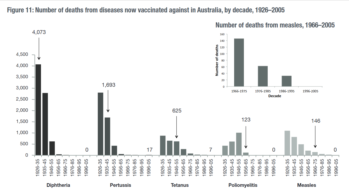
There are some major problems with their graphical presentations here. At least five problems.
Firstly, there is the obvious issue that they themselves are aware that you can’t even tell if the vaccine came in at the beginning, middle or end, of each ten-year period. They caution the reader about this. Instead of cautioning the reader about the deficiency of their graphical presentation they should have just solved the problem by showing the yearly data in the decades before and after the introduction of the vaccines, or at least they could have simply written dates by the arrows on their graph – how hard would that have been?
Secondly, they have provided the raw number of deaths; they ought to have presented the deaths as a mortality rate. I too have provided raw numbers of deaths in some of my own charts whenever dealing with diseases that primarily affected children for populations such as Spain and Sweden where there was on the whole little or no increase in the number of children born each year (I was being quite fair to the vaccinationists by doing this; the maximum theoretical contribution of the vaccine would have appeared even smaller had I used the rate per 100,000 in those instances).
Australia is no such place: you can see this most easily by consulting the vital statistics table on the Australian Demographics Wikipedia page. Australia experienced enormous growth over the 20th century, both in population and in the number of children born each year. Consequently, they really should have used the death rates on their graphs to account for that kind of growth.
Why they didn’t provide rates may have been mere carelessness, or it may have been to hide the extent of the pre-vaccine mortality decline – neither reason would surprise me.
Thirdly, by beginning their graphs in 1926 they have deprived their audience of much needed historical perspective to the point that their diphtheria graph has not so much as a single pre-vaccine data point and therefore does not and cannot provide any indicator of the vaccine’s impact on diphtheria mortality since they have not established the pre-vaccine trend to any degree at all. And their pertussis graph, with only one pre-vaccine data point, is almost as bad.
That it would have been no insurmountable task for them to have provided the early 20th and late 19th century data is demonstrated by the fact that Beattie had already done so, from existing publications, and Beattie provides detailed documentation of those publications. Other researchers have done this too: Michael Willem de Looper compiled, discussed in detail, and graphed the older data in his doctoral thesis Death registration and mortality trends in Australia 1856–1906 ( here is the download link).
If these individuals could do this, no doubt Government health agencies with far greater manpower and money than individual researchers could have pulled this off with ease. If they have time to write 92-page documents appearing to address while in fact avoiding anti-vaccine arguments, I’m sure they could do more serious work like assembling time series of their nation’s cause of death data.
Moreover other Australian government agencies, years before the publication of Responding to arguments against vaccination – a guide for providers, already had put together time series of Australian mortality data going back to 1907. Other Australian government agencies could do it – so was the Department of Health and Ageing uniquely incapable of accessing the publicly available older data?
The only apparent obstacle that would have stopped the Department of Health and Ageing from providing earlier data on their graphs was that doing so would have been fatal to the story they were spinning.
Fourthly, they have committed a post hoc fallacy; the mere introduction of vaccines they see as reason enough to attribute considerable mortality declines to them. They did not even bother doing the simplest, yet crucial steps, such as establishing vaccination coverage rates (which is important if you are trying to credit the vaccine. You need to begin with first showing that enough people got the vaccine for it to at least be plausible that the vaccine could have caused the decline). Their arrows show the mere decade in which the vaccine was available, not necessarily the point at which most people routinely got it. Nor did they acknowledge let alone address other very basic, crucial, considerations such as whether or not there had been changes in diagnostic criteria.
The only reason they give for their assumption that these post vaccine declines had to do with the vaccine is this (from page 21):
“Such a dramatic decline in deaths after vaccine introduction, often in short periods of time, could not possibly be attributed to improvements in living conditions or medical treatment alone.”
They assume that if it was not living conditions and was not medical care it must therefore be vaccines, but at no point have they demonstrated that there are only three possibilities. Again, obvious possibilities that could result in statistical artifacts that would show dramatic declines, such as changes in diagnostic criteria, are not addressed by them at all.
Furthermore, whether they think it possible or not, far more dramatic declines than anything that occurred after their vaccination programs could occur in the complete absence of a vaccine – because they did: the most dramatic, impressive, Australian mortality declines for measles, whooping cough, and diphtheria occurred in the late 19th and first decades of the 20th century as shown by Greg Beattie. Australia is not anomalous, and equally dramatic mortality declines occurring in the complete absence of vaccination can be seen for many other countries, as we ourselves have reviewed in this essay series (Sweden, Spain, England, etc.).
Fifthly, unlike Beattie, they provided no examples of the mortality profiles for major infectious diseases for which there was no widespread vaccination. Therefore, their graphical analysis lacks controls. Why they would have left out controls is fairly obvious; the mortality declines for diseases in Australia such as scarlet fever was equally dramatic to any of the others, yet vaccination programs were not carried out for it, and had they shown this it would have cast doubt on their narrative.
In sum the Australian Department of Health and Ageing’s graphical presentation of infectious disease historical mortality declines in Australia looks like it was done more for the purpose of obfuscation than of illumination – they left out a great deal of relevant information and detail that they could have easily provided. For a much more impressive, detailed graphical analysis of Australian mortality data replete with controls, and plenty of historical perspective see Beattie’s graphs.
After attempting to claim that vaccines really did play a major role in historical infectious disease mortality declines after all, they pivot back to notifications of incidence for a few paragraphs, and then finish out with the ever-popular whooping cough warning story:
They mention (on page 22) the usual triad of Sweden, Japan, and the UK, but they mostly focus on the UK, and they most definitely try to give you the impression that pertussis deaths went up in the UK when pertussis vaccination rates fell:
“There was a decline in the acceptance of pertussis vaccine in Britain in the mid-1970s. Between 1977 and 1979, there was an epidemic of 102,500 cases of pertussis during which 27 children died from the direct consequences of pertussis and 17 developed permanent neurological damage. Acceptance of pertussis vaccine has now improved to about 93 per cent and pertussis has declined. Similar large epidemics occurred in Japan and Sweden at about the same time due to low acceptance of pertussis vaccine.”
Once again, consulting the WHO mortality database, we can see that deaths went down, not up, after vaccination rates fell.
If we are going to just grab whatever three-year period we want, as the Australian government document is doing, then I’ll point out that in the three-year period of 1969 through 1971, a few years before the vaccination rate fell in the UK, there were 62 pertussis deaths – twice what they mention happening in the random three-year period that they picked after the fall in vaccination rates.
Case Example 10: Gallagher’s – Measles Vaccination: make an informed choice
At a glance:
- Repeatedly finds fault with a mortality rate graph designed to address historical questions, because it does not do something it was not intended for (addressing efficacy questions). And this despite the author having explicitly stated that the graph was not intended to address efficacy questions.
- After spending the whole article downplaying the value of mortality data, he ends his article with the mortality-based claim Vaccination saves lives.
Science blogger Paul Gallagher’s 2014 article Measles Vaccination: make an informed choice is mostly an attack against an Australian measles death rate graph from Greg Beattie’s book Fooling Ourselves on the fundamental value of vaccines.
There are numerous aspects of Gallagher’s article that could be criticized. For example; he attempts to claim that Beattie’s Australian death rate graph is wrong by referencing a graph for the USA as if that somehow makes the Australian graph wrong because it doesn’t show what the USA graph shows (he interestingly cites York’s post Measles deaths, pre-vaccine). He attempts to refute a death rate data point with another data point that has not been calculated as a rate. He suggests that Beattie’s graphs have been examined and discredited by the Australian government with his basis for this belief being this Australian government document here where there is no mention at all of graphs, nor charts, nor Beattie. He claims that anti-vaxxers are saying all sorts of things while providing no documentation of it.
I’m not going to try and disentangle Gallagher’s almost incoherent article, though. All that it contains of interest to me is Gallagher’s repeated insistence that Beattie is trying to use the graph from his book to show that vaccines don’t work despite Beattie having explicitly stated in his book that the mortality rate graphs are intended to provide historical perspective and are not intended for the purpose of evaluating vaccine efficacy (emphasis in the following excerpt from Gallagher’s article is mine):
“One notes the first problem is his reliance on mortality and not morbidity. Death as a consequence of a vaccine preventable disease is a limited indicator of how effective vaccination has been in reducing infection. Overall morbidity (infection) offers a more realistic picture.
Gallagher of course does not note that Australia is missing the relevant measles incidence data, nor does he note that Beattie did in fact provide as a graph (in the same book where he provided the measles mortality graph), what little Australian measles notification data there is.
After repeatedly faulting Beattie’s graph for not doing something it wasn’t intended for, Gallagher ends his article with.
“Make an informed decision. Vaccination saves lives.”
The irony of spending a whole article downplaying mortality data and then ending with Vaccination saves lives apparently escaped Gallagher.
Case Example 11 – The Logic of Science’s – Yes, vaccines did save us from disease: a graphic analysis
At a glance:
- Despite having made the bold claim in the title that vaccines (plural) have saved us from disease (general) the article is almost entirely dedicated to arguing that vaccines are responsible for the last 1 ½ % of the mortality decline of one disease (measles) in one country (the USA). This is supposed to somehow show that the anti-vaccinationists and their graphs are therefore wrong.
- Conflates historical arguments with efficacy arguments.
- Introduces the usual non sequitur crediting pre-vaccine mortality declines to medical care, and also as usual does not substantiate it.
- Applies double standard; says that it is usually best to use the whole data set but had earlier in the same article accused an anti-vaccine graph of being “deliberately zoomed out” because . . . it used the whole data set.
Yes, vaccines did save us from disease: a graphic analysis (Archived Version Here) is an article posted on the LogicOfScience.Com in 2015 by an author using the very apt pseudonym Fallacy Man. He states on his about page that he has a B.S, M.S and Ph.D. in biology and that he is a post-doctoral researcher at his University.
Fallacy Man’s strategy has some originality to it.
As noted in the at a glance portion above, Fallacy Man’s article is devoted almost entirely to laying claim for the vaccine, to the last 1 ½ % of the USA measles mortality decline. His basis is that an apparent leveling out in the USA measles mortality decline is followed by a sharp drop in recorded measles mortality, post vaccine. This supports his contention.
Had Fallacy Man limited himself to merely making a pro-vaccine argument with a title that corresponded to the article’s argument, then the limited scope and modesty of his claim would be perfectly fine. But Fallacy Man was attacking the anti-vaccine position and arguing that the anti-vaccinationists and their death rate graphs are wrong, and that showing the whole data set as they do (which he later in the same articles says is the best practice) is deceptive – deceptive because the 1 ½ % post vaccine decline looks quite small compared to the greater than 98% pre-vaccine decline? Those dastardly anti-vaxxers cunningly making 1 ½ % seem as though it is much smaller than 98%.
The anti-vaccine graphs were not intended for the purpose of countering pro-vaccine messages about vaccines having contributed to 1 ½% of the mortality decline for one illness in one country, because that’s not a real-world pro-vaccine message. If you were to go around saying that vaccines account for less than 2% of the mortality decline for allegedly vaccine preventable diseases people would consider you an anti-vaxxer.
The real world pro-vaccine message is that vaccines have been one of the foremost, up to the very foremost factor in reducing infectious disease mortality in general and mortality form the allegedly vaccine preventable diseases in particular (as we have seen in Exhibits A through T in Part 1 and 4 of this series).
To put the lie to the real-world vaccine evangelist preaching you of course need to show the whole historical data set where most the mortality decline occurs, not just the portion with less than 2% of the decline.
Fallacy Man, like all the others, avoids addressing this by simply not acknowledging that vaccinationists make the claims that they do, acting as if they don’t, and conflating efficacy arguments with historical arguments.
One final somewhat unrelated observation of Fallacy Man’s article: despite the last 1 ½% of the measles mortality decline in the USA being the focus of Fallacy Man’s article, all he does is commit a post hoc fallacy: he doesn’t make an effort to identify let alone control for other factors, and he does not acknowledge let alone address the most basic considerations such as whether or not the diagnostic criteria was stable or changed over the time in question.
Case Example 12: When Anti-Vaccine Activists Falsely Dismiss Polio and Measles Harm Published on Debunking Denialism
At a glance:
- Drives home the gravity of measles by invoking deaths in the pre-vaccine era and claims that measles vaccines have saved 17 million lives in 14 years. Then after making these claims that pertain directly to mortality, the author calls it intellectually dishonest for anti-vaccinationists to point to mortality rates.
- The Author backs up his insistence that pointing to death rates is “intellectually dishonest” by citing that 2010 Gorski article (which was reviewed in this essay series as part of Case Example 2, in Part 5). But the only truly intellectually dishonest example in the Gorski article isn’t even a death rate graph, it’s that same Canadian measles cases graph.
- Claims that the major decline in the USA diphtheria case notifications was initiated by widespread vaccination in the late 1940s. This is demonstrably false as already covered in this essay (See Figure 22 from Part 3 of this essay series).
When Anti-Vaccine Activists Falsely Dismiss Polio and Measles Harm was published on Debunking Denialism in 2016.
Case Example 13: Dr. Iannelli’s – Graphs That Show Vaccines Don’t Work
At a glance:
- Conflates historical arguments (what vaccines did or did not do) with efficacy arguments (what vaccines can or cannot do).
- Iannelli also makes posts that appeal to Graveyard Gambits and various other historical mortality related claims about lives saved, deaths averted, and mortality reduced by vaccines. These are posts which give you the impression that vaccines played the major role in the historical infectious disease mortality decline – precisely the belief debunked by the anti-vaccinationist mortality graphs that Dr. Iannelli is trying to dismiss.
Graphs That Show Vaccines Don’t Work was published on Vaxopedia in 2016. The author, Dr. Vincente Iannelli is a board certified pediatrician, author of a parenting book, and founder of the website Vaxopedia. The article is a response to anti-vaccine graphs in general. The author assumes right in the title that the principal purpose of anti-vaccine graphs is to show vaccines as inefficacious. As with all the other apologists, Dr. Iannelli does not consider the obvious usage of the graphs for the purpose of debunking pro-vaccine mortality-based messages.
Dr. Iannelli regularly makes posts in which he stresses the value of vaccines through mortality related claims. His post Grave Reminders of Life Before Vaccines provides a handy list of other posts to remind you of the world before vaccines, including of course, as you would suspect from the title, graveyard gambits, along with other strong reminders of the world before vaccines such as 19th century epidemics. He gives his readers the idea that vaccines are the reason we no longer see that kind of mortality.
Dr. Iannelli, is both a vaccine evangelist and apologist. When he is in apologist mode, he dismisses anti-vaccine historical mortality graphs (graphs that debunk the belief that vaccines played the primary role in the infectious disease declines) and is oblivious to their usage for debunking vaccine evangelist mortality-based messages. Then in another post there he is preaching about the world before vaccines, and referencing deadly 19th century epidemics to do it – his evangelist message is exactly the sort of message that those graphs debunk.
Case Example 14: Naturopathic Doctors for Vaccines’ – The Mortality Gambit
At a glance:
- The author gives an example of anti-vaccinationists who have clearly addressed morbidity and mortality as distinct questions.
- The author then shows us an example of an anti-vaccine mortality graph that is labeled mortality and death, but then the author insists that it is nonetheless intellectually dishonest because it shows . . . mortality.
- The author assumes that the sole purpose of historical mortality rate graphs must be an effort to show vaccines as inefficacious. That someone might use historical mortality data to, oh I don’t know . . . address historical mortality related claims about what vaccines did or did not do, apparently did not occur to the author.
Die Another Day: The Mortality Gambit was written by Maxwell Cohen, ND, and published on Naturopathic Doctors for Vaccines in 2019.
Case Example 15: Northern Rivers Vaccination Supporters’ – Weren’t the death rates from these diseases dropping before vaccines came along?
At a glance:
- They assume that the sole purpose of mortality rate graphs is to measure vaccine efficacy rather than to debunk claims made by vaccinationists that directly pertain to mortality. Like all the others they do not acknowledge that such claims are made and act as if such claims are not made.
- They introduce the usual non sequitur of crediting pre-vaccine mortality declines to medical care, and like Gorski they use polio and the iron lung as their case example (See A Close Look at Gorski’s Iron Lung Example in Part 5 of this essay series)
- Their effort to reroute the conversation away from historical questions and instead to efficacy questions is especially unreasonable, as they themselves make numerous historical mortality claims on other pages of their website such as, “In the 1900s, diphtheria caused more deaths in Australia than any other infectious disease and was a common cause of death in children, but has now almost disappeared in Australia due to immunisation.” – From their diphtheria page.
Northern Rivers Vaccination Supporters’ page Weren’t the death rates from these diseases dropping before vaccines came along? is listed by them as having been reviewed in 2021. They are based in Australia.
End note for this section:
The 15 case examples of vaccine apologetics provided in this essay series, make for an ample basis from which to analyze the principal strategies used by vaccine apologists when they are trying to dismiss the presentation of historical mortality data that directly contradicts the messages preached by their fellow vaccinationists. These 15 case examples cast a wide enough net to capture multiple examples of all their go-to arguments. These go-to arguments of theirs I will summarize next essay.
Up Next, the Final Installment – Part 7: The Vaccine Apologist’s Playbook
In the final installment of this essay series, I will:
- Publish the Vaccine Apologist’s Playbook: A concise summary of the principle strategies used by the vaccine apologists to avoid confronting the awkward fact that vaccines are preached to the public through powerful messages that are directly contradicted by the historical mortality data.
- Comment on the significance to the overall vaccine debate of the material that we have here reviewed in this essay series. And explore some of the inferences and deductions that we can make about the vaccinationists themselves based on our study of their evangelism and apologetics.
- Provide one last set of graphical presentations for infectious disease mortality declines juxtaposed with vaccine introduction. The country we will look at is an especially revealing example in my opinion.
A Couple Ideas for Those Who Would Like to Support my Work
Consider supporting my work: I offer the following three suggestions, any one or combination of which would be most helpful:
- Making a small single, or recurring donation to me through the donation page on my website (or a paid Substack subscription which is effectively a donation as all my essays are freely available), or making a purchase of a small print, mug, or greeting card, through my art prints website.
- Making a single or recurring donation to one of the independent media outlets who publish my work (like right here at Activist Post), and without whom few would see my work online to begin with.
- Supporting this work by getting the word out; sharing this article, and or sharing other notable works by me or the independent media outlets who bring my work to your attention. This increases our reach and makes us happy to know that our work is benefiting more people.
Correspondence: many comments and questions will be most valuable when simply placed in the comments below this article where other readers can engage with the comments and questions, and benefit from seeing the exchange of ideas. That being said, don’t hesitate to contact me directly. Here is one of my current emails:
jdc.henderson(at)mailfence(dot)com
(I will get back to you, but not always very fast).
Jordan Henderson lives in Washington State in the Northwest of the United States. He works in oil paints, and charcoals. A portfolio of his works can be viewed at either of his websites: Original Paintings – Fine Art Prints
-
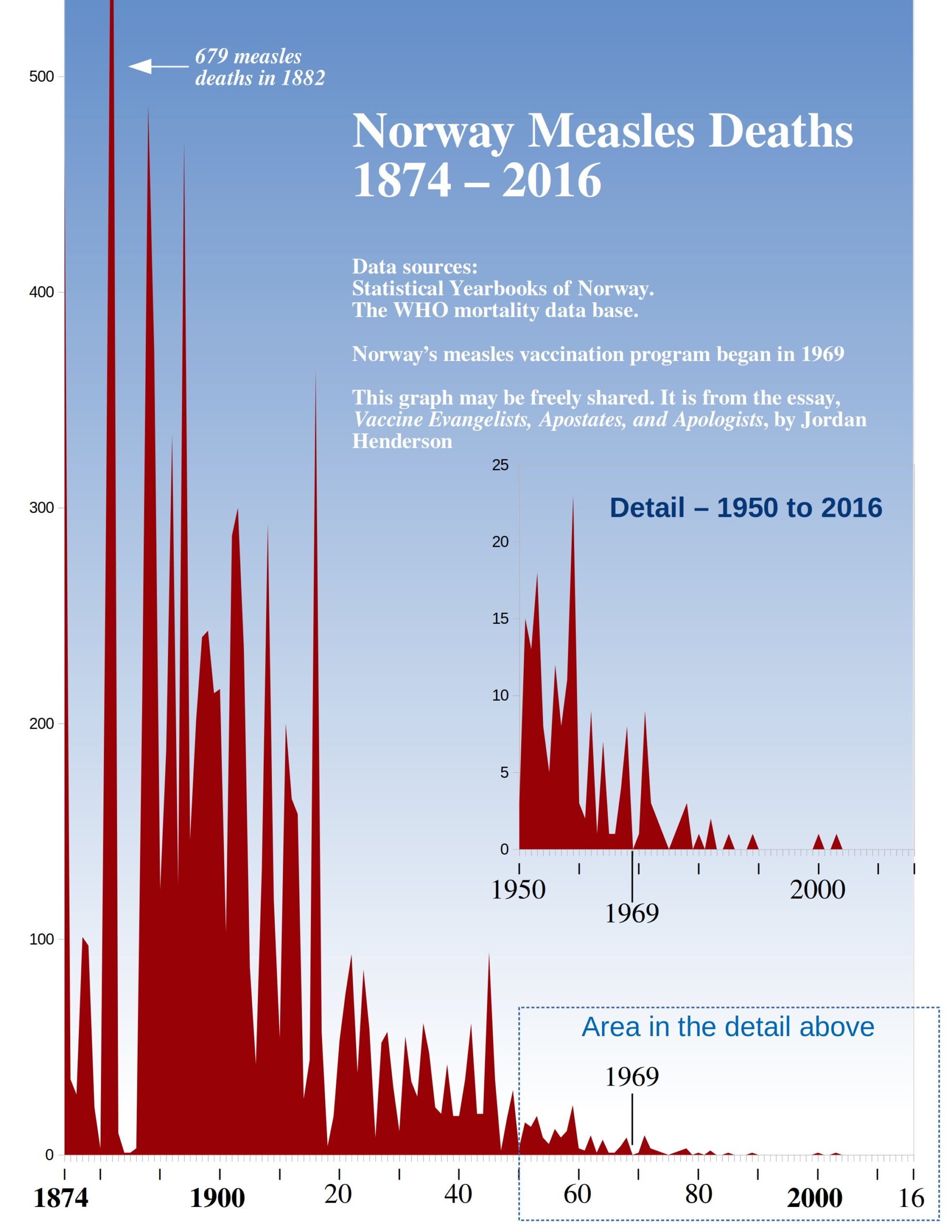
Postscript: Measles in Norway & Sweden
Last essay we looked at a natural experiment that occurred in Sweden when they stopped their pertussis vaccination program. I promised that we would return to Scandinavia this essay and look at another natural experiment that happened in Scandinavia but with measles instead.
The information on measles in Scandinavia worked fairly smoothly into the flow of this essay . . . until I decided that I didn’t like the earlier version of this essay, started over, and rewrote the whole essay. Now it doesn’t smoothly fit in, but I did promise this information, and it’s worth looking at, so I’m delivering the Scandinavian measles mortality information here in a postscript.
Scandinavia is traditionally comprised of the three kingdoms of Denmark, Norway, and Sweden.
The natural experiment that I had in mind was this: Norway was the first Scandinavian country to introduce a measles vaccination program beginning in 1969, Denmark was the last Scandinavian country to introduce a measles vaccination program beginning in 1987. That leaves roughly 17 years during which time Norway had a measles vaccination program and Denmark did not.
Denmark did have measles vaccines available before 1987 and some parents did have their children vaccinated in the early and mid-1980s (note 44 in the article cited) before the national measles program was in place, but that still leaves the entire decade of the ‘70s during which time Norway had widespread measles vaccination and Denmark had next to none.
Both Norway and Denmark had steeply declining, similar measles death rates before either of them had a vaccine program. The average yearly measles death rate in the 1960s was – 0.97 per million population in Norway, and 1.16 per million population in Denmark.
Then during the 1970s the measles death rate was lower still in both countries, almost the same, just slightly higher in Norway (0.55 per million) with a vaccine program than in Denmark (0.43 per million) without one. (You can verify these numbers by downloading the data sets through the WHO Mortality Data Base.)
If the measles vaccine had a major beneficial impact on measles mortality in Norway you would expect widespread measles vaccination in Norway to have resulted in Norway pulling ahead of Denmark and having had a substantially lower measles mortality rate than Denmark in the 1970s. Instead measles simply continued to decline in Norway and in Denmark as it had already been doing, and they both continued to have very similar mortality rates, with the rate in Norway not improving over Denmark again until the mid-1980s.
I was going to elaborate this information further with graphs of the data side by side, and so forth, but the more I thought about it the less important this natural experiment seemed to me, because any country-to-country comparison, even if they have many similarities is still precarious as they are bound to have many differences too.
Furthermore, all this natural experiment suggests is that measles vaccination contributed at most little, if anything, to the measles mortality decline in Norway which is also suggested by simply looking at the historical mortality data for Norway, juxtaposed with the beginning of their vaccination program.
So that’s what we’ll do here, we’ll look at the historical mortality profile of measles in Norway from the late 19th century forward, juxtaposed with the beginning of their measles vaccination program. And while we’re at it we’ll also return to Sweden and take a look at the historical mortality profile for measles in Sweden too.
Norway
Figure 58
Sweden
Figure 59
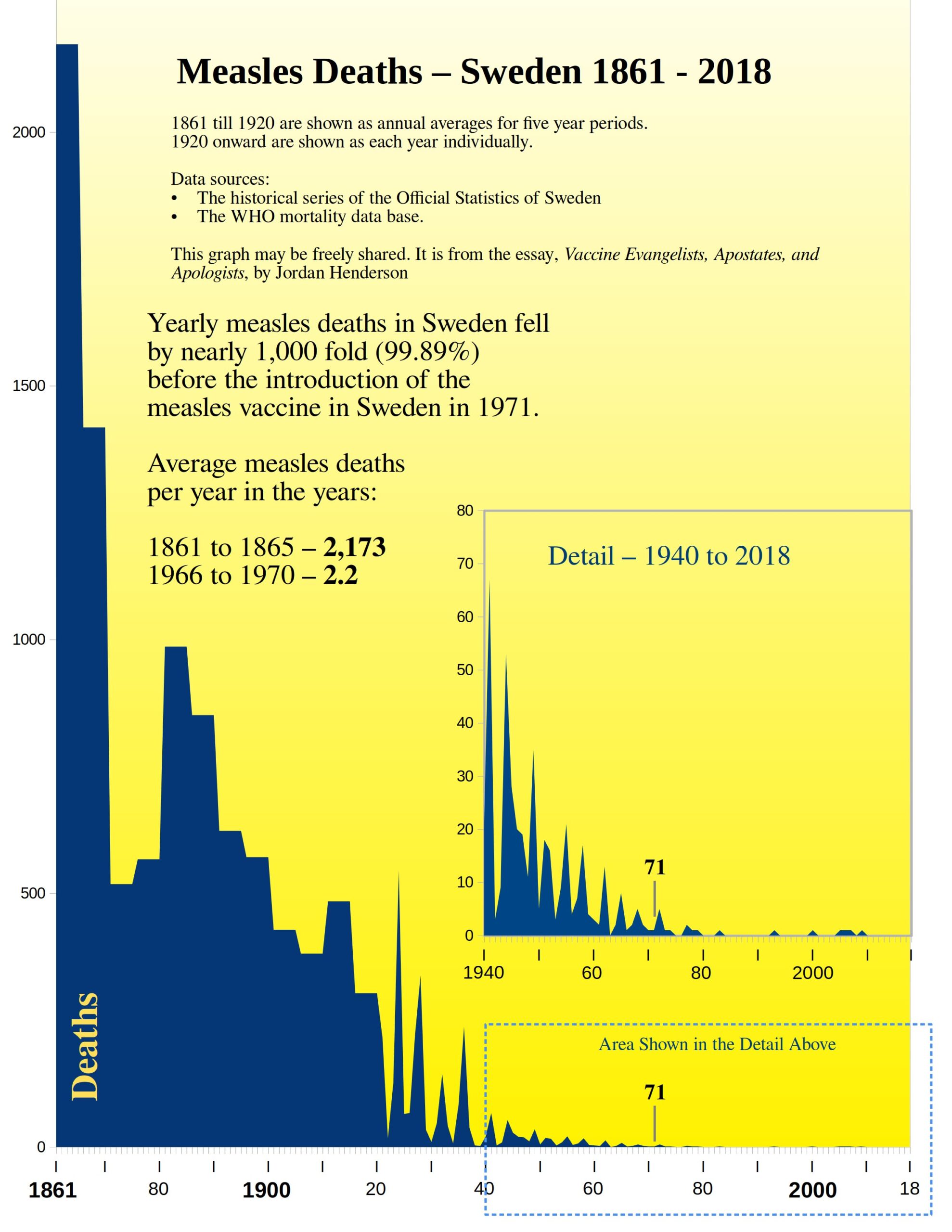
Sweden once again ends up being one of the most remarkable examples. This is most likely because we get more historical perspective with Sweden than we do with Norway, or most other countries for that matter, and because the mortality declines, at least for some diseases, seem to have set in much sooner, and progressed more rapidly in Sweden.
We are looking at a pre-vaccine, measles mortality declines in Sweden, that is just shy of a 1,000-fold decline.
Notes for this Section:
- I had hoped to put together similar graphs for the other Nordic countries – Denmark, Finland and Iceland, but I have not found comparably easy to access online archives with the older historical cause of death data for the other Nordic countries. Though you can easily find the younger data for all of them, back to 1950, through the WHO Mortality Data Base.
- The Scandinavian countries experienced population growth over this time period, but the number of children born each year did not change all that much, so as with the diseases that primarily affected children for Spain, I here too used the actual number of recorded measles deaths rather than the rate per 100,000.
- Here are the links to the online archives of the Norwegian Statistical Yearbooks, and the various Historical Series of the Official Statistics of Sweden.
- I have also pulled, from the same sources, the historical data for scarlet fever in Norway and Sweden, and whooping cough in Norway (we already reviewed whooping cough in Sweden – Figure 52 in Part 5), and I’ll provide graphs of those later in an addendum to this series along with some other graphical presentations that I prepared but either cut from the series when I rewrote sections, or that I never ended up working into the main essays in the first place.
Become a Patron!
Or support us at SubscribeStar
Donate cryptocurrency HERE
Subscribe to Activist Post for truth, peace, and freedom news. Follow us on SoMee, Telegram, HIVE, Minds, MeWe, Twitter – X, Gab, and What Really Happened.
Provide, Protect and Profit from what’s coming! Get a free issue of Counter Markets today.
Be the first to comment on "Vaccine Evangelists, Apostates, & Apologists: Part 6 — The Apologists Continued"