
In Part 1 we focused on the preaching of the Vaccine Evangelists. Now we will review the work of Vaccine Apostates in which the Apostates have debunked the preaching of the Vaccine Evangelists.
If you have yet to read Part 1 of this series, you may wish to do so before reading Part 2. Here is the link to Part 1: Vaccine Evangelists, Apostates, and Apologists: Part 1 – The Evangelists.
We covered a lot of ground in Part 1, so even those of you who have already read it may want to briefly revisit Part 1 and scan the table of contents to refresh your memory.
As before I’ll provide a table of contents in this essay so that you can get an overview at a glance:
Table of Contents (of Part 2 in the series)
- Storming the Bailey: Vaccine Apostates Debunk the Faith.
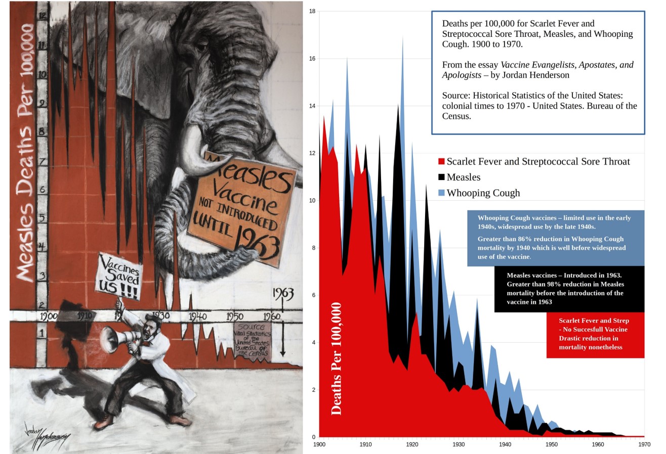
- Historical Death Data: Vaccine Evangelists Tell You About it; Vaccine Apostates Show it to You.
- An Introduction to the Work of Roman Bystrianyk, Suzanne Humphries, and Greg Beattie.
- Historical Death Rates for Measles, Scarlet Fever, and Whooping Cough in the USA, England and Wales, and Australia.
- Measles
- Scarlet Fever
- A Brief Note on Scarlet Fever and Antibiotics
- Whooping Cough
- Historical Death Rates for Infectious Diseases that Were the Leading Causes of Death in 1900 in the USA
- Pneumonia and Influenza
- Tuberculosis
- Gastritis, Duodenitis, Enteritis, and Colitis
- Diphtheria
- Regarding Smallpox and Polio
1 – Storming the Bailey: Vaccine Apostates Debunk the Faith.
In Part 1 we reviewed numerous examples of Vaccine Evangelism, divided into the basic categories of Graveyard Gambits, Bait and Switch Preaching and The Lifespan Lectures. All those examples promoted the central misconception of the Doctrine of Salvation Through Vaccination. That misconception is:
The belief that vaccines played a primary role in causing the drastic decline in deaths attributed to infectious disease in general, and many major diseases in particular, that occurred in the late 19th and early 20th centuries, especially as this relates to the plummet in infant and child mortality rates; and also the corollary belief that, these diseases would return with comparable devastation if we stopped vaccination against them.
I pointed to this belief as being the Bailey in a Motte and Bailey doctrine (Revisit Part 1 if you need a refresher on Motte and Bailey doctrines). In short, this means that the aforementioned belief is highly desirable rhetorical ground to occupy for the vaccinationists, but it’s not a defensible position if challenged.
By debunking the belief in question, The Vaccine Apostates have, so to speak, stormed the Bailey. Let us now review some of the work of Vaccine Apostates in which they have debunked the belief in question.
Historical Death Data: Vaccine Evangelists Tell You About it; Vaccine Apostates Show it to You.
A straightforward, clear means for dispelling the Vaccine Evangelists’ preaching is simply to put their preaching into context by comparing it with the historical mortality data.
An effective way to share the historical mortality data is through a graph of this data, which allows the viewer to comprehend at a glance decades of mortality data spanning the time frame in question. We’ll review many such graphs below.
Death-rate graphs are only one of many types of evidence in the vaccine debate, but they will be the fulcrum of my analysis of the vaccine conflict, because death-rate graphs more succinctly illustrate, better than any other tool I know of, the disconnect between what the Vaccine Evangelists’ claim or imply happened, versus what actually happened.
Vaccine Evangelists frequently point to death data, too, just as do Vaccine Apostates, but the Evangelists have a strong aversion to death-rate graphs. What the Vaccinationists usually do instead of graphing out the data and showing it to you, is to tell you the number of deaths for the years of some time period before vaccination for the disease in question.
We saw this in many of the Exhibits of Vaccine Evangelism in Part 1 of this series, for example:
- The Daily Telegraph (Exhibit D) informed us that “Diphtheria killed 4073 people in Australia between 1926 and 1935.”
- The Vaccine History website of the Philadelphia College of Physicians (Exhibit E) told us that “Diphtheria and measles killed thousands of children each year before their respective vaccines were developed.”
- In Exhibit G the CDC informed us “Whooping cough vaccines became widely available in the 1940s. Before then, about 200,000 children got sick and about 9,000 died from whooping cough each year in the United States.”
The Vaccine Evangelists most definitely use the historical death data to illustrate the value of vaccines, but they don’t show you – they tell you; this is very common for the Vaccine Evangelists, to tell you about the historical death data.
In contrast to the Vaccine Evangelists telling you about the historical data, the approach of the Apostates is to plot the data on a graph and show it to you. That difference (telling you about the data vs. showing it to you) is revealing.
An Introduction to the Work of Roman Bystrianyk, Suzanne Humphries, and Greg Beattie.
Here in the English-speaking sphere of the vaccine conflict, graphs of historical death rates for a great portion of the English speaking world have been presented, published, and discussed in detail along with many other important considerations in the following two books:
- Dissolving Illusions: Disease, Vaccines, and The Forgotten History by Roman Bystrianyk and Suzanne Humphries
- Fooling ourselves on the fundamental value of vaccines by Greg Beattie.
I highly recommend these two books, which are each a wealth of information and insight. In the meantime, though, you can access the historical death-rate charts and graphs that these authors have shared on their websites (linked to above). They generously gave permission to share these graphs. You can find data visualizations of historical death rates from England and Wales, and the United States, here on Bystrianyk and Humphries’ website, and Australian historical death rates here on Beattie’s website.
With the Preaching of the Vaccine Evangelists fresh in our minds from Part 1, let us now review some of the historical death rates by looking at a portion of the aforementioned authors’ graphs of the death rates.
We’ll begin with the iconic childhood diseases of measles, scarlet fever and whooping cough. Then we’ll look at the leading causes of death in 1900 in the USA, which were pneumonia and influenza, tuberculosis, and diarrheal diseases. We’ll also look at diphtheria, which was the only other infectious disease to make the top ten leading causes of death list in 1900.
2 – Historical Death Rates for Measles, Scarlet Fever, & Whooping Cough in the USA, England and Wales, and Australia.
Measles
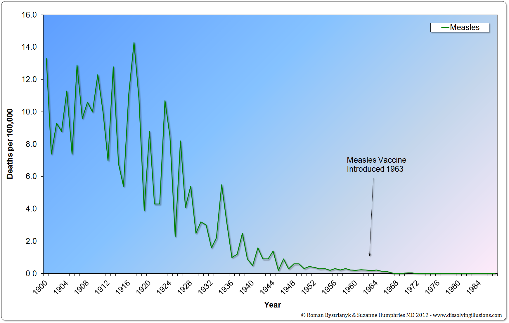
Figure 1
United States measles mortality rate from 1900 to 1987. (Vital Statistics of the United States 1937, 1938, 1943, 1944, 1949, 1960, 1967, 1976, 1987, 1992; Historical Statistics of the United States— Colonial Times to 1970 Part 1; Health, United States, 2004, US Department of Health and Human Services; Vital Records & Health Data Development Section, Michigan Department of Community Health; US Census Bureau, Statistical Abstract of the United States: 2003; Reported Cases and Deaths from Vaccine Preventable Diseases, United States, 1950–2008)
The graph above is from Roman Bystrianyk and Suzanne Humphries’ book Dissolving Illusions. You can verify that this graph accurately reflects the statistics recorded in the sources cited by consulting these publications and checking. While the information spans multiple publications, you can conveniently verify most of the time period of this graph in one publication on page 58 of Historical Statistics of the United States— Colonial Times to 1970 Part 1 – Bureau of the census.
As you can see, almost all the decline in measles deaths in the USA (98.6%) occurred before the introduction of the measles vaccine in 1963. This decline in measles deaths before the introduction of the measles vaccine was even more dramatic elsewhere. Let’s look at another chart of measles deaths from Dissolving Illusions, this one for England and Wales.
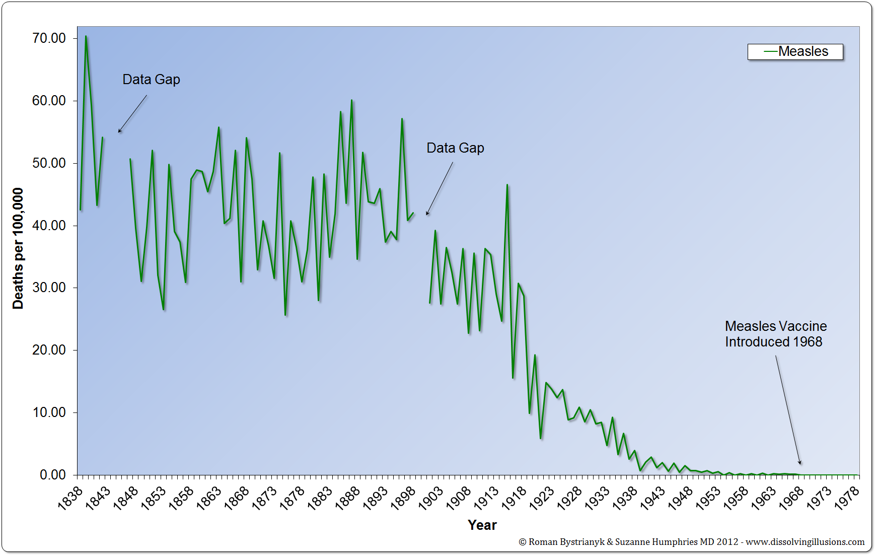 Figure 2
England and Wales measles mortality rate from 1838 to 1978. (Record of mortality in England and Wales for 95 years as provided by the Office of National Statistics, published 1997; Report to The Honourable Sir George Cornewall Lewis, Bart, MP, Her Majesty’s Principal Secretary of State for the Home Department, June 30, 1860, pp. a4, 205; Essay on Vaccination by Charles T. Pearce, MD, Member of the Royal College of Surgeons of England; Parliamentary Papers, the 62nd Annual Return of the Registrar General 1899 (1891–1898))
Here we see a 99.8% decline in measles deaths before the introduction of the measles vaccine. Notice that the vaccine is both introduced a few years later in England and Wales (1968 in England vs. 1963 in the USA). Notice also that these statistics for England are much older than the US statistics and go back all the way 1838, whereas for the United States the mortality data sorted by cause, and by year, is available from 1900 onward — making the US data much younger, meaning that the US data, for all the dramatic decline that it does show, is missing a probable decline that had already occurred in the 19th century.
Some states have much older data than the US in general, such as the state of Massachusetts, which has the distinction of being the first state in the US to register statewide vital records (accessed May 15th 2023).
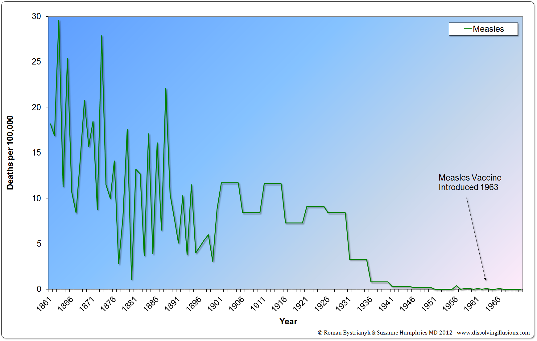 Figure 3
Massachusetts mortality rate from measles from 1861 to 1970. (Historical Statistics of the United States—Colonial Times to 1970 Part 1, Bureau of the Census, p. 63)
In all these cases we can see that almost all the decline in the measles death rate occurred before the vaccine was introduced.
Bystrianyk and Humphries also charted out the data for France, which while no older than the US data, is especially interesting due to the low uptake of the measles vaccine.
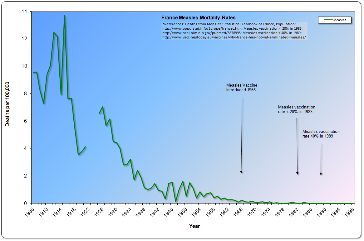 Figure 4
France Measles Mortality Rates 1906-1998 (Deaths from Measles: Statistical Yearbook of France; Population: http://www.populstat.info/Europe/francec.htm; Measles vaccination < 20% in 1983: http://www.ncbi.nlm.nih.gov/pubmed/6878995)
Thanks to the work of Bystrianyk and Humphries we have now seen, through graphs, the same dramatic decline in measles mortality — before the introduction of the vaccine – for England/Wales, France, and the United States. Now let’s look at a geographically very different place that also kept detailed vital records reaching back into the 19th century – Australia.
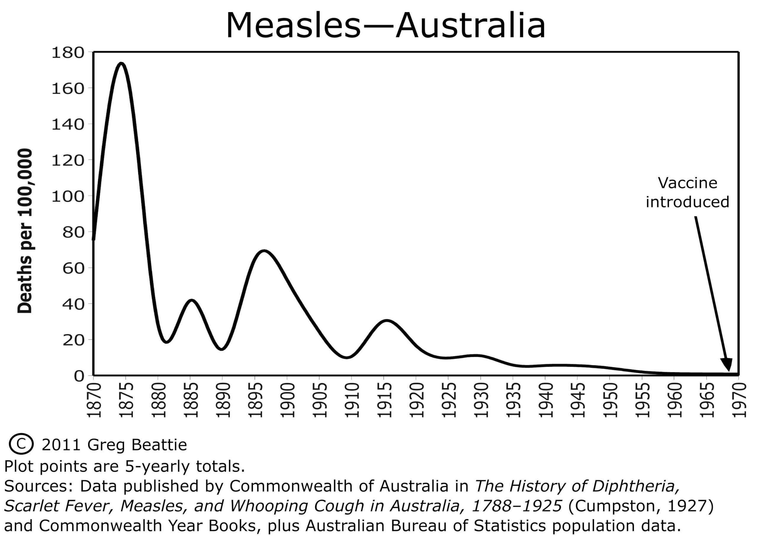 Figure 5
This graph was created by Greg Beattie and is from his book Fooling Ourselves on the Fundamental Value of Vaccines. Here is what he has to say about it:
“The graph for measles (Figure 1{Figure 5 in this essay}) shows us that the five-yearly death rate, 100 years before the vaccine was introduced, was around 170. One hundred years later, and immediately prior to introducing the vaccine, it was less than one.
That’s a reduction of 99.5%—before the vaccine arrived. The remainder of less than 1% is therefore the only portion of the decline to which the vaccine can possibly lay claim, because it simply was not around for the first 99.5%. How much claim can it lay to this last little bit? We will see in Chapter Three.”
It is clear that for the USA, England/Wales, France, and Australia, the measles vaccine cannot have been responsible for more than a fraction of the decline in the measles death rate; other factors were responsible for almost all of the decline.
Now let’s look at scarlet fever.
Scarlet Fever: Historical Death Rates
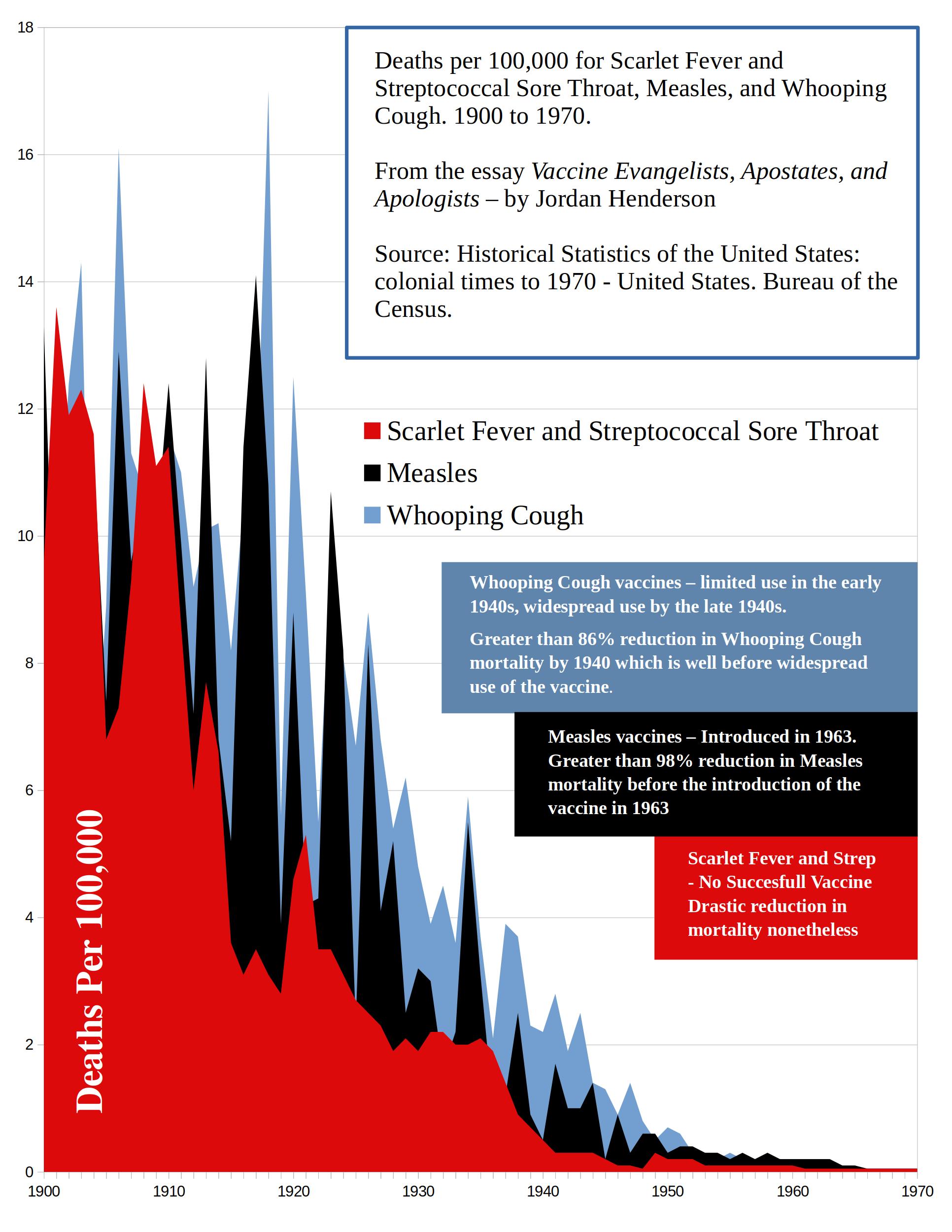 Figure 6
As you can see, in the early 20th century, deaths were attributed to scarlet fever at a rate nearly on par with measles and whooping cough. In the 19th century scarlet fever death rates were on average even higher then either whooping cough or measles.
Like measles and whooping cough, scarlet fever deaths were primarily in children.
Evidently, scarlet fever can even be confused with measles, as scarlet fever is regularly listed on measles differential diagnosis (see here, and here)
What is especially interesting about scarlet fever is that there was no widespread vaccination against it. A 1924 vaccine was developed but evidently of so little worth, and with serious side effects, that no one bothers mentioning it and it is hard to find any information on it at all.
The CDC simply states “there is no vaccine to prevent scarlet fever,” and that’s generally what you will find stated: the government of Canada’s Scarlet Fever Fact sheet also states that “There is no vaccine to prevent Scarlet Fever or Strep Throat.” The United States National Center for Biotechnology Information also states that there is no vaccine for scarlet fever.
Considering that vaccinationists are always trying to give credit to vaccines, it makes you wonder just how bad that 1924 scarlet fever vaccine was that they don’t even want to bring it up?
The book Dissolving Illusions details reasons why health authorities may prefer not mention to the scarlet fever vaccine at all. I’ll leave you to read that for yourself in Bystrianyk and Humphries’ book that I so highly recommend. For now, though, suffice it to say that we can rule out the scarlet fever vaccine from the list of potential reasons for the dramatic decline in scarlet fever deaths.
A Brief Note on Scarlet Fever and Antibiotics
Since Vaccinationists can’t credit the decline in the deaths attributed to scarlet fever to vaccines, they try to at least still credit the decline to modern medicine . . . somehow. So they will usually attribute the decline in scarlet fever deaths to antibiotics.
Even just in general it’s not uncommon to see the plummet in scarlet fever deaths attributed to antibiotics, like these quotes below.
“Before antibiotics were available, scarlet fever used to be a dreaded disease and was a leading cause of death in children,” said Nathan Price, MD, a pediatric infectious disease specialist with Banner Children’s.” – Scarlet Fever Page at BannerHealth.com
“Can scarlet fever kill you? Not likely. Before antibiotics became widely available in the 20th century, scarlet fever was a leading cause of death in children. Today, scarlet fever is considered a relatively mild disease.” – Scarlet Fever Page at VeryWellHealth.com
“Before the advent of antibiotics, scarlet fever was extremely serious, often causing long periods of illness, many dangerous complications, and even death.” –Encyclopedia Brittanica
I don’t think the authors of those statements above are being intentionally deceptive, I just don’t think they’re thinking very carefully about this at all; those statements above are evidence of our society’s assumption that modern medicine played the primary role in the decline of infectious disease mortality . . . somehow: “Well if in this case it wasn’t a vaccine that came to our rescue then it must have been an antibiotic!”
So let’s evaluate this claim briefly: the claim that the decline in deaths attributed to scarlet fever is thanks to antibiotics.
In the late 1930s medical researchers tested the early antibiotic sulphonamide drugs for treating scarlet fever. A study published in 1939 on a controlled trial of over 300 scarlet fever patients, divided into a sulphanilamide (type of sulphonamide) treatment group and a control group is summed up as so (numbering from the source linked to below):
5. The results show that sulphanilamide had no significant effect upon the initial symptoms of scarlet fever, or upon the kind, incidence, or duration of later complications.
6. A large number of toxic reactions followed the use of both sulphanilamide and benzyl-sulphanilamide.
7. In view of all the evidence submitted, it is considered that there is no justification for the employment of sulphanilamide and benzyl-sulphanilamide in the treatment of scarlet fever.
– THE SULPHANILAMIDE TREATMENT OF SCARLET FEVER BY JANE 0. FRENCH, M.D Journal of Hygiene, Volume 39, Issue 5, September 1939 , pp. 581 – 596
To their credit, those claiming that “antibiotics conquered scarlet fever” generally do not try to credit the early antibiotic sulphonamides, but instead they credit penicillin. So, let’s look at penicillin for scarlet fever.
In this document here you can see that TORBEN JERSILD M.D. at the University of Copenhagen was experimenting with the antibiotic penicillin for treatment of scarlet fever in 1945. You can also see that the previous use of the early antibiotic sulphonamide had been “disappointing,” and that he switched over fully to penicillin for scarlet fever in 1946. Jersild notes in this next document from 1948, that:
So, we can see that in the mid- to late-1940s, sulphonamides are being used to little or no effect against scarlet fever, and that Jersild is promoting penicillin which he has had promising results with and to which the decline in scarlet fever deaths is, today, so frequently attributed. But keep in mind that it is not until the late 1940s that the medical practice is starting to regularly use penicillin for scarlet fever.
Then we can see in this document here that the British, also disappointed with sulphonamides, saw this publication of Torben Jerisild’s about penicillin treatment of scarlet fever and started using penicillin to treat scarlet fever in Britain, also, in the late 1940s.
I haven’t found a clear indicator of when penicillin was regularly used against scarlet fever in the US, but according to Times reporting from 1943, there was almost no penicillin available in the US in the early 1940s, just enough for 30 patients at a time (suffering from any ailment) in 1943.
We know that Americans were a couple years later experimenting with penicillin against scarlet fever in the US, in 1945 with good results, so it seems likely that it would have been used regularly by the late 1940s.
We have clear documentation in the late 1940s of penicillin usage for scarlet fever in Britain, and that is looking like a safe bet for the US too.
Keep that in mind as we look at for scarlet fever death rates; does it look like most the decline occurred before or after the late 1940s? If antibiotics can help against for scarlet fever that’s great, but pointing to them as the major reason for for scarlet fever no longer being the threat it once was is simply pathetic. Like vaccines for other diseases, penicillin for scarlet fever came too late to be plausibly credited with anything more than, at the most, a small fraction of the decline in scarlet fever deaths.
Now let’s look at Bystrianyk and Humphries’ scarlet fever death-rate graph for England and Wales, and then we’ll look at Beattie’s scarlet fever compared to measles death-rate graph for Australia. Both of these are graphs are of much older data than the US mortality data, and therefore give us a bigger picture view of the scarlet fever mortality trends.
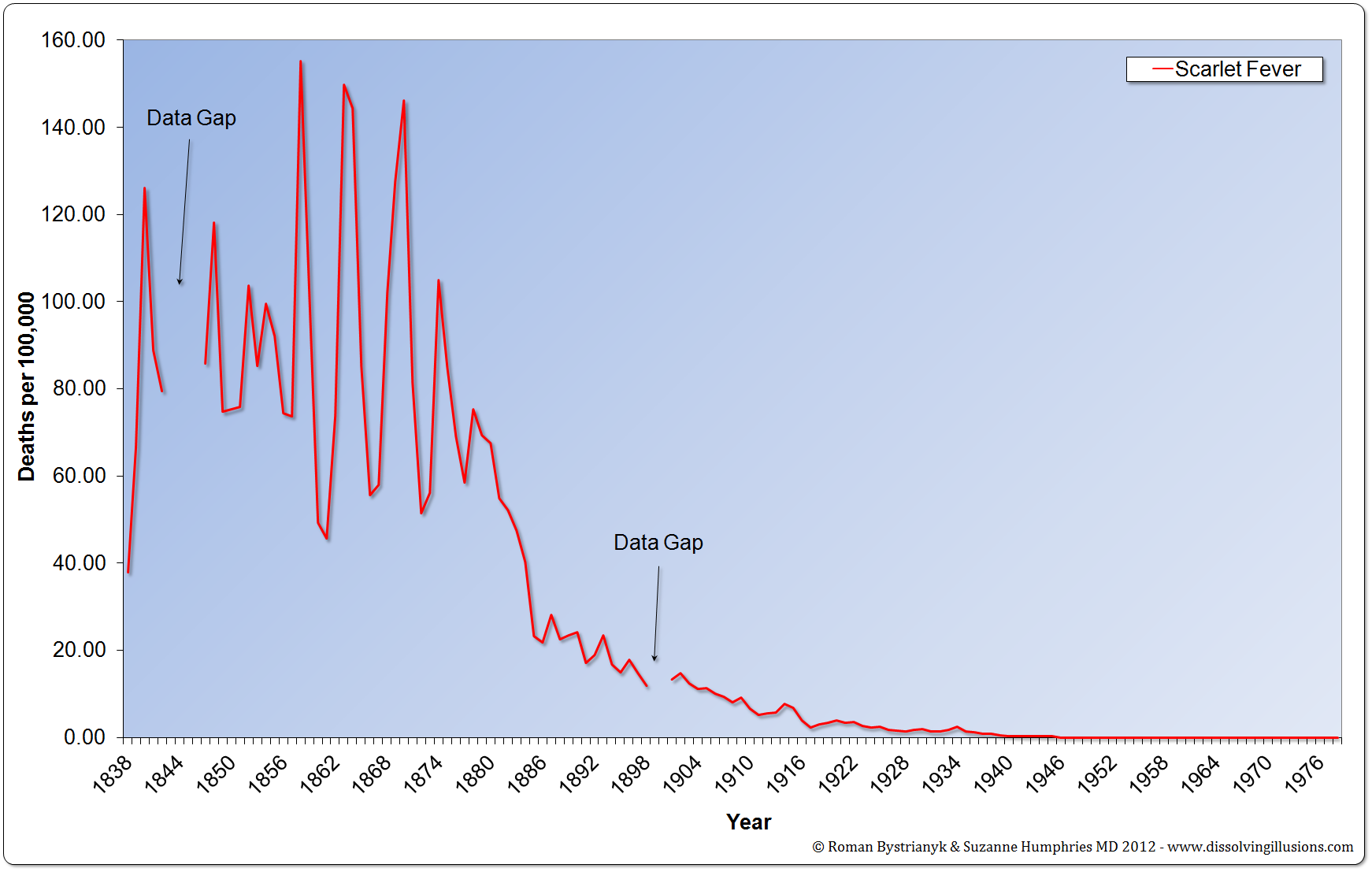 Figure 7
England and Wales scarlet fever mortality rate from 1838 to 1978. (Record of mortality in England and Wales for 95 years as provided by the Office of National Statistics, published 1997; Report to The Honourable Sir George Cornewall Lewis, Bart, MP, Her Majesty’s Principal Secretary of State for the Home Department, June 30, 1860, pp a4, 205; Essay on Vaccination by Charles T. Pearce, MD, Member of the Royal College of Surgeons of England; Parliamentary Papers, the 62nd Annual Return of the Registrar General 1899 (1891–1898))
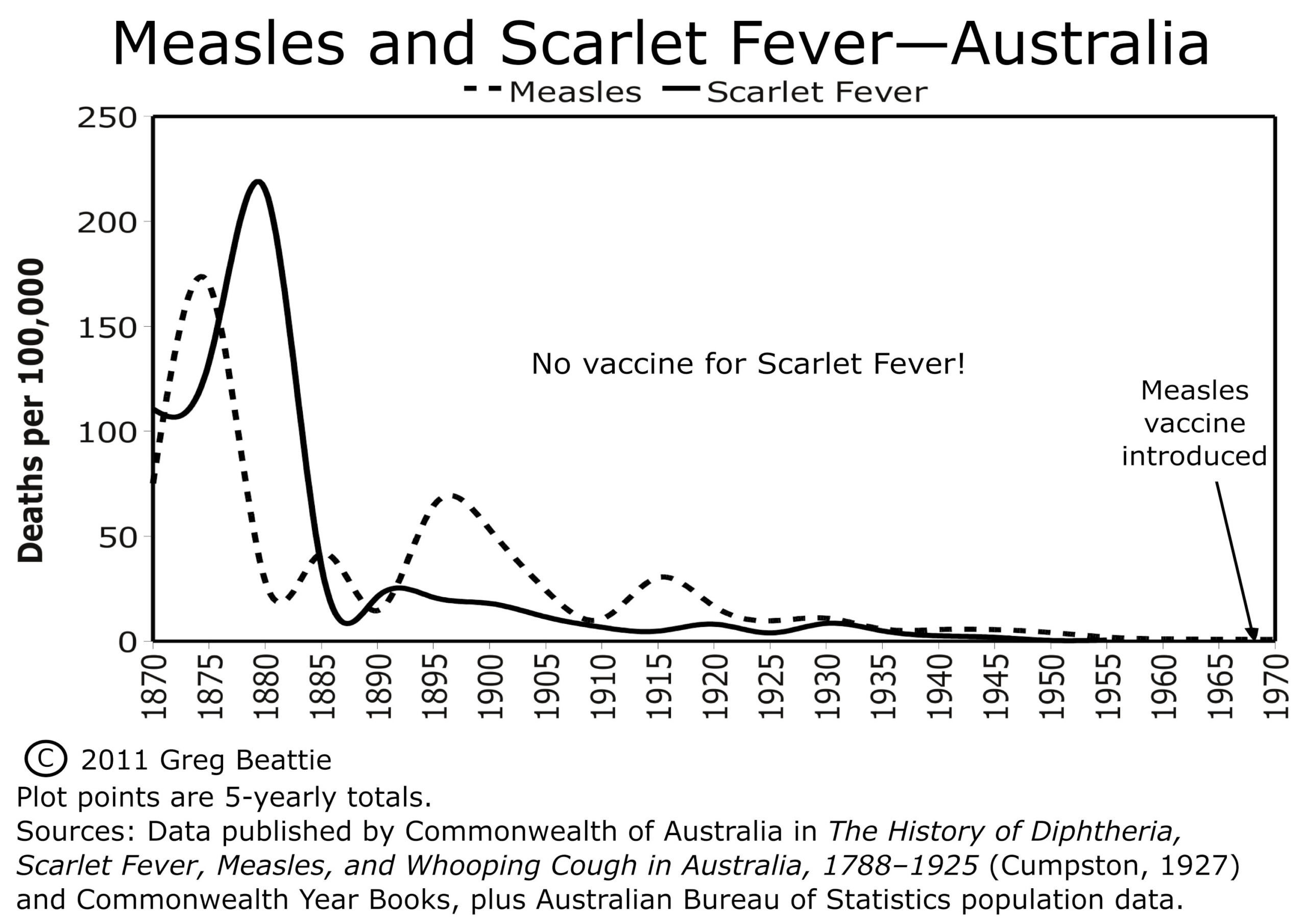
Figure 8
We can see that more deaths were attributed to scarlet fever than to measles in the 19th century, for both Australia and England and Wales where there is 19th century data. Otherwise, scarlet fever and measles have very comparable historical death rates.
The drastic decline in deaths for scarlet fever occurred without a successful vaccine against it, and before antibiotics came into widespread use, meaning that neither vaccination nor antibiotics can be credited for this dramatic decline.
Now, let’s look at whooping cough/pertussis:
Historical Trends in Whooping Cough Deaths
Historical trends in whooping cough deaths are comparable to historical trends in measles and scarlet fever deaths. Whooping cough deaths also primarily hit children and infants. A significant difference, though, is that vaccines were developed and came into use much earlier for whooping cough.
Whooping cough vaccines were developed as early as 1914, but these early vaccines were not promising and were not in widespread use. Here is what the NIH has to say about the early pertussis vaccines:
“The whole-cell pertussis vaccine became widely available in the United States in the 1940s, although it was first licensed in 1914. It was crudely made and had limited use until the 1940s, because of reports of serious side effects including death. – National Institutes of Health – Pertussis Page –
We can safely rule out the early crude pertussis vaccines as being any sort of major player, so we are looking at serious pertussis vaccine usage not occurring until the late 1940s, especially 1948 and later. Mass vaccination with the combined DTP (diphtheria, tetanus, pertussis) vaccine occurred in the years after DTPs introduction in 1948 in the USA.
In the USA most the decline in deaths attributed to whooping cough had already occurred before the introduction of pertussis vaccine in the 1940s and definitely before 1948. Furthermore, deaths attributed to whooping cough simply continue to decline as they had already been doing without pertussis vaccines.
Before we look at the whooping cough graphs, let’s revisit Vaccine Evangelism Exhibit G, from Part 1:
Exhibit G
“Whooping cough vaccines became widely available in the 1940s. Before then, about 200,000 children got sick and about 9,000 died from whooping cough each year in the United States. After vaccine introduction, whooping cough cases reached an all-time low in the 1970s.” – CDC DTP Vaccine page (Web Archived Version Here).
As we already noted, government health authorities pivot from deaths to notifications of incidence; they start out talking about both death and notifications of incidence, then they finish by talking about just notifications of incidence, leaving you to think that the picture for death is the same.
They very clearly are trying to give you the impression that the reason we no longer have 9,000 whooping cough deaths per year is because of pertussis vaccines, and that whooping cough deaths began to decline because of pertussis vaccines. They do not tell you that whooping cough deaths began to decline long before pertussis vaccines, and that the majority of the decline had happened before pertussis vaccines.
Let’s look at the chart for the USA, then we will get back to the CDC.
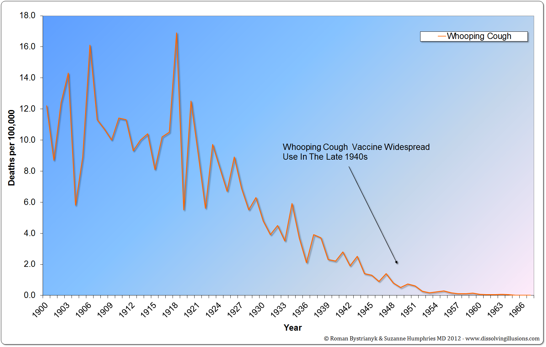 Figure 9
United States whooping cough mortality rate from 1900 to 1967. (Vital Statistics of the United States 1937, 1938, 1943, 1944, 1949, 1960, 1967, 1976, 1987, 1992; Historical Statistics of the United States—Colonial Times to 1970 Part 1; Health, United States, 2004, US Department of Health and Human Services; Vital Records & Health Data Development Section, Michigan Department of Community Health; US Census Bureau, Statistical Abstract of the United States: 2003; Reported Cases and Deaths from Vaccine Preventable Diseases, United States, 1950–2008)
Here also we see that if the whooping cough vaccine made any contribution at all to the decline in whooping cough deaths it could not have been much relative to whatever did cause most the decline in whooping cough deaths.
One more point here: The CDC said that there were “about 9,000” deaths a year before whooping cough vaccines in the 1940s. That gives us the impression that there were about 9,000 deaths attributed to whooping cough each year in the late 1930s, doesn’t it? Let’s check the data.
According to the Vital Statistics of the United States, there were between 2,666 and 7,518 deaths a year between 1939 and 1933.
USA Whooping Cough Deaths 1939 to 1933 With Links to Each Year’s Vital Statistics
USA Vital Statistics 1939 – 3,026
USA Vital Statistics 1938 – 4,778
USA Vital Statistics 1937 – 4,981
USA Vital Statistics 1936 – 2,666
USA Vital Statistics 1935 – 4,733
USA Vital Statistics 1934 – 7,518
USA Vital Statistics 1933 – 4,453
Would you call 2,666 to 7,518 deaths, with an average of 4,593 “about 9,000” ?
1933 is the earliest year in which the data for all the United States is available; before that the data is from the death registration area (comprised of the states and cities in the United States that kept sufficiently good death records to be included). Where then is the CDC getting their 9,000 number from?
Possibly they are getting the 9,000 number from an extrapolation of the earlier death registration area data to the rest of the USA by applying the death rate calculated from the death registration area to the rest of the US population; that’s not at all unreasonable methodology, but they would have to be going back into the 1920s to get a death rate high enough to yield 9,000 whooping cough deaths when extrapolated to the whole US population.
Whatever the case, the CDC’s statement is decidedly misleading in several different ways; this statement of the CDC’s juxtaposed with the above death rate graph of the data illustrates why the Vaccine Evangelists would much rather tell you about the data instead of showing it to you.
Let’s move on to the other countries:
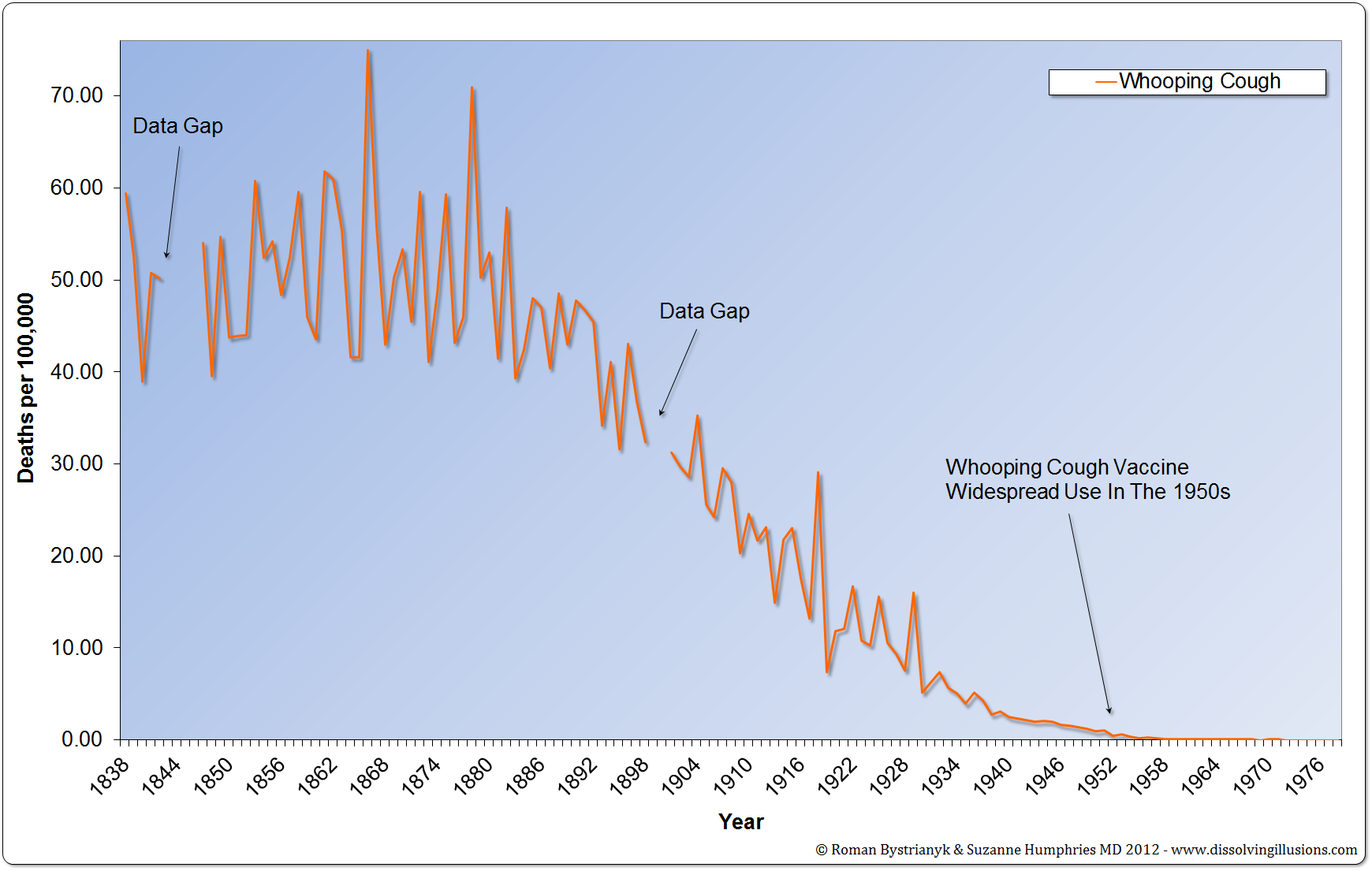
Figure 10
England and Wales whooping cough mortality rate from 1838 to 1978. (Record of mortality in England and Wales for 95 years as provided by the Office of National Statistics, published 1997; Report to The Honourable Sir George Cornewall Lewis, Bart, MP, Her Majesty’s Principal Secretary of State for the Home Department, June 30, 1860, pp. a4, 205; Essay on Vaccination by Charles T. Pearce, MD, Member of the Royal College of Surgeons of England; Parliamentary Papers, the 62nd Annual Return of the Registrar General 1899 (1891–1898))
For England and Wales, the pre-vaccine decline is even more dramatic. We can see an even bigger picture of the whooping cough death trend going back to 1838, and the whooping cough vaccine was brought in later than what it was in the USA.
Let’s look at Australia:
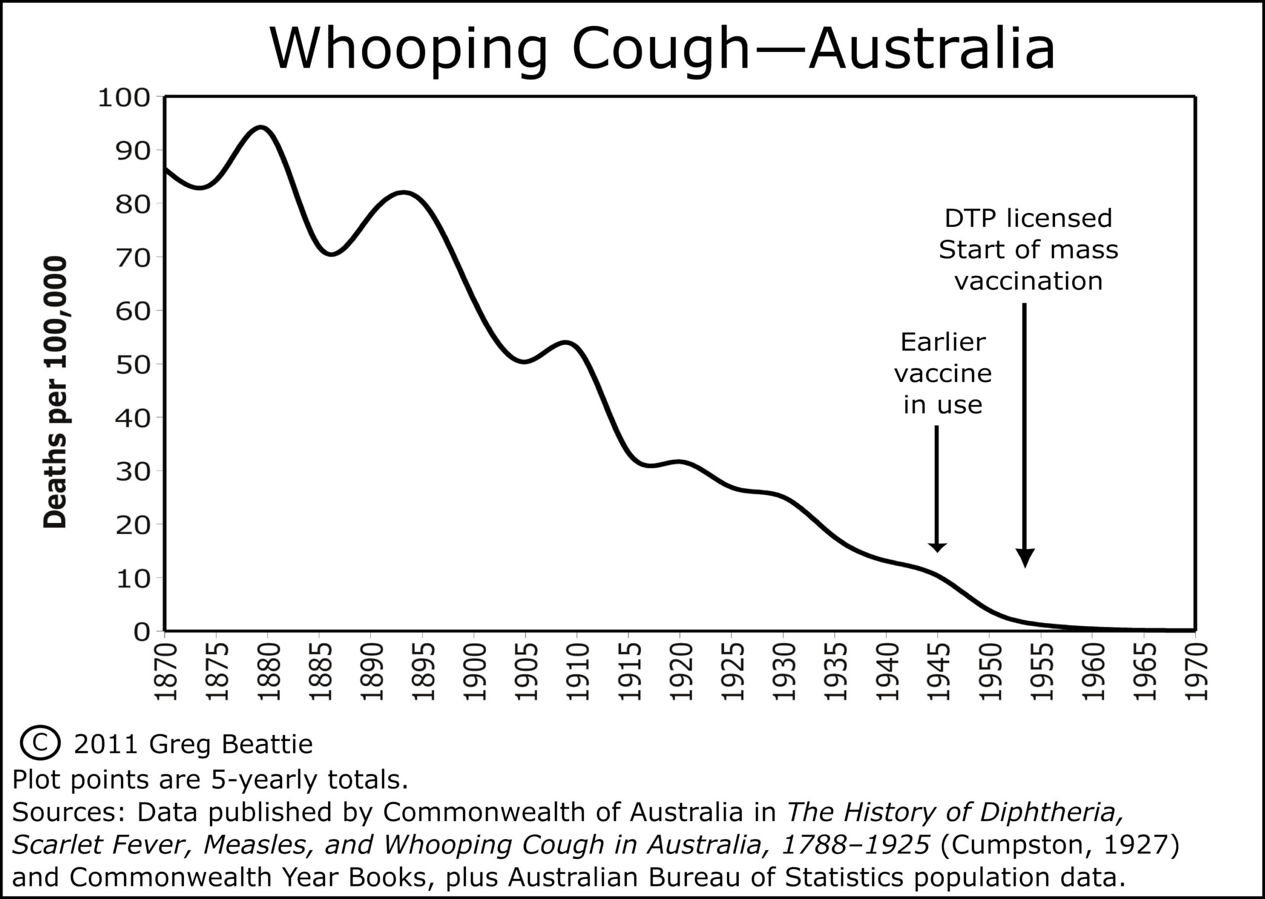 Figure 11
Beattie says of whooping cough vaccines in Australia:
“This was another vaccine introduced gradually from the 1940s. Its routine use in infants came with the licensure in 1953 of DPT vaccine (the ‘P’ is for pertussis, or whooping cough). As can be seen from the graph, there was roughly 95% reduction in mortality from the 1870s, prior to the DTP vaccine being licenced in 1953, and close to 90% reduction before earlier vaccines were used, during the 1940s.”
In sum, whooping cough deaths plummeted in the late 19th and early 20th centuries, as did deaths for scarlet fever and measles.
For scarlet fever no vaccine was in widespread use and no antibiotics till after almost all the decline.
For measles no vaccine was available till after almost all the decline in deaths had occurred (98.6% to 99.8%).
For whooping cough, the vaccines come into widespread use decades earlier than the measles vaccine, but the majority of the decline in deaths had still occurred before their introduction. Furthermore, the decline in whooping cough deaths simply continued after the vaccine’s introduction as it had already been doing before the vaccine.
If whooping cough vaccines contributed at all to the decline in whooping cough deaths, it wasn’t much.
3 – Historical Death Rates for Diseases Categorized as Infectious that Were the Leading Causes of Death in 1900 in the USA
We’ve gone over a lot of historical death rates for different diseases in different places and we could review quite a bit more and see the same trends, but for now I just want to touch on the leading causes of death in the USA in 1900.
Diseases like measles, whooping cough, and scarlet fever have such a high profile in our cultural conscience that you would be forgiven for thinking them among the deadliest of the infectious diseases of the early 20th century. But none of those three makes the list of the top 10 leading causes of death in the USA in 1900.
So to drive home just how detached from reality the misconception (that vaccines played a primary role in causing the drastic decline in deaths attributed to infectious disease in general, and many major diseases in particular, that occurred in the late 19th and early 20th centuries, especially as this relates to the plummet in infant and child mortality rates, and the corollary belief that, these diseases would return with comparable devastation if we stopped vaccination against them) really is, we must, in addition to looking at these iconic diseases, look at the deadliest of them all.
The top three leading causes of death in the USA in 1900 are categorized as infectious diseases and they were, according to the VITAL STATISTICS – RATES IN THE UNITED STATES 1940-1960 (which actually covers from 1900 to 1960; you can find the leading causes of death for 1900 on page 80)
Number 1 – Pneumonia and Influenza
Number 2 – Tuberculosis
Number 3 – Diarrhea, enteritis, and ulceration of the intestine
After these three is heart disease and other noninfectious causes of death, with the only other infectious disease making the list being diphtheria at Number 10.
So four of the top 10 leading causes of death in the USA are primarily or wholly attributed to infectious causes and occupied the top three and tenth positions. These four causes, each on their own, had a substantially higher death rate in 1900 than the other three diseases we’ve looked at combined (measles, scarlet fever, and whooping cough).
On page 58 of Historical Statistics of the United States: colonial times to 1970 by the United States Bureau of the Census we can see the death rate per 100,000 population in the Death Registration area for all these diseases in 1900 on one page.
Pneumonia and Influenza – 202.2
Tuberculosis – 194.4
Diarrheal Diseases (Gastritis, Duodenitis, Enteritis, and Colitis) – 142.7
Diphtheria – 40.3
All four of the above combined – 579.6
Compare those rates to deaths per 100,000 population in 1900 for:
Measles – 13.3
Whooping Cough – 12.2
Scarlet Fever – 9.6
All three combined at 35.1 don’t add up to the rate for Diphtheria, the lowest of the infectious diseases that are in the top 10 causes of death for 1900.
On page 59 of the same document (Historical Statistics of the United States: colonial times to 1970 by the United States Bureau of the Census) we can see that the total death rate in 1900 was 1,720 per 100,000 population.
So the top three leading causes of death listed above amount to more than 31% of the total death rate in 1900, and if we add in Diphtheria then these four account for – 33.697% of the death rate for 1900.
Despite vaccines having clearly not played a primary role (if any at all) in the drastic reduction of deaths from diseases such measles, scarlet fever and whooping cough, the widely promoted belief that vaccines played a primary role in the drastic reduction of infectious disease mortality in general could still be true if vaccines played a primary role in the plummet of the death rate for these four diseases that we are about to look at, because these next four at a combined 579.6 deaths per 100,000, account for over 70% of the estimated 797 deaths per 100,000 thousand attributed to infectious diseases in 1900 in the USA.
So, let’s have a look.
Pneumonia and Influenza: Historical Death Rate in the USA
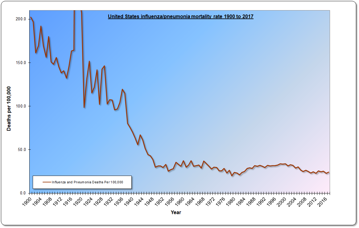 Figure 12
This graph is also from Bystrianyk and Humphries’ book, and is also available on their website DissolvingIllusions.com on the charts and graph page. The sources are all listed there on that page, and took up too much room for me to repeat here! You can go to the web page which I linked to and follow the sources, and you can also easily verify for yourself 70 years’ worth of the data all at once on the ever-so-useful page 58 of the document Historical Statistics of the United States: colonial times to 1970 by the United States Bureau of the Census.
According to an influenza timeline of the CDC:
“In 1960, the US Surgeon General, in response to substantial morbidity and mortality during the 1957–58 pandemic, recommends annual influenza vaccination for people with chronic debilitating disease, people aged 65 years or older, and pregnant women.”
Do you see how the plummet in the influenza and pneumonia death rate started in 1960? Neither do I; whatever the primary reasons were for the plummet in the influenza death rate in the USA which occurred in the first half of the century (and may very well have started earlier in the 19th century), influenza vaccination wasn’t one of them.
Let’s see if the picture is any less unfavorable to the contribution of vaccines for tuberculosis.
Tuberculosis: Historical Death Rate in the USA
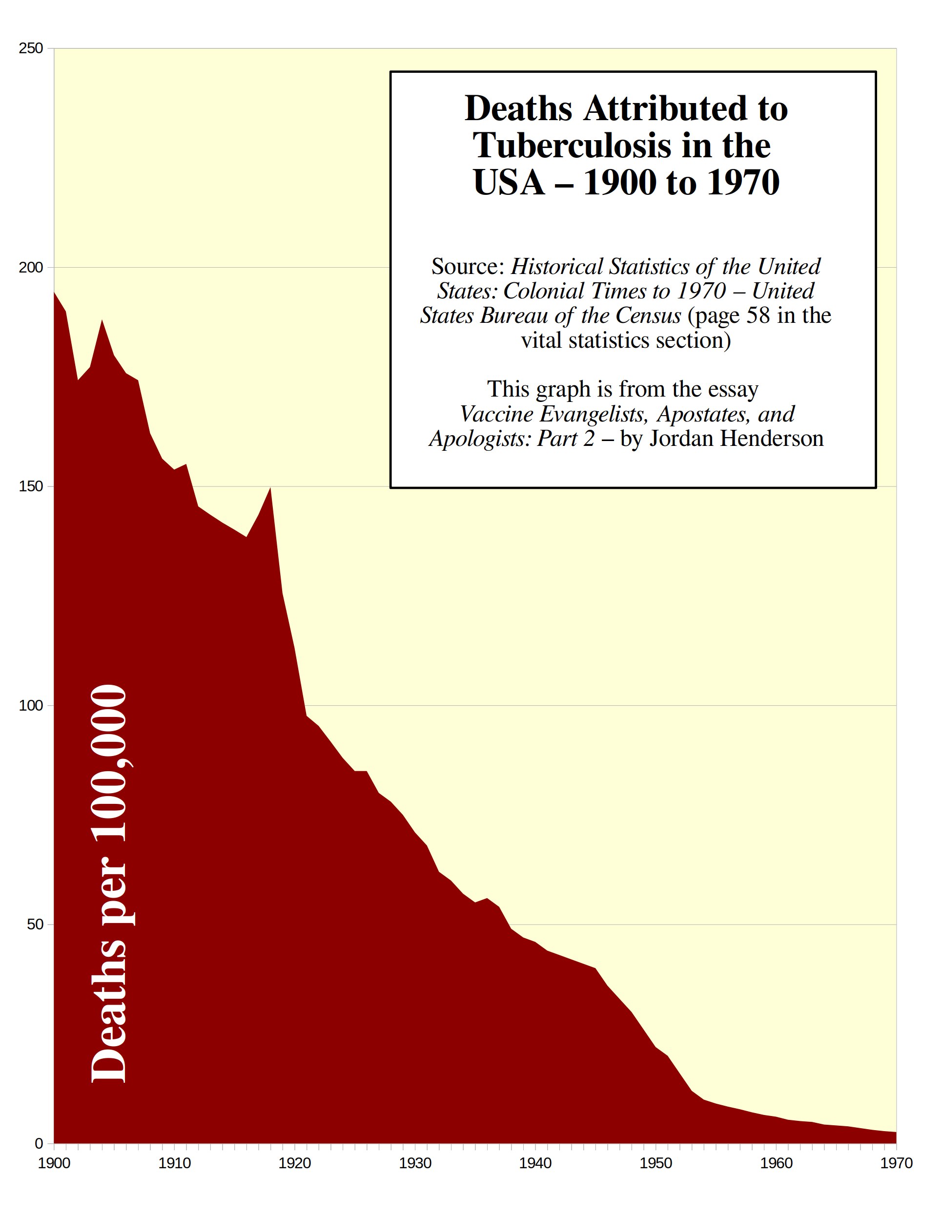 Figure 13
BCG is the tuberculosis vaccine. So, when was the BCG vaccination program for tuberculosis introduced in the USA?
“Because the BCG vaccine was never universally put into practice in the United States, it can be said that none of the decline in incidence or death rates can be attributed to vaccine use.” – Explanations for 20th Century Tuberculosis Decline: How the Public Gets It Wrong Merrill, R., Davis, S., Lindsay, G. and Khomitch, E. (2016) Journal of Tuberculosis Research
Okay, well that doesn’t look too good for the vaccines-as-savior idea. Now from what I understand, the BCG vaccine did become available in the USA in the 1950s; it just wasn’t recommended for most people, there was no mass vaccination campaign with it, and I have yet to see any data at all demonstrating if any more than a mere token of people actually got vaccinated with the BCG vaccine for tuberculosis in the USA. Ultimately, however, it is of no matter, as we can clearly see that most the decline occurred before the 1950s, and the tuberculosis death rate had been in steep decline since at least 1900.
Gastritis, Duodenitis, Enteritis, and Colitis: Historical Death Rate in the USA
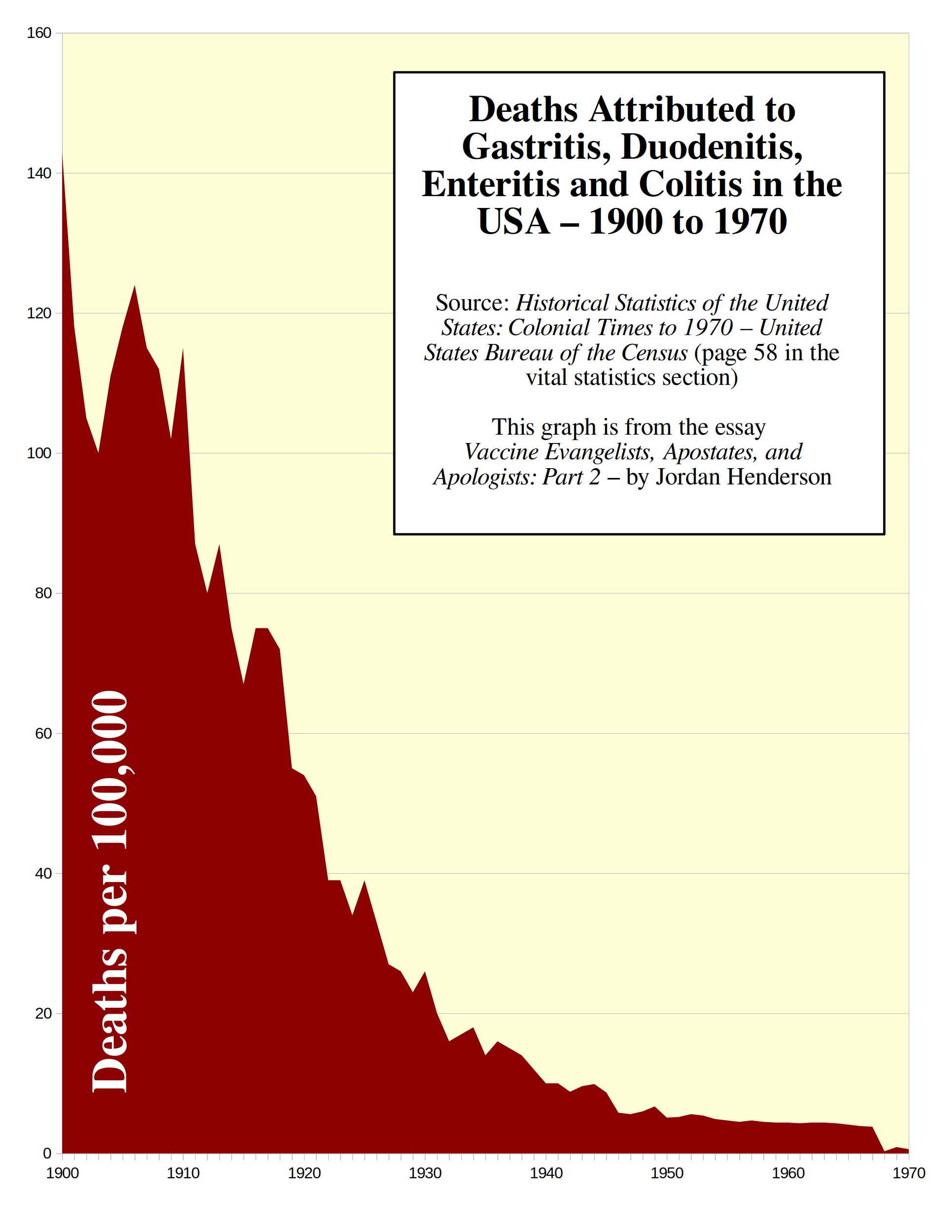 Figure 14
Let me clear up some potential confusion here: This category shows up simply as Diarrhea and Enteritis in earlier documents, such as the VITAL STATISTICS RATES IN THE UNITED STATES 1900-1940, so maybe they grouped some much less common, but related diseases in here in the Historical Statistics of the United States: colonial times to 1970 by the United States Bureau of the Census that were formerly grouped separately, but it hardly changes the picture.
For example: the category Diarrhea and Enteritis in the older document I linked to, if you add together the two age groups, adds up to a rate of 139.9 deaths per 100,000 in 1900. In the 1970 document the Gastritis, Duodenitis, Enteritis, and Colitis category shows 142.7 deaths per 100,000 for 1900 – nearly the same.
So for all practical purposes this is the category of Diarrhea and Enteritis with a couple related, less-common diseases thrown in.
Most of the deaths in this category occurred in young children under two years old (you can see that in the older document linked to above where the Diarrhea and Enteritis category is broken down by age groups).
Here the picture is even more bleak for those seeking glory for vaccines. The only vaccine I see hyped for allegedly reducing diarrheal deaths is rotavirus vaccine, which wasn’t licensed till 1998.
So now let’s look at historical trends in deaths attributed to a disease for which vaccines came into use much earlier – diphtheria.
Historical Trends in Diphtheria Deaths
Let’s begin with some words from our friends at the CDC by revisiting Exhibit H from Part 1:
Exhibit H
Diphtheria was once a major cause of illness and death among children. The United States recorded 206,000 cases of diphtheria in 1921, resulting in 15,520 deaths. Starting in the 1920s, diphtheria rates dropped quickly in the United States and other countries that began widely vaccinating. Due to the success of the U.S. immunization program, diphtheria is now nearly unheard of in the United States. In 2019, countries reported more than 22,900 cases to the World Health Organization, but many more cases likely go unreported. – CDC’s DTP page (accessed April 2023) (Web Archived Version Here)
Let’s look at the diphtheria death rate in the US.
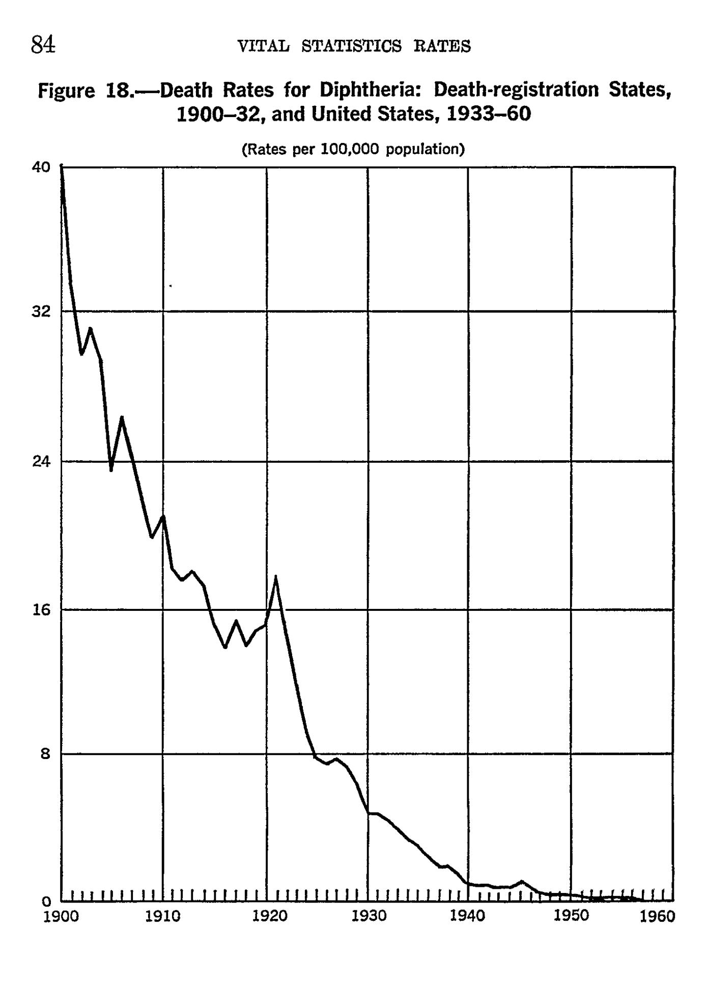 Figure 15
This graph is straight out of VITAL STATISTICS – RATES IN THE UNITED STATES 1940-1960 and as you can see from the screen capture above of the diphtheria death-rate graph, you can find it on page 84 of that document.
Now when was the diphtheria vaccine introduced? The CDC statement featured in Exhibit H gives us the idea it was widespread in the 1920s, but they can’t quite seem to keep their story straight, because we also find from the CDC the following (emphasis mine):
“During the 1920s, 100,000 to 200,000 cases of diphtheria (140 to 150 cases per 100,000 population) and 13,000 to 15,000 deaths were reported each year. After diphtheria toxoid-containing vaccines became available in the 1940s, the number of cases gradually declined to about 19,000 in 1945 (15 cases per 100,000 population). A more rapid decrease began with implementation of a universal childhood vaccination program which included diphtheria toxoid-containing vaccines beginning in the late 1940s.” – From the Diphtheria section of the 14th edition of the CDC’s “Pink Book” published August 2021 (side note: did you see that this is yet another Bait and Switch? They started with cases and deaths and then switched to cases only. By the way, the CDC is also misleading you on cases in the statement above, we’ll look at that in Part 3)
So here they say the diphtheria toxoid vaccines became available in the1940s. What’s up with this confusion at the CDC?
I haven’t been able to find satisfactory, definitive, primary sources on the exact introduction and historical coverage of diphtheria vaccines in the USA, but there seems to be general agreement that the milestones of diphtheria vaccination are as follows:
- Experimental diphtheria vaccines were developed in the second decade of the 1900s.
- A toxoid vaccine considered successful was developed in 1923, introduced in 1926, and geographically limited vaccination campaigns took place after that in the latter half of the 1920s in some East Coast cities.
- Diphtheria vaccination becomes somewhat widespread in the USA in the 1940s.
- Universal childhood vaccination with diphtheria vaccine as the “D” part of the DTP vaccine in 1948 and thereafter.
In addition to suggesting that diphtheria vaccines were introduced in the 1920s, or introduced in the 1940s, the CDC also sometimes provides a timeline basically like the one I just laid out:
“Beginning in the early 1900s, prophylaxis was attempted with combinations of toxin and antitoxin. Diphtheria toxoid was developed in the early 1920s but was not widely used until the early 1930s. It was incorporated with tetanus toxoid and pertussis vaccine and became routinely used in the 1940s.” – From the Diphtheria section of the 14th edition of the CDC’s “Pink Book” published August 2021
The only relevant hard dates I’ve for this vaccine are the introduction of diphtheria toxoid vaccines considered successful in 1926, followed by geographically limited diphtheria vaccination campaigns in some East Coast cities, and 1948 as the beginning of routine childhood vaccination with DTP.
So we have good reason to regard the diphtheria vaccine as having contributed little or nothing to this drastic decline in the diphtheria death rate; the diphtheria death rate had been plummeting since at least 1900, had fallen by over 80% before 1926, simply continued to decline in the 1930s as it had been doing already, and almost all the decline occurred before universal child vaccination with DTP in 1948.
4 – What About Smallpox and Polio?
Smallpox and polio are poster children for vaccines. But these two diseases and the debate about their respective vaccines are so distinct that they each deserve to be analyzed at length on their own.
Because I believe that the discussion around smallpox and polio demands considerable separate attention in order to do the discussion justice, I am setting these two particular diseases and their respective vaccines to the side, at least for now, so that I can keep the essay series focused on the other infectious diseases.
But there are certainly readily available resources for an in-depth look at smallpox and polio.
The two books whose death-rate graphs we have been looking at are both excellent sources for demystifying the polio vaccine story. Those books again are:
Dissolving Illusions: Disease, Vaccines, and The Forgotten History by Roman Bystrianyk and Suzanne Humphries
Fooling ourselves on the fundamental value of vaccines by Greg Beattie.
Janine Roberts’ book Fear of the Invisible is a classic that goes deep into polio, and is well worth reading. The recent book on polio – Moth in the Iron Lung by Forrest Maready – I found to be excellent as well.
For smallpox: Dissolving Illusions focuses quite intensely on smallpox and the smallpox vaccine. Here’s a short summary of the very important history of the smallpox vaccine:
- Oldest vaccine.
- The only vaccine claimed to have eradicated a disease.
- The vaccinationist’s crusades against the unvaccinated began with the smallpox vaccine
- And the 19th century crusades against the unvaccinated are still arguably the worst of them.
Roman Bystrianyk (co-author of Dissolving Illusions) has information on smallpox on his Substack such as Menagerie Roulette, and Roman will also soon be releasing a major work in the form of a documentary film Dissolving the Vaccine Illusion on July 11th 2023, so keep your eyes open for that.
Classic 19th century works on smallpox vaccines, freely available through online archives include:
Vaccination a Delusion by Alfred Russel Wallace
Vaccination: Proved Useless & Dangerous by Alfred Russle Wallace
Vaccination in Italy by Charles Ruata, and provided as a PDF on the Dissolving Illusions website
The refutation of smallpox and polio vaccine mythology is in very capable hands, and I encourage the reader to delve into the above resources when they get the chance.
We will touch upon smallpox and polio here and there in this series as that is unavoidable in a general vaccine discussion; but for the purpose of this essay series, I’ll use as my primary examples the other iconic childhood diseases, and the somewhat overlooked but important leading causes of death in the past, such as tuberculosis and diarrheal diseases (since they account for the lion’s share of the infectious disease mortality).
A Couple Ideas for Those Who Would Like to Support This Work
To those who would like to support my work, I offer the following three suggestions, any one or combination of which would be most helpful:
- Making a small single, or recurring donation to me through the donation page on my website (or a paid Substack subscription which is effectively a donation as all my essays are freely available), or making a purchase of a small print, mug, or greeting card, through my art prints website.
- Making a single or recurring donation to one of the independent media outlets (like this one!) who publish my work, and without whom few would see my work online to begin with.
- Supporting this work by getting the word out; sharing this article, and or sharing other notable works by me or the independent media outlets who bring my work to your attention. This increases our reach and makes us happy to know that our work is benefiting more people.
Up Next: Part 3. The Red Herring: A Tour of the Motte
In the imagery of the Motte and Bailey analogy, the desirable Bailey has been stormed: the Vaccine Apostates knocked over the flimsy palisade, pushed aside a drunken guard or two and took the Bailey.
The Vaccine Apostates accomplished this, as we just saw, by showing us the death data, thereby debunking the belief promoted by the Vaccine Evangelists.
So at this point the Vaccine Apologists lead the retreat into their stronghold, the Motte (comprised primarily of notifications of incidence data), pretend that the Evangelists had never been preaching out in the Bailey to begin with, and accuse the Apostates of attacking a strawman for having stormed the Bailey where their colleagues, the evangelists, had just been preaching.
We’ll get to the Vaccine Apologists later, but for Part 3 we’ll focus on notification of incidence data, so that we are familiar with the vaccinationist’s stronghold, and how they use it as a decoy or red herring to get attention off of the death data.
P.S. The original drawing Elephant in the Room that I am using as the cover image of this essay, is on display at the second annual Truth Show at Blo Back Gallery in Pueblo, Colorado. If you are in the area go check it out; Blo Back Gallery’s annual Truth Show is an exciting development at the nexus of art and the developing truth movements.
Jordan Henderson lives in Washington State in the Northwest of the United States. He works in oil paints, and charcoals. A portfolio of his works can be viewed at either of his websites: Original Paintings – Fine Art Prints
Become a Patron!
Or support us at SubscribeStar
Donate cryptocurrency HERE
Subscribe to Activist Post for truth, peace, and freedom news. Follow us on SoMee, Telegram, HIVE, Flote, Minds, MeWe, Twitter, Gab, and What Really Happened.
Provide, Protect and Profit from what’s coming! Get a free issue of Counter Markets today.
Be the first to comment on "Vaccine Evangelists, Apostates, and Apologists: Part 2 – Apostasy"