
This is the fifth installment of the essay series, Vaccine Evangelists, Apostates and Apologists. Here are the links to the earlier installments:
- Part 1 – The Evangelists
- Part 2 – Apostasy
- Part 3 – The Red Herring: A Tour of the Motte
- Part 4 – Spanish Death Data
This essay installment is centered around the deconstruction of Dr. David Gorski’s vaccine apologetics. Gorski is a prolific writer and polemicist who has devoted a considerable number of his articles to defending the reputation of vaccines. The deconstruction of Gorski’s arguments will provide a springboard for hitting a couple especially interesting related topics. In particular we will in this essay installment:
- Explore a selection of deceptive pro-vaccine graphs from various institutional and independent authors.
- See what really happened in Sweden when they stopped vaccinating against pertussis.
Note to readers: there’s been a change in the planned order of these essays. I wrote in the overview that Part 5 of this essay series was going to be Tall Tales: The Platitude of Vaccines and Water, and Other Global Claims. I wrote that essay out but I ultimately concluded that that whole essay was simply not essential to this series and threatened to bog down this series, as well as eat up my time refining it, so I axed that essay and I’m cutting straight to the deconstruction of the Vaccine Apologists here for Part 5.
~ Recap of a couple points especially salient to this essay installment ~
In Part 1 of this series I introduced the reader to the principal misconception of the Doctrine of Salvation Through Vaccination. This is the belief promoted by vaccine evangelists that:
Vaccines played a primary role in causing the drastic decline in deaths attributed to infectious disease in general, and many major diseases in particular, that occurred in the late 19th and early 20th centuries, especially as this relates to the plummet in infant and child mortality rates. And they (vaccine evangelists) also imply and sometimes directly preach the corollary belief that, these diseases would return with comparable devastation if we stopped vaccination against them.
In Part 1. and Part 4. of this series I provided extensive documentation of doctors, pediatricians, scientists, journalists and public health organizations making claims such as the graveyard gambits, lifespan lectures, and so forth, that directly promote the misconception laid out above. They make claims of lives saved, deaths averted, mortality reduced. Claims that give undue credit to vaccines.
I provided the reader various analogies by which to understand the dynamic by which the Vaccine Apologists indirectly defend the Evangelists from the criticism of the Apostates.
The analogies were: Bait and Switch Confidence Games, Motte and Bailey Doctrines, Gaslighting, and Red Herrings.
These are all means by which the following dynamic takes place:
Vaccine Evangelists make claims that are directly contradicted by the historical mortality data.
Vaccine Apostates show that that the evangelists’ claims are directly contradicted by the historical mortality data.
Vaccine Apologists cannot directly defend the claims of the vaccine evangelists because the evangelists are indeed wrong, and their claims and implications are directly contradicted by the mortality data, so the apologists find all sorts of ways to confuse, misdirect, and get the conversation away from the matter of historical mortality declines altogether. In short, they deflect people’s attention off the main point.
All this is important to keep in mind as we focus our attention on the Apologists.
~End of Recap~
Table of Contents for Part 5
1 – Case Example #2 of Vaccine Apologetics: Dr. David Gorski’s articles:
- Leads with misdirection and conflation
- Illustrative Fable: The Vax Fire Crew and The Great Fire
- Capitalizing on Conflation
- Likely that Gorski is arguing in bad faith
- But don’t anti-vaccinationists argue that vaccines don’t work?
2 – Pot Calling the Kettle black
- Gorski deconstructs a deceptive anti-vaccine graph
- Gorski uses a deceptive pro-vaccine graph from the CDC
3 – Setting the Record Straight: Deceptive Pro-Vaccine Graphs Galore
- French deceptive pro-vaccine graph
- Spanish deceptive pro-vaccine graph
- Australian deceptive pro-vaccine graph
- American (using English data) deceptive pro-vaccine graph
- Who then is really creating all the deceptive graphs?
- This is just the tip of the iceberg
4 – Unsubstantiated claims about modern medicine
- A close look at Gorski’s iron lung example
- What then did cause the infectious disease mortality decline?
- What you would logically need to do to substantiate Gorski’s medical care claim
5 – The Swedish vaccine warning story is an own goal* for the vaccinationists
- Whooping cough death in Sweden
- Whooping cough cases in Sweden
- Coup de grâce: cases divided by deaths equals . . .
(* “Own goal” is to inadvertently inflict a defeat on one’s own side: The Swedish example is put forward by the vaccinationists to demonstrate how bad it would be if we stopped vaccinating, but closer inspection of the Swedish example reveals the opposite.)
6 – Summary of my critique of Gorski’s arguments
- Principal Criticism
1 – Case Example #2 of Vaccine Apologetics: Dr. David Gorski’s articles:
“Vaccines didn’t save us” (a.k.a. “vaccines don’t work”): Intellectual dishonesty at its most naked.”
&
J.B. Handley versus vaccine science. Again. Not surprisingly, J.B. loses.
We began the deconstruction of vaccine apologetics in Part 3 with:
Case Example #1 of Vaccine Apologetics Isabella B’s article Graphical Proof that Vaccines Work.
Now we will deconstruct our second case example; comprised of articles by the vaccine apologist Dr. David Gorski. Especially the articles “Vaccines didn’t save us” (a.k.a. “vaccines don’t work”): Intellectual dishonesty at its most naked (Archived Version Here) and J.B. Handley versus vaccine science. Again. Not surprisingly, J.B. loses (Archived Version Here)
The first article Vaccines didn’t save us” (a.k.a. “vaccines don’t work”): Intellectual dishonesty at its most naked was published on Science Based Medicine back in 2010 and it is a Vaccine Apologist classic. That article is widely referenced by other Vaccine Apologists and continues to be the article that Gorski himself refers back to whenever the matter of undue credit given to vaccines comes up.
(Here Gorski is writing in 2023 referring back to his 2010 article. Here Gorski is writing in 2021 again referring back to his 2010 article. He also refers back to this 2012 article of his, but his 2012 article only deals with the matter of undue credit given vaccines by referring back to Gorski’s 2010 article!)
So, Gorski’s article “Vaccines didn’t save us” (a.k.a. “vaccines don’t work”): Intellectual dishonesty at its most naked” isn’t just a popular classic with other Vaccine Apologists, it’s Gorski’s own go to article to reference whenever dealing with apostates who are removing undue credit from vaccines.
The other article I know of in which Gorski deals with apostates removing undue credit from vaccines in which he doesn’t just refer back to his 2010 article is Gorski’s 2018 article J.B. Handley versus vaccine science. Again. Not surprisingly, J.B. loses.
I’ve taken trouble to document how Gorski continues to reference his 2010 article for the purpose of demonstrating that Gorski evidently still stands behind that work and believes that this article of his has stood the test of time.
So, I will deconstruct the classic 2010 article of Gorski’s, and also the 2018 article. These two comprise all of Gorski’s work focused on the debate surrounding the matter of undue credit given to vaccines, that I am aware of, with any of his other work that appears to deal with this matter merely referring back to one of these two articles.
Please consider taking the time to read Gorski’s Vaccine Apologist classic “Vaccines didn’t save us” (a.k.a. “vaccines don’t work”): Intellectual dishonesty at its most naked and/or the other Gorski article that we are here placing in the hot seat (J.B. Handley versus vaccine science. Again. Not surprisingly, J.B. loses).
Let’s begin the deconstruction!
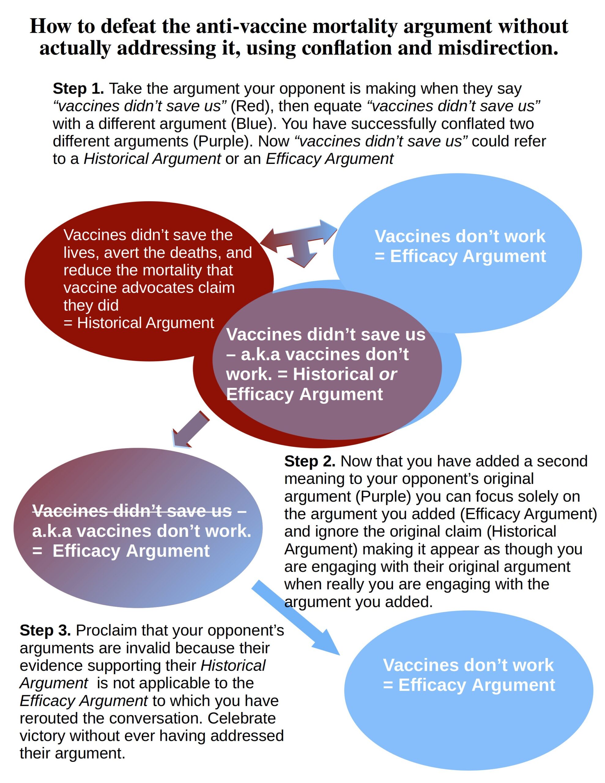
Gorski Leads with Misdirection & Conflation
Gorski wastes no time in conflating two distinct ideas: The question of what vaccines have or have not done, with the question of whether or not vaccines work. Where does Gorski do this? Everywhere, but he starts right in the headline;
“Vaccines didn’t save us” (a.k.a. “vaccines don’t work”)
That’s as heavy handed of a conflation of two ideas as you can get; “vaccines didn’t save us” is a negation of claims about what vaccines have allegedly done. “vaccines don’t work” is an assertion that vaccines are inefficacious.
These are not the same claim.
Let me show you what Gorski is doing and why. First with a visual (Figure 43) and then with an illustrative fable:
Figure 43
Illustrative Fable: The Vax Fire crew and the Great Fire
Once upon a time The Great Fire raged across vast swaths of some region, burning homes and woodlands.
A small crew of firefighters showed up known as The Vax Fire Crew.
After The Vax Fire Crew showed up the fire was put out.
The Vax Fire Crew were celebrated for their heroic deeds – for they put out the fire. How do we know that they put out the fire? Simple;
There was a great fire.
Then The Vax Fire Crew arrived.
After The Vax Fire Crew arrived the fire was put out.
What more do you possibly need to know? The Vax Fire Crew saved us, they put out the fire.
Lots of expert-written informational material celebrating The Vax Fire Crew’s deeds was provided to the public stating things like, “Before The Vax Fire Crew arrived The Great Fire burned X number of acres per day, after they arrived the fire was put out.”
Now some naysayers and doubting Thomases insisted that The Vax Fire Crew didn’t save us: They pointed to publicly available time stamped series of regularly taken aerial photographs of The Great Fire from fire reconnaissance planes. These photos clearly showed that almost all of the fire had been put out before The Vax Fire Crew had even arrived on scene.
A combination of other factors such as rainstorms, cooler weather, farmers with plows, and other fire crews such as the Nutrition Fire Crew, had done almost all of the work and put out almost all of the fire before the The Vax Fire Crew even showed up.
Well, this was awkward; the most glorious deed that The Vax Fire Crew had done, was being exposed as a sham. So much of their reputation rested on this, what were they to do?
The Apologists for The Vax Fire Crew sprang into action. They could not deny that yes indeed almost all the fire was put out before The Vax Fire Crew had even arrived, but they also couldn’t let it get out that The Vax Fire Crew’s most glorious deed was a sham, so they had no choice but to misdirect the conversation away from the matter entirely.
Their strategy was brilliantly simple; they conflated the question of whether or not The Vax Fire Crew had put out The Great Fire with the question of whether or not The Vax Fire Crew was proficient at their job.
They conflated these two distinct concepts with headlines like this:
“The Vax Fire Crew didn’t save us” (a.k.a. “The Vax Fire Crew don’t work/aren’t proficient at their job”): Intellectual dishonesty at its most naked
Then any time someone brought up the time stamped aerial photographs showing that almost all The Great Fire had been put out before The Vax Fire Crew even arrived, the apologists for The Vax Fire Crew would retort;
“So, you’re saying that The Vax Fire Crew isn’t proficient at their job? You realize that these time stamped photos tell us nothing about whether or not The Vax Fire Crew is proficient? They are irrelevant to the conversation; the time stamped photos are a non sequitur. To judge the proficiency of the The Vax Fire Crew we need to look at these test results of how they did with fire line digging exercises, water pump operations, and hose lays.”
And so, the promoters of The Vax Fire Crew continued to preach the misconception that The Vax Fire Crew had put out The Great Fire. And the apologists defended the reputation of The Vax Fire Crew by misdirecting the conversation through the conflation of the two distinct questions of whether or not The Vax Fire Crew had put out The Great Fire and whether or not they were proficient at their job.
They conflated the matter of what the Vax Fire Crew did or didn’t do with the matter of what they could or couldn’t do.
The End (of the illustrative fable)
Capitalizing on Conflation
What I just described in the illustrative fable is precisely what Gorski is doing. Gorski knows better than to deny that almost all the infectious disease mortality from most the major infectious diseases declined before the respective vaccines for those diseases were introduced or became widespread.
In order to avoid conceding that the reputation of vaccines is resting on a mountain of undue credit Gorski has no choice but to misdirect the conversation away from the question of what vaccines did or did not do, by conflating that question with the question of whether or not vaccines work.
Let’s observe how Gorski can use this conflation of ideas to skip right past the main point of those he is criticizing.
In his 2010 classic“Vaccines didn’t save us” (a.k.a. “vaccines don’t work”): Intellectual dishonesty at its most naked Gorski takes issue with these graphs of Australian mortality profiles by Greg Beattie.
Figure 44
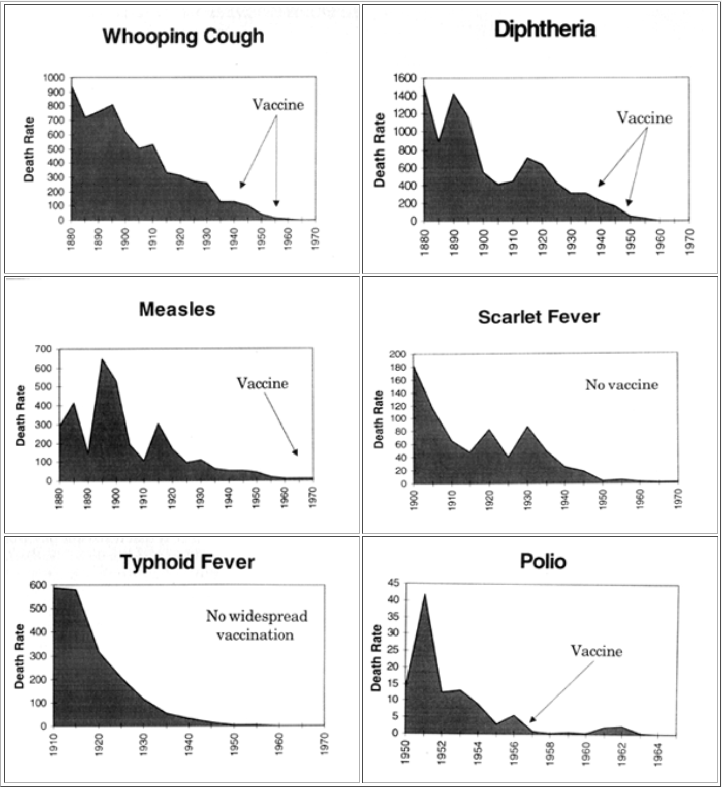
Here is what Gorski has to say (emphasis in the original):
“In fact, let’s look at the Vaccination Library claims first. Notice that there are six graphs, four of which are for vaccine-preventable diseases for which widespread vaccination was undertaken, two for which it was not. All of them show decreasing death rates from various diseases. Wow! It seems like slam dunk evidence, doesn’t it? Vaccines didn’t save us! After all, death rates were declining years before the vaccine, and they were declining for the diseases that didn’t even need a vaccine!
Death rates.
Here’s the problem. It’s not surprising that death rates were declining before introduction of the vaccines. Medicine was improving. More importantly, supportive care was improving. For example, take the case of polio. Before the introduction of the iron lung and its widespread use, for example, if a polio patient developed paralysis of the respiratory muscles, he would almost certainly die. The iron lung allowed such patients to live. Some even survived in an iron lung for decades. No doubt improved nutrition also played a role as well. However, if you want to get an idea of the impact of vaccines on infectious disease, take a look at this graph from the CDC of measles incidence, not death rates:”
While Gorski insists that this is not surprising, it most certainly would come as a shock to many people that between most of the mortality decline up to almost all of the mortality decline for these diseases occurred in the absence of vaccination against them and before their respective vaccination programs.
The reason this would come as a shock to many is because as I demonstrated in Parts 1 and 4 of this essay series, doctors, pediatricians, scientists, journalists, and public health institutions preach messages which convey the idea that vaccines are principally responsible for the drastic reduction in infectious disease mortality.
Furthermore, this actually is slam-dunk evidence against the claims about lives saved, deaths averted, mortality reduced that vaccine evangelists preach, but Gorski does not acknowledge that his fellow vaccinationists have preached any such messages.
Gorski calls the Vaccination Library post with the graphs disingenuous, but how? They provide death rate graphs, which are clearly labeled death rate and then underneath those graphs they talk about them being exactly what they; are death rates. Where is the disingenuity? How is providing accurate information that is clearly labeled as exactly what it is disingenuous?
The answer is that Gorski is judging the graphs based on what they tell us about vaccine efficacy which of course is not the point of those graphs; those graphs were meant to give historical perspective.
The graphs Gorski is criticizing were created by Greg Beattie. Having encountered the strategy that Gorski is using, Beattie wrote in 2011:
“These people tend to argue one thing—that this data cannot be used to assess vaccine performance. And they are correct. These graphs do not make any attempt whatsoever to measure the performance of a vaccine. They simply put things into historical perspective for us. This perspective illustrates that vaccines were unimportant influences in the bigger picture; that they arrived too late to be considered potential contributors of any significance.
In Chapter Three we will examine (under a microscope) the contribution that vaccines made to the tail end of the declines. For now, let us simply acknowledge that, in historical perspective, vaccination made little if any contribution to the decline in deaths from each illness.
-From Beattie’s book Fooling Ourselves on the fundamental value of vaccines
Let’s zoom ahead to Gorski’s 2018 article and see how he continued to evade his opponent’s principal point by capitalizing on the conflation of two separate questions – Have vaccines done what they are claimed to have done? And – Are vaccines efficacious/do they work?
In Gorski’s 2018 article J.B. Handley versus vaccine science. Again. Not surprisingly, J.B. loses He is criticising this article by J.B Handley (Archived Version).
Now it is perfectly clear in Handley’s article (Which Gorski is criticizing) that Handley’s article is not about whether or not vaccines work, it is about whether or not vaccines have done what they are claimed to have done. Here is how Handley opened his article:
“Since 1900, there’s been a massive decline in mortality rates in developed countries, largely due to a marked decrease in deaths from infectious diseases. Did vaccines play a major role in this decline? The history and data provide clear answers that matter greatly in today’s vitriolic debate about vaccines”
Handley does not do a surprise pivot in his article to the separate question of whether or not vaccines work. Handley’s article sticks to the topic of whether or not vaccines played a major role in the mortality decline he is talking about. Handley provides a quote from someone arguing that vaccines do more harm then good, but that is not an argument against vaccine efficacy.
Gorski on the other hand, predictably conflates these two separate questions thereby allowing him to repeatedly misdirect and pivot away from the question at hand to the separate question of whether or not vaccines work. Gorski sets the stage by yet again directly conflating these two concepts before getting to his main points (emphasis mine);
“This time around, he reminded me of one of the two main tactics of antivaxers, a tactic that isn’t covered enough. Basically, there are two central tenets of antivaccine pseudoscience. The first, of course, is that vaccines are harmful because they’re chock full of toxins and cause all sorts of horrific health problems. Skeptics refute this type of misinformation quite well. However, the second tenet of antivaccine pseudoscience is that vaccines don’t work (or don’t work very well) and as a result are not nearly as beneficial as vaccine advocates claim. One variety of this “vaccines don’t work” trope is what I like to refer to as the “vaccines didn’t save us” gambit, which is essentially the claim that vaccines had little to do with the decline in infectious disease over the last century. You can tell that’s the trope by the title of Handley’s blog post, “Did vaccines save humanity?” I will give Handley credit for one thing. This is a wrinkle on this hoary old bit of antivaccine intellectual dishonesty that I haven’t seen before.”
After having set the stage with the direct conflation of distinct ideas (as you can see in the excerpt above), Gorski was free to repeatedly misdirect, and that is what he did again and again. Throughout his article Gorski misdirected the conversation away from the question of whether or not vaccines have saved the lives, averted the deaths, and reduced the mortality as the evangelists claim that they have to the separate question of whether or not vaccines work. The following are examples of Gorski doing this in his article (emphasis in the following excerpts from Gorski’s article is mine):
“Of course, what Kass was really showing was that there are more ways to prevent disease than just vaccines, and this is hardly a message that anyone in public health would dispute. Nor is it a message that shows that vaccines don’t work. I’ll elaborate more as I discuss the next reference cherry picked by Mr. Handley.”
~
“Consideration of mortality alone as the be-all and end-all of whether a vaccine works completely ignores all the morbidity, all the suffering caused by infectious disease.
~
“The use of mortality as the be-all and end-all of vaccine efficacy is an intentional strategy of the antivaccine movement. This strategy completely ignores the morbidity and suffering due to vaccine-preventable diseases.”
~
“No, the only one spreading lies here is Mr. Handley, who is also attacking an obvious straw man. Vaccines work.
The bottom line is that vaccines are safe, effective, and prevent disease. Yes, sanitation and public health measures decreased mortality from infectious diseases before vaccines for them were developed, but that doesn’t mean that they don’t work or aren’t important. The “vaccines didn’t save us” gambit, as demonstrated by J.B. Handley, remains intellectually dishonest.”
Those are all from Gorski’s 2018 article. As you can see, he repeatedly misdirects the conversation to the separate question of whether or not vaccines work. Gorski keeps asserting that “Vaccines work” as if he is correcting Handley. Yet in the article that Gorski is criticizing Handley does not once say “Vaccines don’t work” because again that is clearly not the argument Handley is making in that article; Handley’s article is about what vaccines didn’t do not what they can or could do.
I’ll take a second to point out also that in the second and third excerpts where Gorski states: This strategy completely ignores the morbidity and suffering due to vaccine-preventable diseases. He is arguing from the data we don’t have. Gorski provides no historical data sets of disease suffering sorted by cause. He uses a show of concern for serious disease complications only to downplay the serious disease complication sorted by cause data that we actually do have – which is death.
Interestingly though Gorski does exhibit a hint of understanding that the question at hand is the question of whether or not vaccines have done what they are claimed to have done. Gorski attempts to head off that question by asserting that his fellow vaccinationists have not been making the claims that they have in fact been making:
“No one ever said that vaccination did account for the impressive declines in mortality seen in the first half of the 20th century. Antivaxers like Handley like to make that claim, either explicitly or implicitly, but that doesn’t make it so.”
It is an easily demonstrable fact that vaccinationists did and do say what Gorski is claiming that they are not saying. I demonstrated this at the very beginning of this essay series; here I will simply point you to where I did that. The Lifespan Lectures directly falsify Gorski’s assertion that no one is saying this (Exhibits I through L in Part 1 of this essay series, and Exhibit T. in Part 4).
For example, in Exhibit I I documented four different instances of Paul Offit claiming that vaccines have added 30 years to our lifespan. In Exhibit T I shared an interview with Rino Rappuoli in which he reminds the audience that Before vaccines we lived 47 years and that if we stop vaccinating, we will return to living 47 years rather than the 85 current average at the time of the interview.
These are cut and dry examples of vaccinationists saying exactly what Gorski is asserting that no one is saying. And Paul Offit and Rino Rappuoli aren’t just any vaccinationists; they are some of the most prominent vaccine developers, and evangelists in the world.
Likely that Gorski is Arguing in Bad Faith
A potential excuse for Gorski could be that he had no idea that his fellow vaccinationists are heaping undue credit on vaccines for impressive historical mortality declines, which could be why Gorski claimed that no one is saying the things that they are demonstrably saying.
Firstly, this is implausible: if you are alive today you have almost certainly been exposed to these kinds of claims. If you are deeply involved in the Vaccine Wars there is simply no way that you wouldn’t be paying attention to these kinds of claims when you hear them; these claims wouldn’t slip past your notice.
But I can go beyond pointing to the implausibility that Gorski is unaware of the undue credit that Vax-Evangelists are heaping on vaccines; I can go a step further and definitively demonstrate that Gorski knows that these kinds of claims are being made.
Gorski watched The Vaccine War by PBS. We know this because he wrote a positive review of it as an article back in 2010.
The Vaccine War by PBS begins with Paul Offit claiming that vaccines have added 30 years to our lifespan. PBS appears to have polished up and edited the episode at some point, but you can go all the way back to the transcript that PBS posted in 2010 and see that the episode begins with Paul Offit claiming that vaccines have increased our lifespans by 30 years.
Later transcripts have some changes but still have Paul Offit proclaiming that vaccines have increased our lifespans by 30 years.
Gorski reviewed this episode; unless he skipped the introduction, which would be odd for someone writing a fairly in-depth review of it, then Gorski knows perfectly well that prominent vaccinationists are making these kinds of claims and that their claims are portrayed favorably as factual claims and amplified on national television.
But it gets worse. Gorski is arguably one of the people giving undue credit to vaccines for impressive mortality declines. From his 2012 article The problem of waning pertussis immunity I provide the following excerpts (emphasis mine):
“First, Cherry notes that the purpose of vaccination against B. pertussis is not to eliminate all disease. It’s to prevent serious disease (whooping cough) with its potentially horrific complications, up to and including death, particularly among young infants.”
~
“In any case, this graph illustrates quite clearly that the pertussis epidemics over the last few years are mere blips on the curve compared to what was observed in the past, before there was a vaccine available to combat pertussis. In other words, even with the recent epidemics in the US, this is not the bad old days, when up to 270,000 cases of pertussis could be diagnosed in a year, with as many as 10,000 deaths, mostly among infants.”
Gorski also quotes the CDC:
“Nevertheless, vaccination continues to be the single most effective strategy to reduce morbidity and mortality caused by pertussis.”
Gorski tells us about the US before vaccines with as many as 10,000 deaths. He also approvingly quotes someone who notes that the principal purpose of whooping cough vaccines is to prevent serious disease up to and including death, and Gorski quotes the CDC corroborating this. Gorski credits the improved situation to vaccines and makes no mention of other factors. This would no doubt give the reader the impression that vaccines are the reason or at least one of the principal reasons for the drastic reduction in whooping cough deaths. There can be little doubt either that it was Gorski’s intent to give the reader the impression that the vaccine was responsible for the impressive pertussis mortality decline.
What’s the graph he is talking about? I will show you in just a moment under the subheading – Gorski uses a deceptive pro-vaccine graph.
For now, let us just note that we know, and have documented, that Gorski knows that vaccinationists try to attribute impressive mortality reductions to vaccines, and that therefore mortality data is the appropriate data source for evaluating such claims.
Gorski’s efforts to sideline historical mortality data through denying that vaccinationists are making claims to which mortality data directly relates are rhetorical maneuvers that Gorski is likely doing in bad faith since we can demonstrate from his own writing that he knows that prominent vaccinationists are making the kind of claims that he insists no one is making, and he himself makes misleading statements that give readers the impression that vaccines are the reason for the USA no longer having 10,000 pertussis deaths per year.
But don’t anti-vaccinationists argue that vaccines don’t work?
Yes, they do. Many anti-vaccinationists most certainly argue against the efficacy of vaccines; many anti-vaccinationists do argue that vaccines don’t work. And some of the mortality data such as that showing the major smallpox epidemics that swept through heavily vaccinated regions in the 1870s does count as evidence against the efficacy of a vaccine (see the smallpox graphs at Dissolving Illusions).
What must be understood though is the simple concept that the same person can make different arguments on different topics and their arguments should be evaluated based on what they are arguing. The same person can make arguments both about whether or not vaccines work (a vaccine efficacy argument), and they can make an argument that vaccines did not do what they are said to have done (a historical argument).
The evidence that they present in their argument about whether or not vaccines work should be judged for its value in evaluating vaccine effectiveness.
The evidence that this same person presents in their argument that vaccines did not do what they are claimed to have done (a historical argument) should be judged in light of that question; whether or not vaccines did what they are claimed to have done.
For example: whether or not Greg Beattie or J. B. Handley make arguments that vaccines don’t work, does not change the logic that their arguments that vaccines did not do what they are claimed to have done, are arguments which should be evaluated as the historical arguments that they are.
What vaccines can or could do are vaccine efficacy questions.
What vaccines did or didn’t do are historical questions about what actually happened.
Greg Beattie is meticulous about noting that his graphs provide historical perspective and are not intended to answer vaccine effectiveness questions.
And J. B. Handley’s article that Gorski was criticizing was clearly about what vaccines didn’t do, not what they can or could do.
2 – Pot Calling the Kettle black
Gorski deconstructs a deceptive anti-vaccine graph
In his 2010 vaccine apologetics classic “Vaccines didn’t save us” (a.k.a. “vaccines don’t work”): Intellectual dishonesty at its most naked Gorski deconstructs a measles notifications of incidence graph for Canada created by Dr. Raymond Obomsawin. The Obomsawin Canadian measles cases graph is a deceptive graph which amounts to a lie by omission.
I’m not going to rehash how and why the Obomsawin Canadian measles notifications graph is deceptive here; Gorski already did an excellent job of deconstructing it which you can read in his article.
What work I have seen of Dr. Raymond Obomsawin I have appreciated (excepting this graph of his) and I believe his writings are well worth reading, some of which you can read over here on this website that vaccinationists positively love to hate.
Appreciation for Obomsawin’s work notwithstanding, I’m going to call it as I see it; Obomsawin’s Canadian measles notifications graph was deceptive and Gorski was right to deconstruct it.
Gorski uses a deceptive pro-vaccine graph
In Gorski’s 2012 article The problem of waning pertussis immunity he shares the following graph to prove a point that he is making:
Figure 45
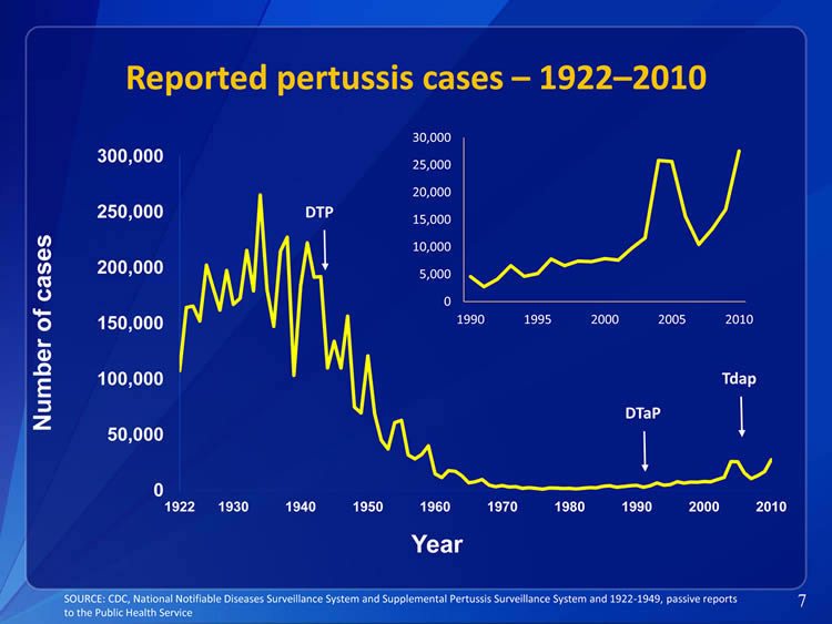
What’s the problem with this graph? I deconstructed two similar pertussis cases graphs in Part 3 of this essay series (another one very similar to this also by the CDC and one by Isabella B) I’ll briefly recap:
DTP was licensed and/or introduced in 1948 or 1949 depending on which source you go by. Even Gorski’s fellow Science Based Medicine contributor Steven Novella, in an article on Science Based Medicine states:
“In 1948 the whole cell pertussis vaccine was combined with vaccines for diphtheria and tetanus to make the DTP vaccine.”
From – Whooping Cough Epidemic Steven Novella – April 4, 2012 (Gorski linked to Novella’s article in Gorski’s same article where he shared this graph).
Where is that arrow pointed on the CDC’s graph that Gorski shared? It should be pointed at 1948 or 1949, but they pointed the arrow at 1943 or 1944. You can tell by consulting the data source, and see that that little “shelf” in the data to the left of their arrow, right before the major drop, represents the two years 1942 and 1943 each of which had right around 190,000 reported cases.
Remember what happened when I corrected the arrow placement on the similarly deceptive graph by Isabella B (Figure 24 from Part 3)? It changed the picture considerably.
Figure 24 from Part 3 Revisited
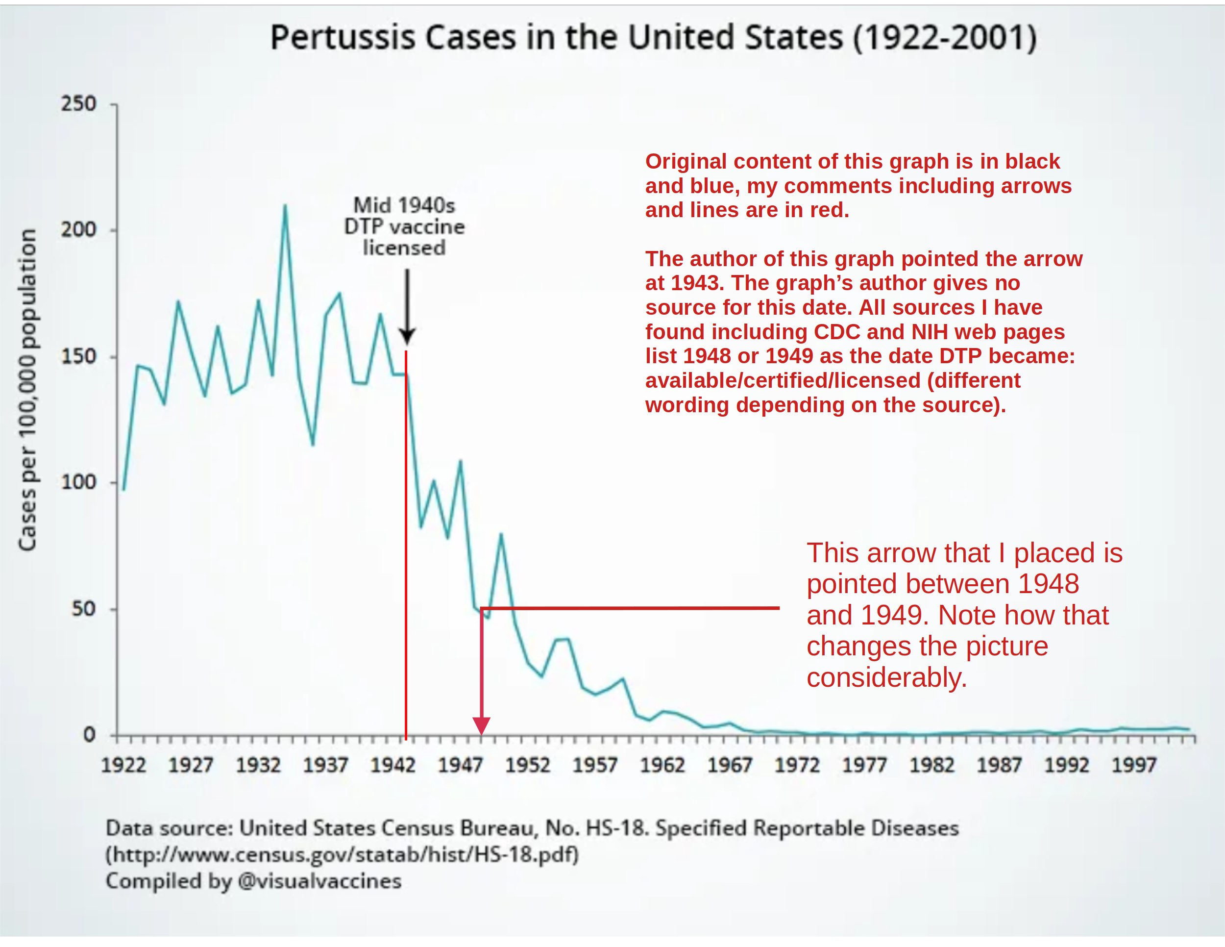
The USA whooping cough notifications data set with the arrow placement for DTP corrected, far from corroborating the point that Gorski is trying to make, actually contradicts his point and shows the steep decline in whooping cough notifications beginning well before the introduction of DTP.
To be clear, even with the arrow placement corrected, I do not think that the USA whooping cough incident notification data proves much of anything at all, and I would not trust it as a gauge of actual incidence because it is a weak incomplete data source for the reasons I laid out in Part 3.
However, these graphs by the CDC and Isabella B are unmistakably deceptive once deconstructed, for they have “misplaced” the arrow for DTP to the very area on the graph that would make the vaccine look as good as possible.
I am going to give Gorski the full benefit of the doubt here: I won’t accuse him of being intentionally deceptive on this, I will instead charitably assume that he made no attempt to double check the CDC’s work, and that he was sufficiently unfamiliar with his subject matter that he did not notice something amiss in the graph, and that therefore he did not know that the CDC graph he shared was deceptive and that once corrected it actually contradicts the point he was trying to make.
3 – Setting the Record Straight: Deceptive Pro-Vaccine Graphs Galore
It is of course quite common for vaccinationists to charge that anti-vaccinationists are dishonest, misleading, lying by omission and so forth, with the unstated implication being that vaccinationists are forthright, or at least more forthright than the anti-vaccinationists.
Gorski has been claiming that anti-vaccinationist graphs and “vaccines didn’t save us” arguments are “intellectually dishonest” for at least13 years now. His basis for this claim is his own conflation and subsequent equivocation of two distinct concepts as we just now reviewed, and also that one deceptive 2009 graph that uses Canadian measles notifications of incidence data that Gorski points to. One graph from one author, that’s it. To date that’s all Gorski’s got on the opposition’s graphical presentations.
Now, what have we got on the vaccinationists’ graphical presentations? Already we’ve reviewed four deceptive pro-vaccine graphs: The deceptive pertussis graph, and the deceptive diphtheria graph by Isabella B, that we reviewed in Part 3 of this essay series, and two different instances of the CDC creating deceptive pertussis notifications graphs, one of which we reviewed in Part 3 and one of which we just now looked at (Figure 45, this essay).
So already the score is 4 to 1. I’m going to go ahead and double that with a review of four more deceptive pro-vaccine graphs. Gleefully pointing to deceptive pro-vaccine graphs is good fun of course but it is also educational, and helps us catch future pro-vaccine deception by understanding past deception, so let’s set the record straight.
French deceptive pro-vaccine graph
France is ground zero for the diphtheria toxoid vaccine. According to the paper Childhood Vaccine Development: An Overview. Baker, J., Katz, S.:
“The key figure in developing the first efficacious and well-tolerated toxoid vaccines was the French investigator Léon Ramon of the Pasteur Institute. Ramon used both heat and formalin to generate a chemically modified toxin (which he termed anatoxin) with better properties than those of Glenny’s toxoid in 1923. The French Academy of Medicine approved this vaccine for children in 1927. Ramon, it should be noted, also played a central role in developing tetanus toxoid between 1923 and 1926. In no small thanks to Ramon’s advocacy efforts, France used diphtheria toxoid widely among children and tetanus toxoid among the military during the 1930s.”
And according to the diphtheria page on the website of the Montpellier University Hospital Center.
“Vaccination was made compulsory for military service in 1931 then compulsory for all in 1938. Massive campaigns were organized in 1942 and applied mainly in occupied zones; diphtheria vaccination was compulsory in Germany in 1941.”
Let’s take these dates for diphtheria vaccination in France and juxtapose them with the French diphtheria death and notifications of incidence data.
Figure 46
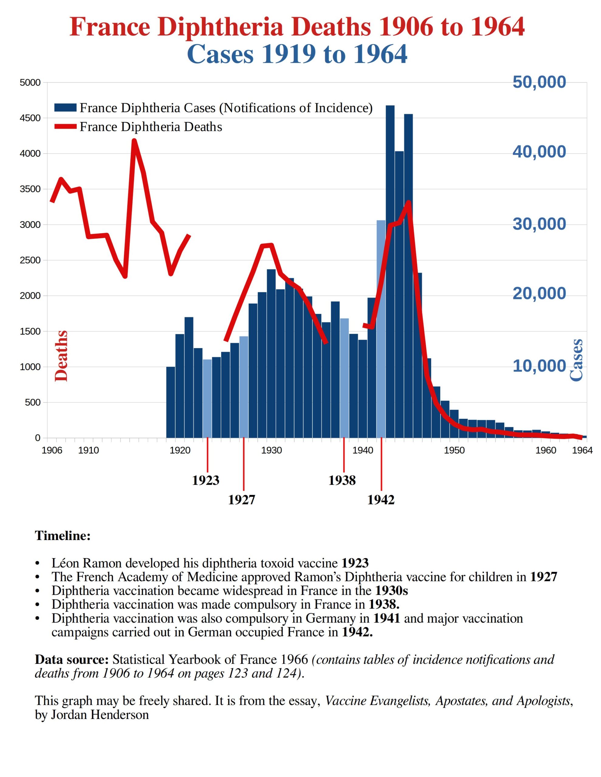 There are gaps in the diphtheria mortality data available for France, hence the gaps in the red line for mortality. (Here is a link to the 1966 Statistical Yearbook of France from which I pulled the data for this graph).
We can see that this French data could present a rather awkward situation for our vaccinationist friends.
A major spike in diphtheria deaths, accompanied by the years with the greatest recorded number of diphtheria cases for France, occurs well after diphtheria vaccination has been developed, approved, used and made compulsory in France.
If they tried crediting the vaccine for the decline after the diphtheria toxoid vaccine had merely been developed in 1923, as Isabella B did on her USA diphtheria graph (Part 3 of this essay series Figure 21), it would look bad for the vaccine as here in France the rates go up after 1923.
The year of vaccine approval, 1927, won’t help them either as the rates go up after that year too.
Nor will it help their case to point to the year the French government made diphtheria vaccination compulsory (1938) nor can they make this data look good for them by pointing to the mass vaccination campaigns carried out in German occupied France (1942).
Here it does not matter if they pivot to the notifications data alone, it still doesn’t support their narrative. Whatever are the vaccinationists to do with this awkward French data right from the pioneers of diphtheria vaccination?
Easy, they just chop off the portion of the graph that looks bad for the vaccine, and they start at a point that looks good for the vaccine. That is exactly what they do.
Figure 47
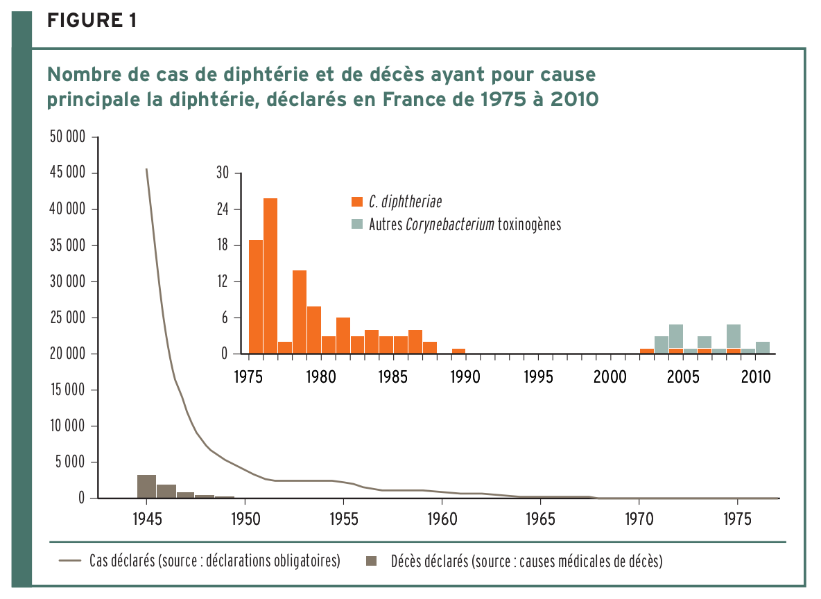
The graph above is a large graph of diphtheria cases and deaths from 1945 to 1975 with a smaller inset graph that is a detail from 1975 on. This graph is from page 51 of Guide to Vaccination by the French General Directorate of Health Technical Committee on Vaccinations.
In the diphtheria section of that guide, they make no mention of the diphtheria vaccine having been made compulsory in France in 1938 and having been in use for many years before that. They shamelessly only mention vaccination efforts from 1945 onward and start their graph at that date.
Spanish deceptive pro-vaccine graph
In Part 4 of this essay series I shared multiple examples of Spanish Vax-Evangelist preachings which would give you the idea that the introduction of the pertussis vaccine to the immunization schedule in 1965 was the principle reason for the reduction in whooping cough mortality (Exhibits M through P). And I provided a graph of the Spanish mortality data (Figure 41) showing that over 98% of the 20th century whooping cough mortality decline in Spain occurred before 1965.
How then would Spanish vaccinationists share a graph of whooping cough mortality in Spain without tipping off their audience that almost all the decline occurred before the introduction of the vaccine to the schedule in 1965?
Same simple strategy that the French use with diphtheria; chop off the portion that you don’t like and start the graph at whatever point looks best for the vaccine. For the data from Spain this means chopping off the first 65 years of the whooping cough mortality data set, and beginning it in 1965, which is in fact what they have done.
Figure 48
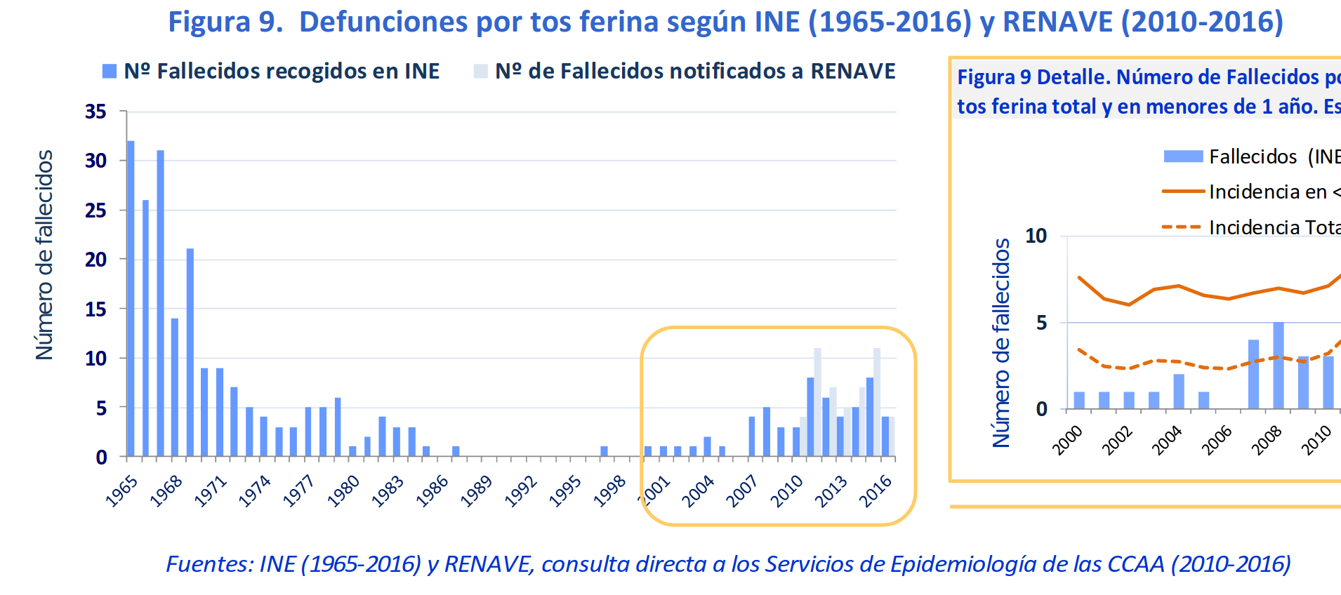
Figure 48, is a screenshot of figure 9 from page 11 of the document Situation of whooping cough in Spain 1998-2016 by the National Epidemiology Center; to the right is simply a detail of the latter portion of the same graph. They make no mention in that document that most of the whooping cough mortality decline occurred before the vaccine was added to the schedule in 1965, and they give no explanation for why they started their graph in 1965.
To avoid acknowledging the incredible decline in the pre-vaccine era, they state, also on page 11.
“In the pre-vaccine era whooping cough deaths exceeded 30 per year.”
In the pre-vaccine era in Spain whooping cough deaths exceed 4,000 per year in Spain in the early 20th century, and were still exceeding a 1,000 a year in the 1930s, and were still up in the multiple hundreds even into the early 1950s.
Why would they describe thousands as exceeded 30? Yes, they are technically right, thousands certainly do exceed 30, but that’s like saying:
“Commercial jets fly at over ten miles an hour.”
“The world’s tallest mountains reach heights of more than 500 feet above sea level.”
“Bull elephants weigh upwards of 73 pounds.”
This is particularly odd as usually the Vax-Evangelists do not downplay pre-vaccine deaths; they just unjustifiably credit vaccines for the reduction from 19th and early 20th century highs.
There are only three logical reasons that I can see for why they would describe Spanish pre-vaccine era whooping cough mortality with the extreme-to the point of absurdity, understatement of exceeded 30 per year:
- To avoid acknowledging that whooping cough mortality plummeted from quadruple digits to double digits all during the Spanish pre-vaccine era.
- To leave the reader with the impression that vaccines are the principal reason for whooping cough mortality decline in Spain.
- To give the impression that there was no significant change in whooping cough mortality before the vaccine, which would suggest that there is nothing of great import to see in the earlier mortality data.
To put the deceptive Spanish graph into perspective here is Figure 41 again from the last essay installment.
Figure 41 from Part 4 of this series revisited
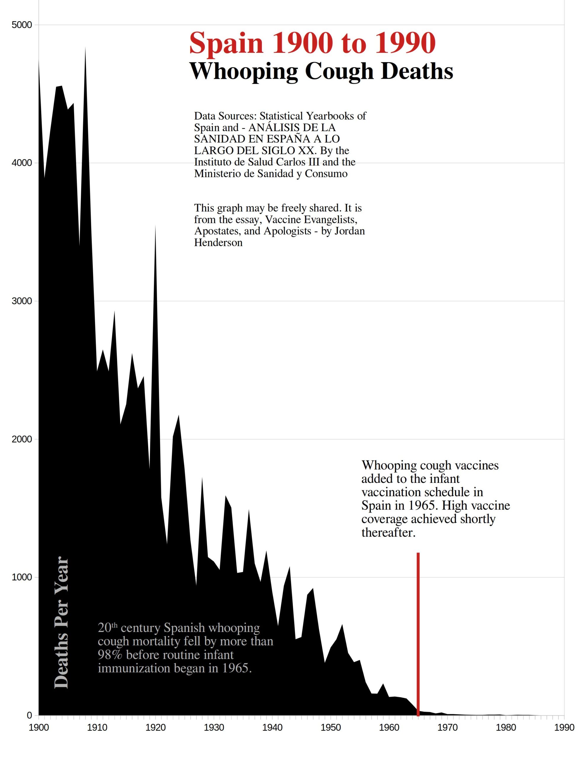
The portion to the right of that red line is all that the deceptive Spanish whooping cough mortality graph showed (Figure 48). The portion to the left of that red arrow is the pre-vaccine era in Spain where the majority of years whooping cough deaths are in the thousands. This they described as, “In the pre-vaccine era whooping cough deaths exceeded 30 per year.”
Australian deceptive pro-vaccine graph
We are now going to look at an especially interesting graph from the Graphs and Data page of the website VaccinateYourChildren. This page on VaccinateYourChildren was created sometime after Gorski’s 2010 classic “Vaccines didn’t save us” (a.k.a. “vaccines don’t work”): Intellectual dishonesty at its most naked because they cite Gorski’s article.
This is a polio graph. I have not discussed polio in this essay series and I refer the reader to the recommended reading that I provided at the end of Part 2 if you would like to get the views of vaccine apostates regarding polio. For polio in Australia, I specifically recommend Chapter 7 of Greg Beattie’s book Fooling Ourselves on the fundamental value of vaccines.
Below is how vaccinationists created a deceptive graph with Australian polio data.
Figure 49
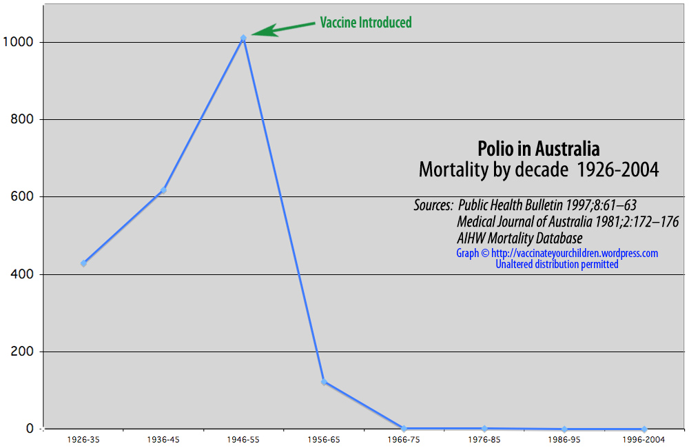
Looks fantastic for the vaccine, doesn’t it? You couldn’t ask for a more favorable graph. Of course, the reason it looks so good for the vaccine is because they fudged it.
They employed two types of deception to get this result: they used concealment, and of course they “misplaced” the arrow.
To obscure all the detail, they used ten-year averages rather than just showing us the yearly data: this simplified their graph to the point that they have just 8 data points on it.
Here is what the yearly data for polio mortality in Australia looks like:
Figure 50
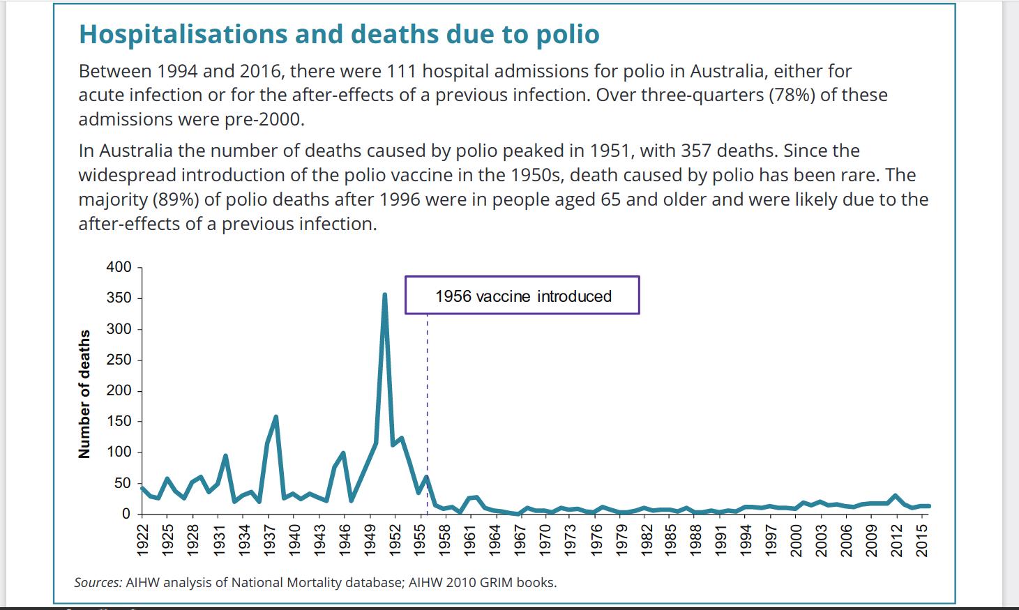
Figure 50 is a screenshot from Polio in Australia, a PDF document by the Australian Institute of Health and Welfare. So, you can see that there is some important detail that the graph from VaccinateYourChildren obscured. But obscuring the data alone was not enough to make their graph show what they wanted it to show, they also had to “misplace” the arrow pointing to the vaccine’s introduction. As you can see in the graph in figure 50 from the Australian Institute of Health and Welfare the polio vaccine was introduced in 1956 in Australia not 55. Now scroll back up to figure 49 and visually move that arrow over one data point to the right where they should have placed it on the 1956-65 data point and see how that alters the picture.
Now it is true that:
“The trivalent inactivated polio vaccine (IPV), which includes all three poliovirus serotypes, was first registered in Australia in 1955, with routine vaccination on the National Immunisation Program (NIP) starting in 1956.”
But I think we can all agree that the year in which routine vaccination began is the relevant point to note on a graph, not the mere year of registration – even the Australian Institute of Health and Welfare knows this as they marked 1956 as the year of introduction on their own graphs. Either way though, the vaccine’s Australian introduction was well after the peak not at the peak as shown in the VaccinateYourChildren graph.
American deceptive pro-vaccine graph (that uses English Data)
This is a graph created by Ian A. York, PhD. York created this deceptive pro-vaccine graph in 2009 which is the very same year that Obomsawin created his deceptive anti-vaccine graph that Gorski is still pointing to. I thought it appropriate that we end our tour of deceptive pro-vaccine graphs here with York’s graph, because York and Obomsawin, who both have PhDs, created their respective deceptive graphs that same year.
York created this graph shortly before he went on to work for the CDC and became the team lead of their Molecular Virology and Vaccines Team, though at the time he created this graph he was still working as an assistant professor of immunology and virology at Michigan State University.
Just last year in 2022 York deleted almost all of his old posts. That was smart of him; I would delete those posts too if I were he. The only reason I found out that York had created something so outrageous and tried to pass it off as real is because so many other vaccinationists cited York’s article where he posted this graph, that I ended up searching for and found it in the internet archives, as I was wondering who this York was that these vaccinationists were citing.
Pulling this skeleton out of York’s closet is worth the trouble as it is simply too interesting not to share; York created this before Gorski’s classic article, and it may have been Gorski’s article which popularized the strategy of conflating two distinct concepts so that the apologists can get the attention away from the question of what vaccines have or have not done and misdirect to efficacy questions. Almost all the apologists since then have used that strategy.
But again, York’s piece predates Gorski’s classic, and York doesn’t use the conflation and misdirection strategy; York tries the near impossible task of directly denying the apostate’s claims which leaves him little option other than bald-faced lies to do it, and bald-faced lies he does use!
This is from York’s post Measles deaths, pre-vaccine which is only available as an archive these days. Here it is:
Figure 51
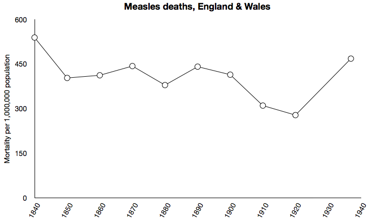
York created this graph as an attempt to refute the anti-vaccinationists who point out that almost all the measles mortality decline occurred before the introduction of the measles vaccine. Right underneath this graph York wrote:
“Obviously, there’s no 95% drop. Measles deaths were pretty much constant for over 100 years, until the vaccine was introduced.”
What’s wrong with York’s graph?
York’s graph has a series of data points that are ten-year averages for measles mortality rates in England from 1840 to 1920. But then, right before the mortality begins to really plummet in England is when York ceases to provide the ten-year averages and instead, he skips ahead 17 years and provides one single data point for just the one year of 1937 and then ends his graph right there. Exceedingly suspicious, not to mention that even if York hadn’t faked this graph, it still couldn’t prove his point as he ends it 30 years before the vaccine was introduced in England.
The only thing in support of York’s assertion is the strange 1937 data point. That 1937 data point in York’s graph shows roughly 450 measles deaths per million which is wildly off. We can go straight to the English and Welsh death data as provided by the UK National Archives, add up the measles deaths for 1937, and calculate the death rate based on England and Wales population at the time and see that the measles death rate per million in 1937 was 25.6 not 450. York’s 1937 data point is over 17 times too high.
What’s York’s excuse for the 1937 data point? York claims that:
“The 1937 data are from a text entitled “Anomalies and curiosities of medicine” By George Milbry Gould.”
I think not: George Milbry Gould died in 1922, and the co-author of Anomalies and Curiosities of Medicine Walter L. Pyle died in 1921.
So that’s that for York’s outrageous graph from his post Measles deaths, pre-vaccine. It is both a lie by omission as he ended all his valid data at 1920, thereby omitting nearly a half century of the data before the vaccine, and it is a lie by outright fabrication due to his seventeen-fold too high 1937 data point that he tried to pass off as something he found in a book whose author and co-author died in the 1920s.
York evidently doesn’t know about the conflation then equivocation strategy that Gorski later uses. York understood perfectly well that the question is about undue credit given vaccines for reducing mortality. York initially made no attempt to conflate and misdirect, as is clear in the title of his article Measles deaths, pre-vaccine. Without a clever means of deception through misdirection occurring to him, York resorted to the desperate measure of plain old lies.
For an accurate presentation of the English and Welsh data see the graphs at DissolvingIllusions.
York is exonerated: Shortly after publishing this graph York began to backtrack as can be seen in the archives of subsequent updates that he made to the post where he presented this graph. York did continue to lie, and did continue to try to pass off this graph as real with his statement “Nevertheless the death rate drop was nowhere near the 95% claimed by antivaccine loons, as the charts here show.”
York did do something that was commendable though: he conceded in the comments:
“By far the most important reason was nutrition. Childhood nutrition (and childhood quality of life) really started to improve around the turn of the century, and nutrition is an enormous factor determining measles survival. This is still hugely relevant today; measles case-mortality rates in Africa are much higher than in the US or UK, for example, and nutrition status is the major predictor. American children in general had better nutrition than British, and that helps account for the earlier drop in measles mortality in the US.”
York then did something even more commendable and began a series investigating what really did cause the measles mortality decline, which looks like he was really investigating the matter in that series in good faith.
I consider York to have made up for this graph, and moved on. I pulled this skeleton out of his closet not to malign York but to demonstrate:
- Just how far vaccinationists will go to defend the narrative.
- That they understand perfectly well that the “Vaccines didn’t save us” argument is about what vaccines didn’t do.
- And to demonstrate why they are all now using Gorski’s tactic of conflation and misdirection.
Directly defending the misconceptions about “Vaccines saved us” was an untenable position even for a bright, well-educated-in-relevant-fields, mind like York’s.
Who is really creating all the deceptive graphs?
As there is to my knowledge no comprehensive review of all vaccine related graphs, I instead offer this quick and dirty method for gauging the prevalence of deceptive graphs coming from each side:
Gorski, after all these years is still pointing to that same Canadian measles cases graph from 2009. That’s the only one shown or mentioned in his article that is genuinely deceptive. Of all the many other vaccine apologists I have read, none of them have done any better. They claim that anti-vaccinationist graphs are deceptive but if they actually offer a concrete example that really is deceptive, they cite Gorki’s article where he deconstructs the Canadian measles cases graph.
This indicates that deceptive graphs are rather rare from the anti-vaccinationists, considering how very few examples that the vaccinationists can point to (as in they can point to that one Canadian measles cases graph. Surely, they have another example somewhere?).
Whereas the prevalence of deception in vaccinationist graphs is so great that I (with far fewer years as an observer and participant in the vaccine discussion than Gorski) can easily point to many deceptive vaccinationist graphs, spanning from 2009 all the way up to the CDC’s ongoing shenanigans of “misplacing” arrows marking the introduction of DTP on their graphs. Each of these pro-vaccine graphs that I have pointed to is as deceptive or more so than Gorski’s one example of a deceptive anti-vaccine graph from 2009.
This is just the tip of the iceberg
There are of course many other deceptive vaccinationist graphs; we could go on pointing them out. Such as more examples of French institutions that also chop off the unfavorable portion of the diphtheria data and start at the point that looks best for the vaccine, or we could look at a Smallpox graph for England that brazenly excludes the 1870s to keep the major epidemic years of the 1870s in a nation with high vaccination rates from messing up their narrative. We could look at Spanish measles incidence graphs that start in 1981 thereby avoiding giving the viewer historical perspective that would alert them to the awkward fact that the two highest ever years for reported measles cases came after measles vaccination, and after Spain had reached over 40% and greater than 70% vaccination rates respectively.
We could review collections of American data based graphs which contain no pre-vaccine data for historical perspective, yet claim to show the impact of vaccines on death and cases. We could review an Australian pertussis graph that impresses the viewer with the total absence of cases after widespread vaccination, but fails to inform the viewer that the absence of cases is simply because Australia stopped collecting the data in 1949. But none of that is what I mean about these deceptive pro-vaccine graphs just being the tip of the iceberg
All these deceptive pro-vaccine graphs, numerous as they are, represent only a tiny portion of the vaccinationist deception. Vaccinationist deception is most often verbal, not visual:
The Graveyard Gambits and Lifespan Lectures. The CDC and Dr. David Gorski giving readers the impression that vaccines are to thank for the USA no longer having 9,000 or 10,000 whooping cough deaths each year. Paul Offit and Rino Rappuoli claiming that vaccines have added 30 and 40 years to our lifespan, Dr Ari Brown pointing to children’s graves in old cemeteries to remind parents of the world before vaccines. All of that is how the vaccinationists give undue credit to vaccines most often.
4 – Unsubstantiated claims about modern medicine
As noted earlier in this series, when apologists are forced to concede the existence of major pre-vaccine infectious disease mortality declines, they salvage what glory they can for modern medicine by crediting modern medicine in general for whatever decline that they can’t credit to vaccines specifically.
Gorski repeatedly asserts that the pre-vaccine mortality declines are due to modern medicine; rarely does he make any effort to back up this assertion:
Here Gorski is in 2023 mentioning medical care only, as though it were the primary reason for the pre-vaccine infectious disease mortality decline (emphasis mine):
“This is commonly known as the “vaccines didn’t save us” gambit, in which antivaxxers point to the declines in mortality from vaccine-preventable diseases that had occurred, due to better medical care, before the introduction of vaccines in order to claim that vaccines really didn’t do us much good.”
Here is Gorski over a decade earlier (2012) stating the same:
“The reason mortality was falling before the vaccine was for other reasons. Medical care was getting better, and a smaller percentage of people who got the disease died from it.”
Gorski doesn’t mention anything other than medical care in either of these cases, and he provided no reasoning, nor citations to back up these assertions.
On rare occasions Gorski will at least mention some other factor (such as nutrition), and on only one occasion that I know of did Gorski actually try to provide a reason for his assertion that the declining pre-vaccine mortality rates were due to medical care. Let’s look at this rare instance of Gorski backing up (or at least trying to) his assertion crediting the decline to medical care.
A close look at Gorski’s iron lung example
Gorski’s classic 2010 article “Vaccines didn’t save us” (a.k.a. “vaccines don’t work”): Intellectual dishonesty at its most naked is the one instance that I know of where he attempts to provide a reason for his assertion that the declining infectious disease mortality was due to medical care. This is also one of the rare instances in which he lets nutrition share in some of the glory too. Here it is:
“Here’s the problem. It’s not surprising that death rates were declining before introduction of the vaccines. Medicine was improving. More importantly, supportive care was improving. For example, take the case of polio. Before the introduction of the iron lung and its widespread use, for example, if a polio patient developed paralysis of the respiratory muscles, he would almost certainly die. The iron lung allowed such patients to live. Some even survived in an iron lung for decades. No doubt improved nutrition also played a role as well.”
Gorski wrote that in response to the six Australian death rate graphs by Beattie that we looked at in Figure 44 of this essay. Gorski then in the article of course pivoted to efficacy and case notifications and pointed to a single USA measles case rate graph as a rebuttal to the six Australian death rate graphs because I guess that was supposed to be a logical response.
So Gorski attempts to credit the pre-vaccine mortality plummets to modern medicine. Now firstly that is a non sequitur on Gorski’s part. The point of those graphs that Gorski is criticizing was to demonstrate what was not responsible for the mortality decline – what vaccines didn’t do; it was a refutation of vaccinationist messages that give people the impression that vaccines played the primary role in infectious disease mortality declines.
And so, even if Gorski could have explained what actually did cause the mortality declines, that would neither change nor refute the point being made — the point being that it wasn’t the vaccines that caused the decline as the Vaccine Evangelists would have us believe.
Secondly, Gorski offered an explanation for one of six diseases (polio); if you are going to attempt to explain the infectious disease mortality decline in general with just one example then at least choose a representative example. Historical polio mortality trends are not representative of historical infectious disease mortality trends. When the other diseases were at their worst in the 19th century, polio was still relatively unknown in many areas. As the mortality for the other diseases plummeted in the first half of the 20th century, polio mortality climbed. Polio mortality had the opposite trend of most the other diseases and the opposite trend of infectious disease mortality in general.
Thirdly, in the big picture polio accounts for a smaller portion of the infectious disease mortality decline than any of the other six diseases shown for Australia in the graphs Gorski is addressing, making polio even less relevant for an explanation of the infectious disease mortality decline in general.
Fourthly, the explanation Gorski provides for the pre-vaccine polio mortality decline doesn’t hold up: Gorski points to the introduction and widespread use of the iron lung to explain the decline. In Australia polio deaths peaked in 1951. Is that when the iron lung was introduced or came into widespread use in Australia? No, by the late 1930s the Australians were already not just using iron lungs, they were developing new designs that were cheaper and easier to manufacture, and producing these iron lungs (technically plywood lungs, but that doesn’t have the same ring to it) in Australia (see Here and Here).
The worst polio mortality years came after the introduction, development, production, and widespread use of iron lungs in Australia. This isn’t of course to say that the iron lungs caused the spike in polio deaths; I’m not suggesting that; I’m simply pointing out the inadequacy of Gorski’s explanation for the pre-vaccine mortality decline.
If he was going to use only one example to back up his assertion about medical care, which is the case, then polio was in every which way the least relevant example Gorski could have used to illustrate his point, and his claim about pre-vaccine polio mortality declines doesn’t hold water anyway.
What then did cause the infectious disease mortality decline?
Frequently I have found that vaccinationists bizarrely act as though they have defeated an argument about what didn’t cause the mortality decline by pointing to something that could have caused the decline. We can see that Gorski does this, and I have personally experienced this multiple times. I’ll, for example, share in a social media group, a graph which demonstrates that a vaccine could not have had anything to do with the majority of a decline in a certain infectious disease. I will make no other claims. Defensive vaccinationists will start with calling the data fake until they take the time to actually check it out and realize it’s real, and then they retort along the lines of:
“Well then it was nutrition that caused that decline. So there! Take that you dumb anti-vaxxer!”
By pointing out what may very well have caused the decline they are merely corroborating my point about what didn’t cause the decline, but somehow, they see this as a refutation of the point being made. This comes up so often I thought it worth addressing.
What then was driving the differences in infectious disease mortality rates? Well actually I’m not going to answer that question. I don’t need to. My point here is to remove undue credit from vaccines. I do not need to identify what did cause the decline in order to rule out what didn’t. It’s like a murder suspect: if it can be demonstrated that Mrs. Peacock wasn’t even at the party the evening of the murder, you can then conclude that Mrs. Peacock didn’t kill Miss Scarlet in the billiard room with the pipe wrench. Even if you don’t know who did, you know who didn’t; Mrs. Peacock didn’t because she wasn’t there that evening.
That is the beauty of the notorious anti-vaccinationist death rate graph: We can use such graphical presentations to debunk various Vaccine Evangelist messages by demonstrating that vaccines did not cause these major mortality declines because for most the infectious diseases they arrived too late to have done so. We do not need to positively identify what did cause major infectious disease mortality declines in order to begin the process of elimination and rule out things that couldn’t have.
Clearly something, likely many things, changed, and these changes drove the decline in infectious disease mortality. Changes in food quality and quantity, drinking water quality, air quality, substance abuse, medical practices, child rearing, breastfeeding or not, living environments, working environments, emotional states which affect physical states, and so on and so forth, could have all exerted in their own way, positive and negative influences on infectious disease mortality rates. And those are just known possible factors; who knows how many other relevant factors we are overlooking?
It would be very difficult to know with any certainty how much influence each known factor exerted on infectious disease mortality rates, how much influence unknown factors exerted, and how various factors in combination affected infectious disease mortality rates.
Therefore, skepticism is warranted when dealing with the claims of vaccine apologists who confidently assert that pre-vaccine infectious disease mortality declines are due to medical care.
What you would logically need to do to substantiate Gorski’s medical care claim
If Gorski and other vaccine apologists wish to go about confidently asserting that pre-vaccine mortality declines are due to medical care, it should be noted that A – even if true that would not change the fact that vaccines are being given undue credit for those declines, and B – the burden of proof rests squarely on the vaccine apologists’ shoulders to demonstrate their bold claims about modern medicine.
At minimum they would need to demonstrate that changes in the quality and availability of medical care accounts for a greater portion of the infectious disease mortality decline than all the other factors. They would need to demonstrate that medical care accounts for more of this decline than changes in the quality and availability of food, and drinking water. They would also need to take into account changes in air quality, living and working conditions, and so forth.
When it comes to attempting to identify what caused the majority of the major historical infectious disease mortality declines, it is delightfully ironic that in many cases, vaccines are one of the few factors that can be ruled out. Most of the other factors were at play throughout the time periods in question and cannot be easily ruled out.
The vaccine apologist’s sweeping assertions that medical care played the primary role in pre-vaccine infectious disease mortality declines are unsubstantiated. To substantiate these claims, they need to provide compelling and sufficient evidence.
5 – The Swedish vaccine warning story is an own goal for the vaccinationists
To illustrate the grave results of not vaccinating, vaccinationists will often point to the horror that unfolded when pertussis vaccination rates fell in the 1970s in various countries. In Gorski’s article “Vaccines didn’t save us” (a.k.a. “vaccines don’t work”): Intellectual dishonesty at its most naked he shares the following excerpt from the CDC:
“Finally, we can look at the experiences of several developed countries after they let their immunization levels drop. Three countries – Great Britain, Sweden, and Japan – cut back the use of pertussis vaccine because of fear about the vaccine. The effect was dramatic and immediate. In Great Britain, a drop in pertussis vaccination in 1974 was followed by an epidemic of more than 100,000 cases of pertussis and 36 deaths by 1978. In Japan, around the same time, a drop in vaccination rates from 70% to 20%-40% led to a jump in pertussis from 393 cases and no deaths in 1974 to 13,000 cases and 41 deaths in 1979. In Sweden, the annual incidence rate of pertussis per 100,000 children 0-6 years of age increased from 700 cases in 1981 to 3,200 in 1985. It seems clear from these experiences that not only would diseases not be disappearing without vaccines, but if we were to stop vaccinating, they would come back.”
That is from an article where the CDC does its own version of misdirection from the mortality argument by studiously ignoring the matter of vaccines being given undue credit for mortality reductions and focusing exclusively on morbidity. The CDC does, though, in that same article invoke deaths when they want to illustrate the seriousness of not vaccinating as seen in the above paragraph, even though they will not so much as acknowledge the matter of undue credit given to vaccines for mortality reductions in their supposed rebuttal of anti-vaccinationist talking points.
Another article on Science Based Medicine published a year before Gorski’s article also invoked the Swedish example.
Here, below, we see a commentator bluntly invoking the Swedish example in the comments to an article on the Boston University School of Public health website:
“The ‘no pertussis vaccine’ experiment has been done repeatedly and results in dead children. This is exactly what happened in Sweden and Japan. About whether these vaccines save lives, there is no reasonable debate whatsoever.”
In the article Vaccines are Necessary by Vincent Iannelli, MD, we are reminded of the grave consequences of not vaccinating:
“pertussis – yes, some of our pertussis outbreaks are because of waning immunity and occur in fully vaccinated children, but there were even larger outbreaks in Japan, Sweden, Italy, Ireland, Australia, and other countries in the 1970s and 1980s when immunization rates dropped, cases soared, and children died.”
There are many nations where pertussis vaccination rates fell in the 1970s.
In many of those nations pertussis vaccination rates started to pick back up shortly after dipping low in the 70s.
Here is where Sweden was very different: Swedish vaccination rates did not head back up throughout the 80s as they did in Britain. Sweden did not introduce a new pertussis vaccine in 1981 as they did in Japan. Sweden instead abandoned their pertussis vaccination program altogether in 1979, had no pertussis vaccination program at all in the 1980s, and did not resume their pertussis vaccination program again until 1996.
In terms of a natural experiment showing what would happen if we stopped vaccinating against pertussis, the Swedish example is as good as it gets.
Whooping cough mortality in Sweden
We’ll start our examination of what happened in Sweden by looking at the mortality data.
Presented below are two graphs of whooping cough mortality in Sweden with nearly 160 years of data shown – all the way back to 1861. Progressively closer views are provided in the next graph with just one century worth of Swedish whooping cough mortality data in Figure 53 and also an inset which is an even closer detail starting right at 1953, the year Sweden introduced the whooping cough vaccine.
These graphs progressing from the big picture all the way to close detail will allow the reader to take it all in while maintaining historical perspective.
The data sources are the historical series of the Official Statistics of Sweden, and the WHO’s mortality database.
Figure 52
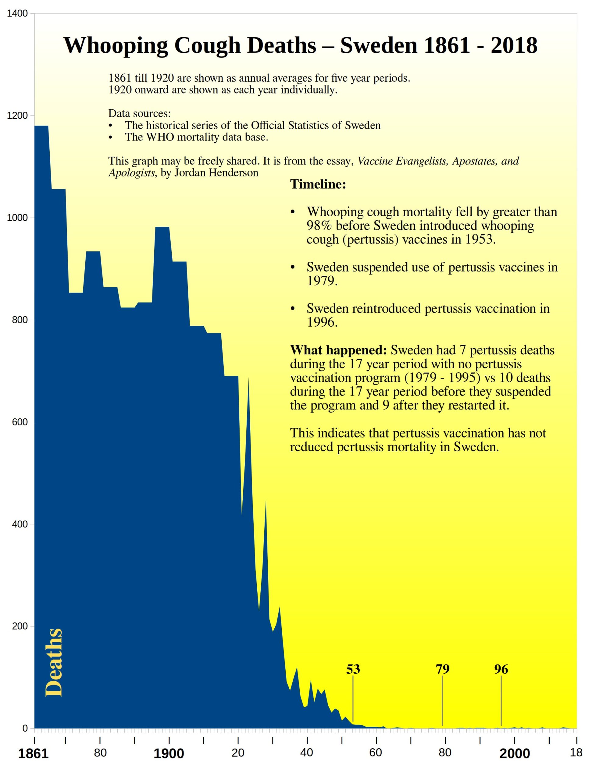 Figure 53
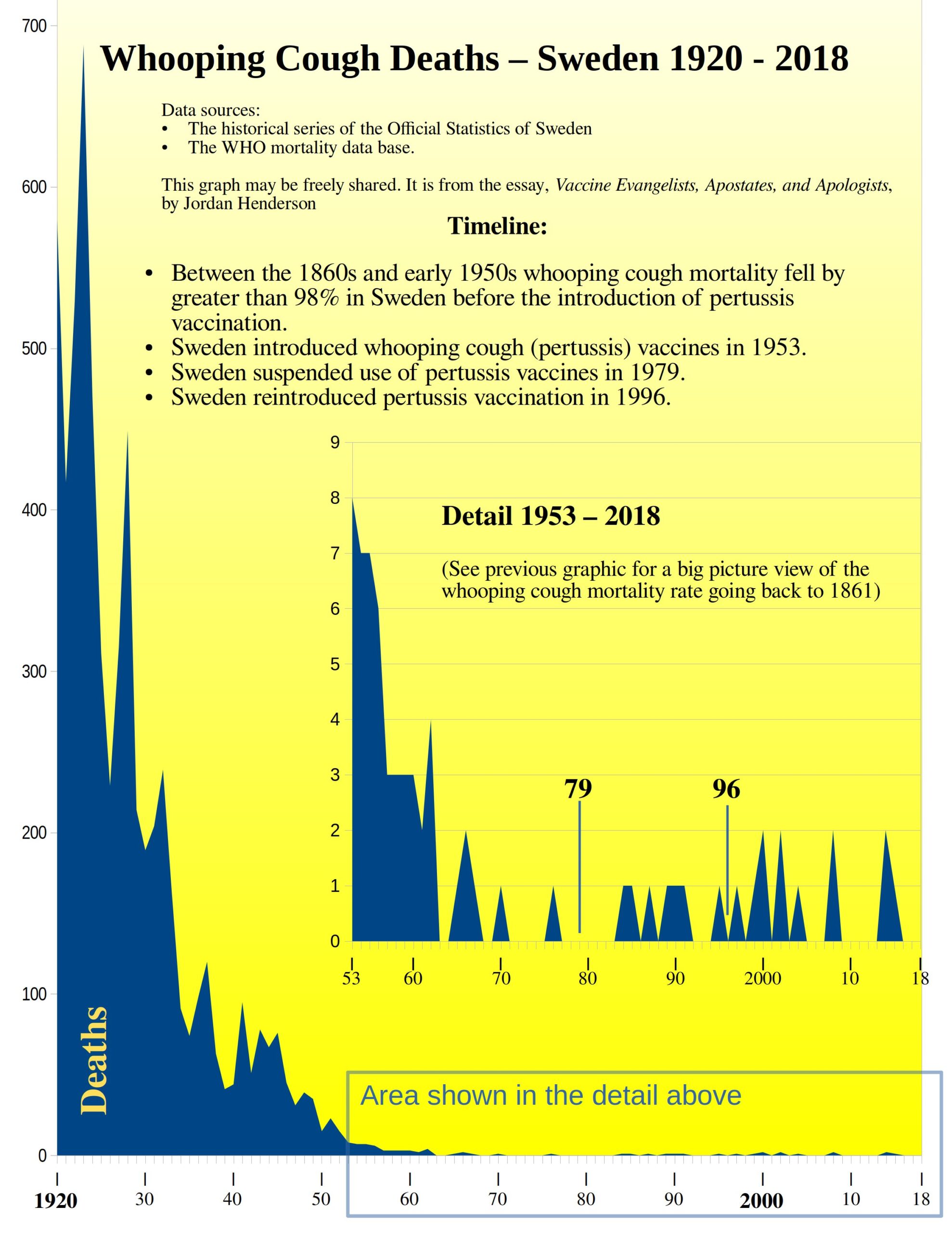
As you can see in the graphical presentations of the data above: almost all the whooping cough mortality decline occurred before the introduction of pertussis vaccination in Sweden in 1953.
Since whooping cough mortality had been declining for at least ninety years, with almost all the whooping cough mortality decline having occurred before the introduction of pertussis vaccination in Sweden in 1953 we can reasonably infer that the last bit of mortality decline would have happened regardless of whether or not Sweden had introduced whooping cough vaccines and that therefore pertussis vaccination contributed little or nothing to the whooping cough mortality decline in Sweden.
But in the case of Sweden, we are not left with just a reasonable inference, we have additional confirmation: when Sweden suspended pertussis vaccination, the mortality rate did not climb back up to the already relatively low pre-vaccine 1950s level. Whooping cough mortality stayed low, averaging less than one death every other year. When vaccines were reintroduced and very high vaccination coverage reached in a very short time, whooping cough deaths didn’t go lower still but actually increased ever so slightly.
Now let’s look at cases.
Pertussis cases in Sweden
Presented below are the number of reported pertussis cases in Sweden from 1980 through the present. (1980 because for cases I’m using just the WHO immunization data portal which does not contain pre-1980 data).
Figure 54
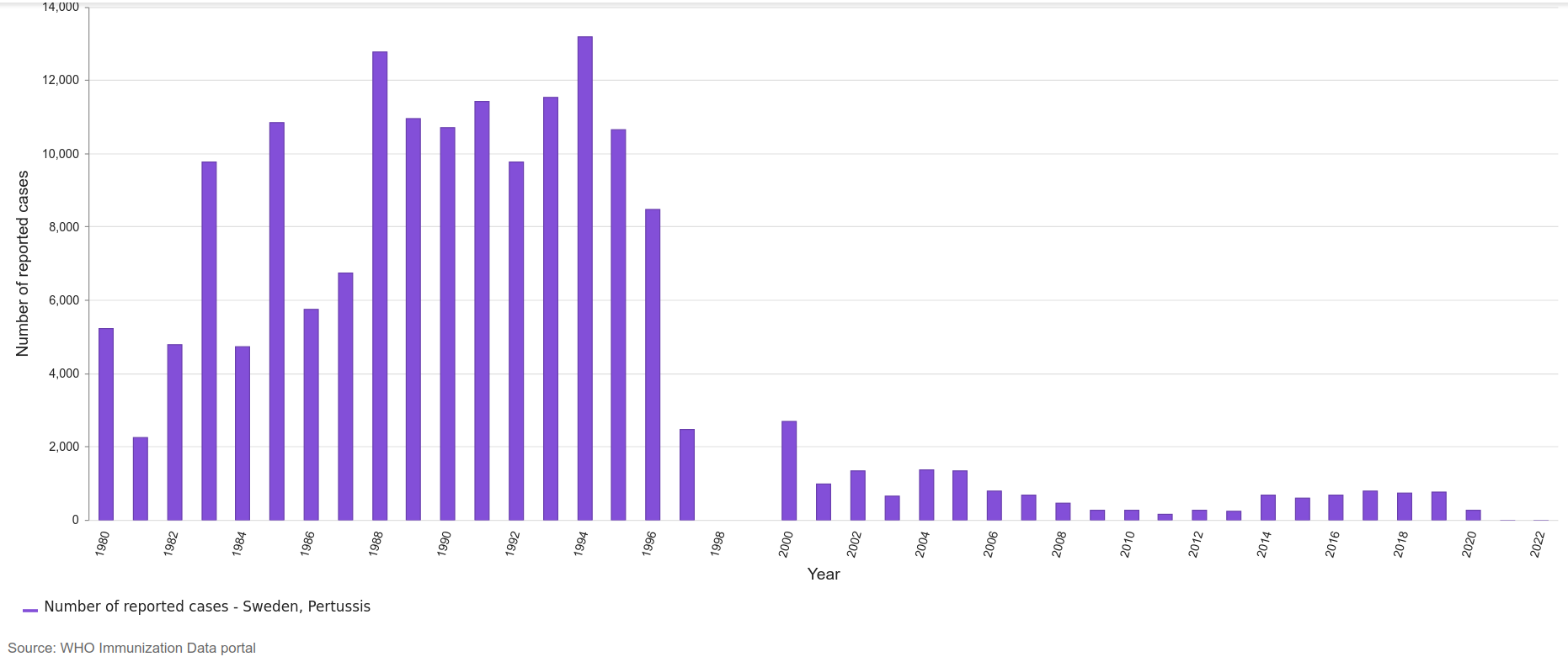
There it is; the substantial drop in reported cases after the reintroduction of the pertussis vaccination program in Sweden.
In the 16 years of 1980 through 1995, without a pertussis vaccination program, Sweden had 141,158 reported pertussis cases.
In the next 16 years beginning in 1996 and continuing through 2011, throughout which time pertussis vaccination rates were very high, Sweden had 22,059 reported pertussis cases.
In other words, Sweden had 6.4 times fewer reported cases with high pertussis vaccination rates.
If we stopped our analysis here it would appear to be a draw, with one data set supporting the anti-vaccinationist contention that pertussis vaccination had little or no positive effect on pertussis mortality, while still allowing the vaccinationists to wax eloquent about fewer reported cases.
So, something for everyone! – If that is, we were to stop our analysis here. But we have no reason to stop now: we can use the mortality data and the reported cases to calculate the case fatality rate. And the case fatality rate is the fatal blow to the Swedish whooping cough warning story.
Coup de grâce: cases divided by deaths equals . . . the case fatality rate
For the16 years of 1980 through 1995, without a pertussis vaccination program in Sweden the case fatality rate works out to 1 death per 20,165 cases. We could also express the case fatality rate as about five deaths per 100,000 cases.
For the next 16 years beginning in 1996 and continuing through 2011, throughout which time pertussis vaccination rates were very high in Sweden, the case fatality rate works out to 1 death per 2,451 cases. We could also express that as a rate of nearly 41 deaths (40.8) per 100,000 cases.
So, the case fatality rate went up 8-fold with the reintroduction of pertussis vaccination.
Figure 55
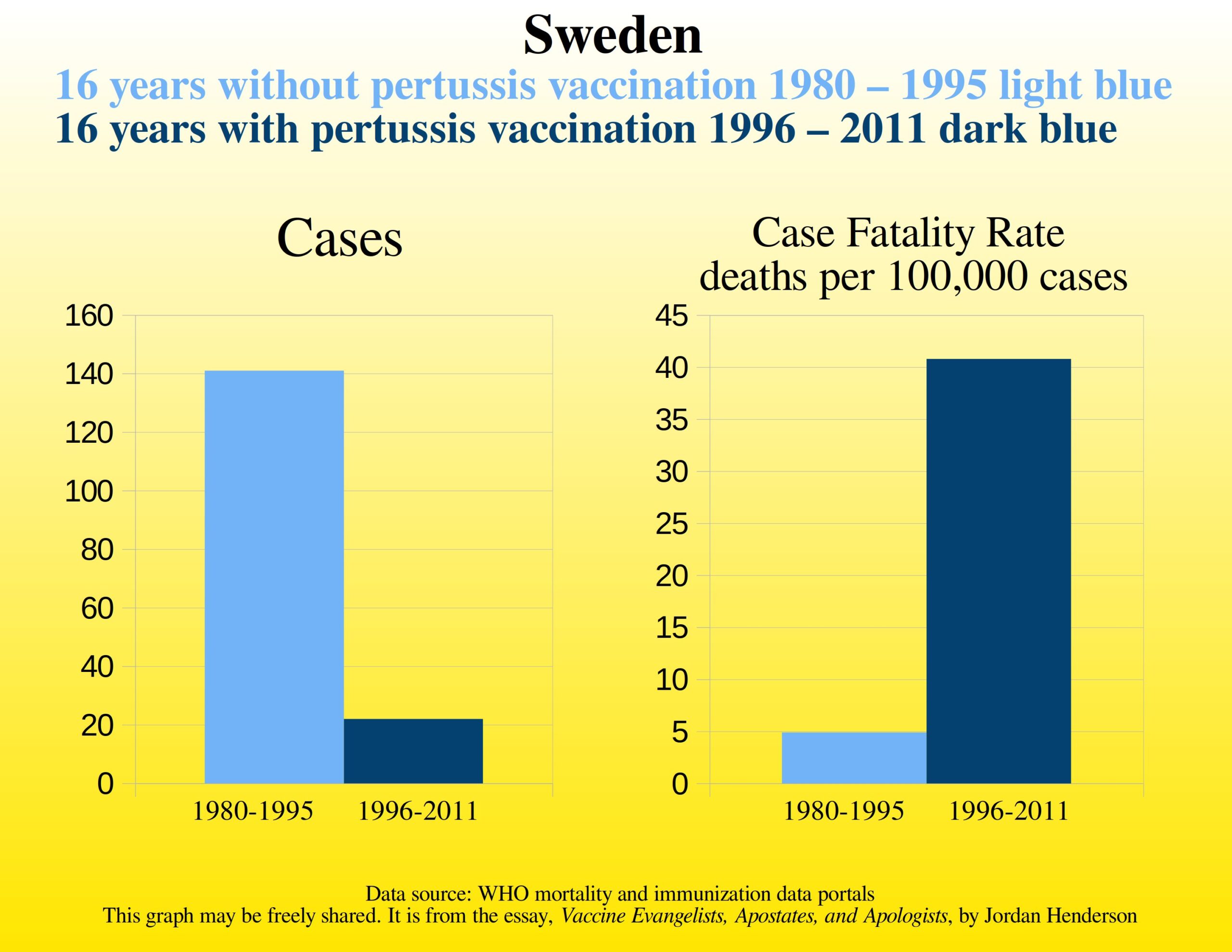
The reintroduction of the pertussis vaccination program brought a 6-fold reduction in cases and an 8-fold increase in the case fatality rate – plummeting cases and skyrocketing case fatality rates.
That is to say, six times fewer patients were recorded as having pertussis in Sweden but each of those patients was eight times more likely to have a fatal outcome after the reintroduction of the vaccine.
That’s no victory at all:
If you had a fishing boat fleet that implemented a new set of safety procedures which over the years resulted in 6 times fewer man overboard incidences, but when a man did go overboard, they were 8 times less likely to be successfully rescued and instead they drown – that would not be a net success.
From end to end then the Swedish whooping cough warning story is an own goal for the vaccinationists. It is a demonstration of net nothing lost by ending vaccination, net nothing gained by resuming it.
But that still leaves us with the mystery of why did the cases plummet and the case fatality rate skyrocketed?
I will offer my speculation on what happened and I invite readers and critics to provide evidence that supports or contradicts this speculation if they have any on hand.
I propose that the drop in cases coinciding with a jump in case fatality rates was most likely a statistical artifact caused by confirmation bias. What I propose is that health care professionals would be confident that the vaccines work. They would not be as worried about patients with a cough, and less likely to diagnose patients with pertussis. What before were mild cases of pertussis became just plain old coughs and colds.
Parents who believed in vaccines enough to have their child vaccinated (almost all the Swedes) also would not be as worried about bringing their child to a doctor for a cough as they would figure that their child had a high degree of protection, and so between these factors the case rate falls. But severe whooping cough – severe enough to be fatal – still catches the attention of both parents and health care professionals and so is less likely to be brushed to the side, hence the mortality rate doesn’t fall.
This would explain why the case rate plummeted and the case fatality rate skyrocketed. This scenario would involve no change in prevalence of actual sickness, only a change in the attitude of parents and health care providers towards kids with a cough.
Summary of my critique of Gorski’s arguments.
I mentioned that I would use this deconstruction of Gorski’s arguments as a point of departure for hitting subjects of particular interest such as pertussis in Sweden. So much so have I done this that perhaps the critique of Gorski’s arguments has almost gotten lost amongst all the excitement of reviewing deceptive pro-vaccine graphs, and examining what really happened in Sweden. So here I will summarize my critique of Gorski’s arguments in his two articles that directly deal with (or I should say appear to deal with, but studiously avoid) the matter of undue credit given vaccines.
Principal criticism
My first and foremost criticism of Gorski’s arguments presented in the articles:
“Vaccines didn’t save us” (a.k.a. “vaccines don’t work”): Intellectual dishonesty at its most naked and J.B. Handley versus vaccine science. Again. Not surprisingly, J.B. loses
Is that Gorski avoids acknowledging that vaccine evangelists are regularly making claims that give undue credit to vaccines for lives saved, deaths averted, and mortality reduced (as I have extensively documented in Part 1 and 4 of this essay series).
As I demonstrated Gorski does this by explicitly conflating the question of:
Have vaccines saved the lives, averted the deaths, and reduced the mortality that the vaccine evangelists claim them to have done?
With the question of whether or not vaccines work.
Gorski did this right at the very beginning of his writing on these matters with the title itself “Vaccines didn’t save us” (a.k.a. “vaccines don’t work”).
Gorski consistently misdirects from what is a fundamentally historical question to a question of vaccine efficacy.
This, my first and foremost criticism of Gorski’s arguments, is the only one I’m going to note in this summary.
The review of all the deceptive graphs, and the examination of what really happened in Sweden, is subject matter I wanted to cover anyway, and deconstructing Gorski’s arguments was simply a nice opportunity to do it.
But for Gorski’s writing specifically, my principal criticism is that he uses conflation and misdirection to altogether avoid acknowledging the undue credit given vaccines, and gaslight his audience into thinking that:
“No one ever said that vaccination did account for the impressive declines in mortality seen in the first half of the 20th century. Antivaxers like Handley like to make that claim, either explicitly or implicitly, but that doesn’t make it so.”
I will close this essay installment with a meme that I welcome you to share if you see fit to do so. When sharing this meme, it would pair well with any of the death rate graphs we’ve been reviewing in this series or with the cover drawing, with which it is already paired at the beginning of this essay installment. (you’re welcome to share any of the graphics that I have created for this series. Bystrianyk and Humphries, and Greg Beattie each also give permission on their respective websites to share their graphical presentations).
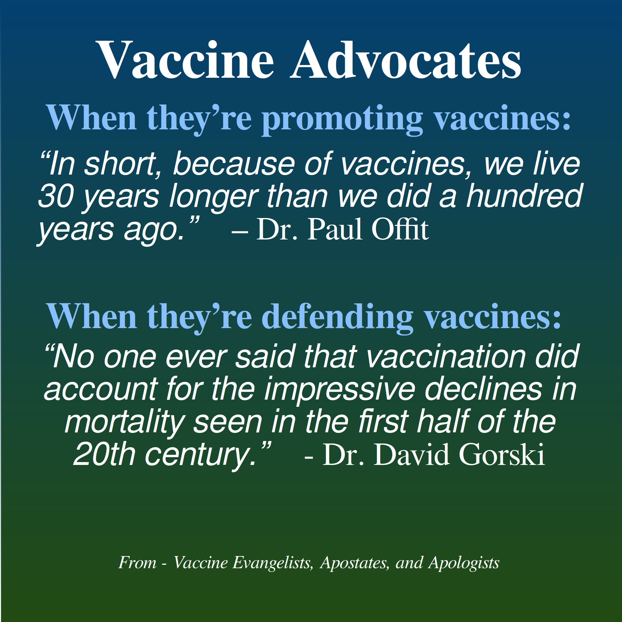
A Couple Ideas for Those Who Would Like to Support my Work
Consider supporting my work: I offer the following three suggestions, any one or combination of which would be most helpful:
- Making a small single, or recurring donation to me through the donation page on my website (or a paid Substack subscription which is effectively a donation as all my essays are freely available), or making a purchase of a small print, mug, or greeting card, through my art prints website.
- Making a single or recurring donation to one of the independent media outlets who publish my work (like right here at Activist Post), and without whom few would see my work online to begin with.
- Supporting this work by getting the word out; sharing this article, and or sharing other notable works by me or the independent media outlets who bring my work to your attention. This increases our reach and makes us happy to know that our work is benefiting more people.
Up next: Part 6: The Apologists Continued
This essay series is on track to wrap up in 7 installments as originally planned, and we are fully in the deconstruction of the apologists phase now. In the next installment, the penultimate installment, I will continue the deconstruction of vaccine apologetics with our third case example of vaccine apologetics. Which vaccine apologist’s work will end up under review next shall remain a suspenseful secret for the time being. But I will offer below a glimpse of what is to come:
In the next installment as part of the deconstruction of vaccine apologetics we will return to Scandinavia. The Swedish whooping cough natural experiment that we just reviewed is not the only such natural experiment that happened in Scandinavia in the 1970s and ‘80s. Another natural experiment also occurred in Scandinavia, but involving measles instead of pertussis. This other natural experiment is less well known, because the vaccinationists don’t try to use it as a scare story (most of them probably aren’t even aware of it), but it is equally interesting and instructive; stay tuned.
Jordan Henderson lives in Washington State in the Northwest of the United States. He works in oil paints, and charcoals. A portfolio of his works can be viewed at either of his websites: Original Paintings – Fine Art Prints
Unfortunately, this article is too long to post on HIVE in its entirety. This is only 1/3 of this massively in-depth article which includes 15 more graphics. CLICK HERE TO READ THE REST.
Become a Patron!
Or support us at SubscribeStar
Donate cryptocurrency HERE
Subscribe to Activist Post for truth, peace, and freedom news. Follow us on SoMee, Telegram, HIVE, Minds, MeWe, Twitter – X, Gab, and What Really Happened.
Provide, Protect and Profit from what’s coming! Get a free issue of Counter Markets today.
Be the first to comment on "Vaccine Evangelists, Apostates, and Apologists: Part 5 — The Apologists"