
 By Neenah Payne
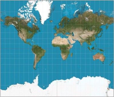
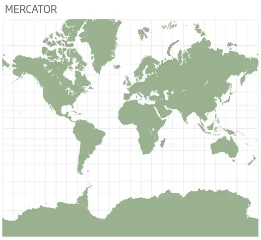
Size matters when it comes to countries — and perception of size affects the status and power of a country or continent. So, when the world map dramatically inflates the size of the US, Canada, and Europe and radically diminishes the size of Latin America and Africa, that has huge ramifications for politics and economics. Correcting that map is key to a more accurate view of reality and global fairness. The Mercator Map which the world has used for centuries makes the Northern Hemisphere look much larger than it is — at the expense the Southern Hemisphere. There are growing calls now to use a more accurate map.
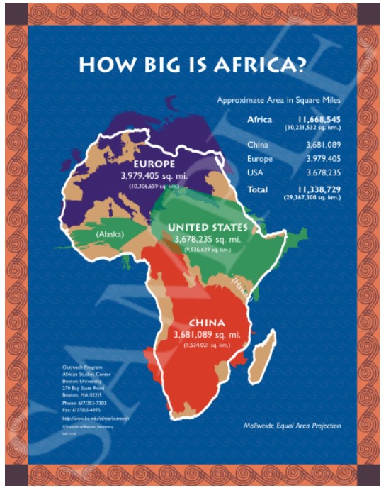
Africa Could Fit China and the U.S., With Room to Spare
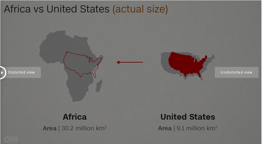
“An interactive map underscores how mind-bogglingly vast the African continent really is. Africa is massive—30.22 million square kilometers, in fact. It can easily swallow up the whole of Europe; it’s the second-largest continent in the world. Yet the familiar Mercator map does not actually reflect this reality.”
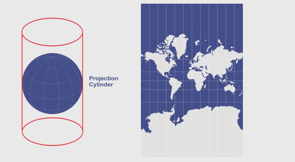
 The Mercator projection (Wikimedia)
In the video How Europe Conquered Africa, Professor James Small compares the size of Africa on the Mercator map with its true size on a more accurate map.
Africa State of Union – Size Big Deal – Africa vs United States
The True Size of Africa | Why Africa’s Map Is Drawn Wrong Relative To Its Size
Why All Maps are Wrong about Africa
Africa is Bigger Than We Realize
 “Africa is much bigger than we think, hence the title. The map was created by designer Kai Krause….most maps we see are based on the ‘Mercator Projection’ that came up in 1569.…There are two meanings in this map that we must come to understand. Africa is greatly underestimated in size due to the Mercator Projection and Africa is the motherland for every place in the world.
Why is Africa never portrayed in its actual size? The ‘Mercator Projection’ is the reason why. The Mercator projection, is the type of map projection introduced by Gerardus Mercator. This projection is widely used for navigation charts, because any straight line on a Mercator projection map is a line of constant true bearing that enables a navigator to plot a straight-line course…. Under the ‘Mercator Projection’ Africa looks about the same size of Greenland but Africa is actually 13 to 14 times larger. Flat maps also contribute to this distortion as the landmasses towards the pole are extremely exaggerated.
It is also mentioned that European imperialism is to blame as well.…. As we can see from the map, Africa is bigger than China, the U.S, Western & Eastern Europe, Japan, Mexico, and India. That’s not it either—Africa is also bigger than Russia, Canada, Brazil and many more countries. We all consider size equals power.”
Africa State of Union – Size Big Deal – Africa vs United States
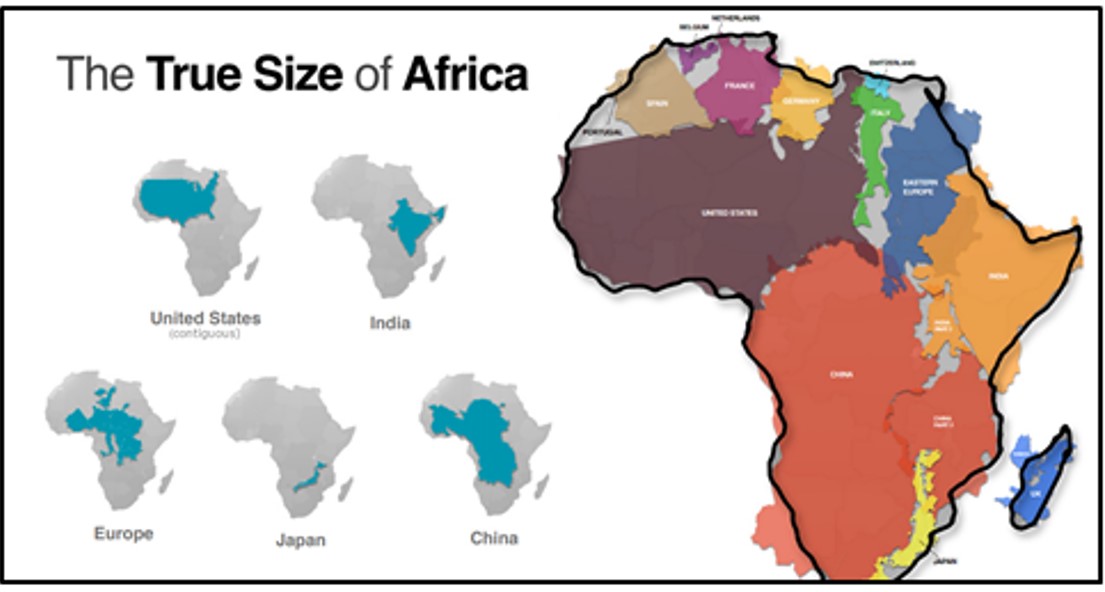
New Interactive Map Shows True Sizes
A Simple Interactive Tool Shows The Real Size India, China, and Africa reports:
“In early 2013, James Talmage and Damon Maneice, two computer developers in Detroit, created an interactive map that shows the relative expanse of nations and continents. Partly inspired by the designer Kai Krause’s map ‘The True Size of Africa,’ and an episode of The West Wing, TheTrueSize.com shows how distorting the Mercator-map projections are.
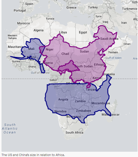
How does the tool work? You enter a name of a country and then drag that country on to your desired geographical point of comparison; the tool will adjust the country’s borders to reflect its true relative size. For example, the map below shows the size of Africa in relation to China and the U.S. Look at how the two biggest economies in the world can both be swallowed by the continent with room to spare.
These visualizations challenge deeply held assumptions about the size of nations.”
New World Map
New world map is a more accurate Earth and shows Africa’s full size
“A new kind of world map (above) has been developed that shows the true size of the continents without distorting their shapes too much. The world map you are probably familiar with is called the Mercator projection (below), which was developed all the way back in 1569 and greatly distorts the relative areas of land masses. It makes Africa look tiny, and Greenland and Russia appear huge.”
The great map myth was incredibly unfair to the ‘mother continent’: This is the true size of Africa
“The way most people see the world is still under the heavy influence of the world’s best known and most widely recognized map, the Mercator Projection, from 1569. …But this map, however, is incredibly unfair regarding Africa. The continent’s size on the commonly used map is grossly underestimated due to the Mercator Projection….
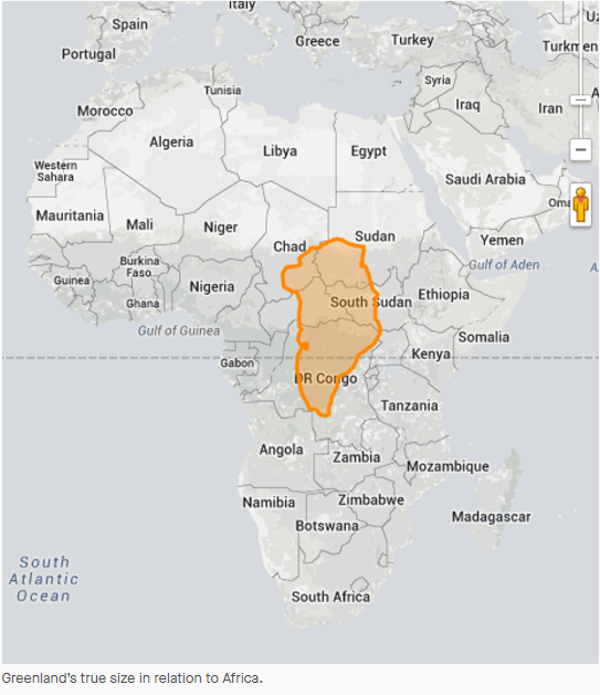
For instance, the Mercator map depicts Greenland as roughly the same size as Africa when, in fact, the vast continent is 14 times larger. As a matter of fact, Greenland is similar in size to Congo….
The Mercator Projection Conundrum
…. The effort to put the planet’s spherical shape onto a flat map makes the landmasses closest to the poles stretched. Hence, the further the territory from the Equator, the larger it appears on the map.
Since Africa bestrides the Equator, its size remains almost identical on the Mercator projection, while the areas furthest from it become enlarged. That means Europe and North America appear much bigger in size due to the distortion. Moreover, North America and Europe seem to be much bigger than Central Africa and South America….
The Unjust World Map System
The undeniable truth is it’s not a coincidence that Canada, Russia, the U.S., and Europe look massive looking at our most widely used maps. This practical but unfair system made it easier for Western cartographers to mark towns, roads, and others in their territories, said Menno-Jan Kraak, the president of the International Cartographic Association and professor of cartography at the University of Twente, Netherlands, for CNN.
“The world maps that prevail today have been embedded in Western imaginations since the British empire. They continue to prevail despite many challenges to their fairness and accuracy. They underpin the ongoing Anglo-Euro-American presumption that the world belongs to them, and pivots around these geo-cultural axes”, added Marianne Franklin, the University London’s professor of Global Media and Politics at Goldsmiths.
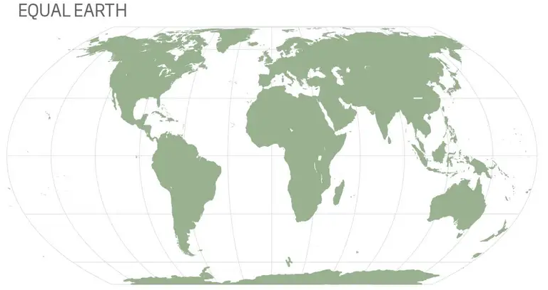
There were several attempts to solve this unjust system, including using the Robinson projection with curved sides. Finally, a group of scientists developed an entirely new type of world map, claiming it the most accurate yet. The Equal Earth Map created by Tom Patterson, Bojan Šavrič, and Bernhard Jenny accurately represents the continents without cutting or stretching parts of our curved planet on a flat surface.
The Equal Earth Map Projection Made It Fair
As explained by the authors, the Equal Earth Map projection is an equal-area pseudocylindrical projection for world maps created to provide a visually pleasing alternative to the Gall-Peters projection, which some schools and groups have been using for fairness. The overall shape is similar to the Robinson projection; the curved sides suggest the spherical Earth shape, while the straight parallels compare how far north or south places are from the Equator.
The unbeatable fact is that the ‘Mother Continent’ is more extensive than Europe, the U.S., China, India, and Japan combined. To repeat, the true size of Africa is 30.37 million square kilometers, meaning the vast continent could easily carry several major world nations.”
How Big is Africa? As big as the USA, China, India and Europe, together!
IT’S REALLY AS BIG AS CHINA, INDIA, THE UNITED STATES AND MOST OF EUROPE PUT TOGETHER.
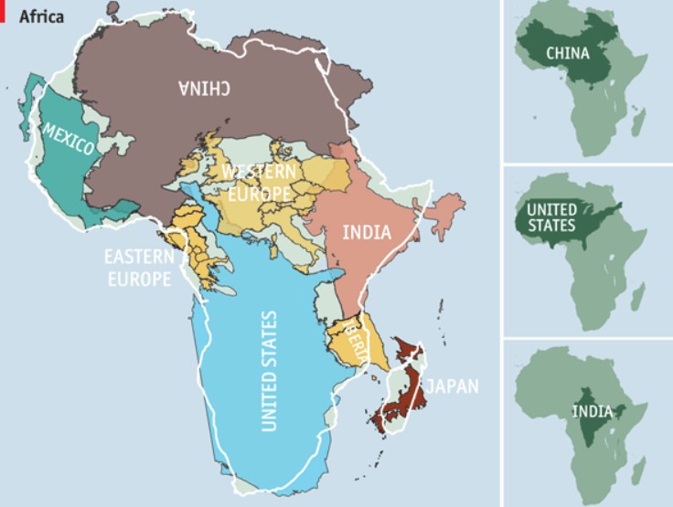
Mapped: Visualizing the True Size of Africa
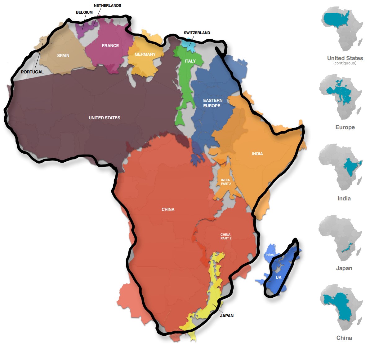 A Geographical Jigsaw
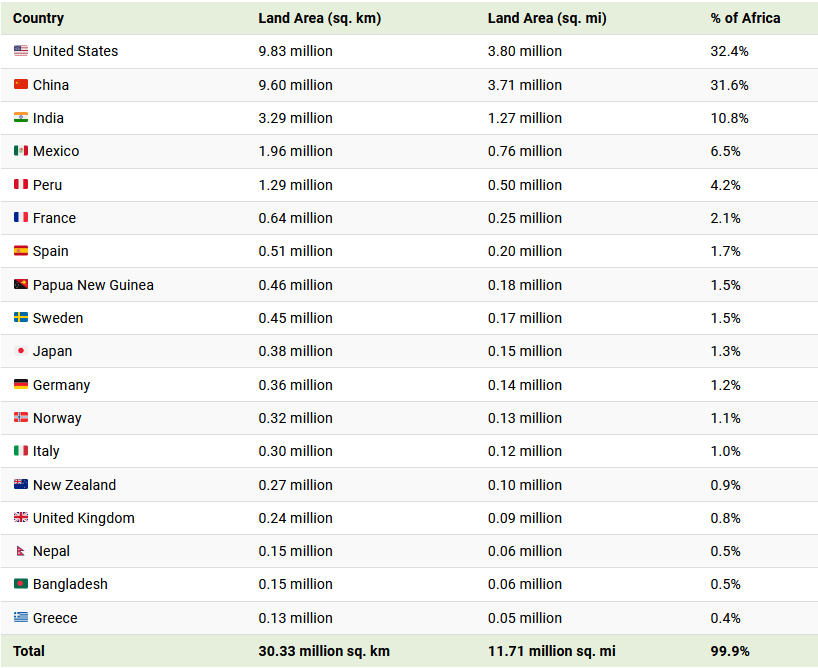
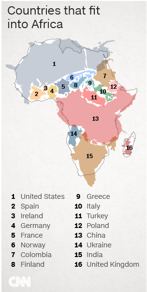
“Today’s infographic comes from Kai Krause and it shows the true size of Africa, as revealed by the borders of the countries that can fit within the continent’s shape. The African continent has a land area of 30.37 million sq km (11.7 million sq mi) — enough to fit in the U.S., China, India, Japan, Mexico, and many European nations, combined.
You could add together all of the landmasses above and they would not equate to the geographical footprint of Africa, which itself is home to 54 countries and 1.2 billion people.
Editor’s note: The above table is slightly different from the countries shown in the visualization, which focuses more on fitting recognizable country shapes into the geographical shape of Africa.
Why the Misconception?
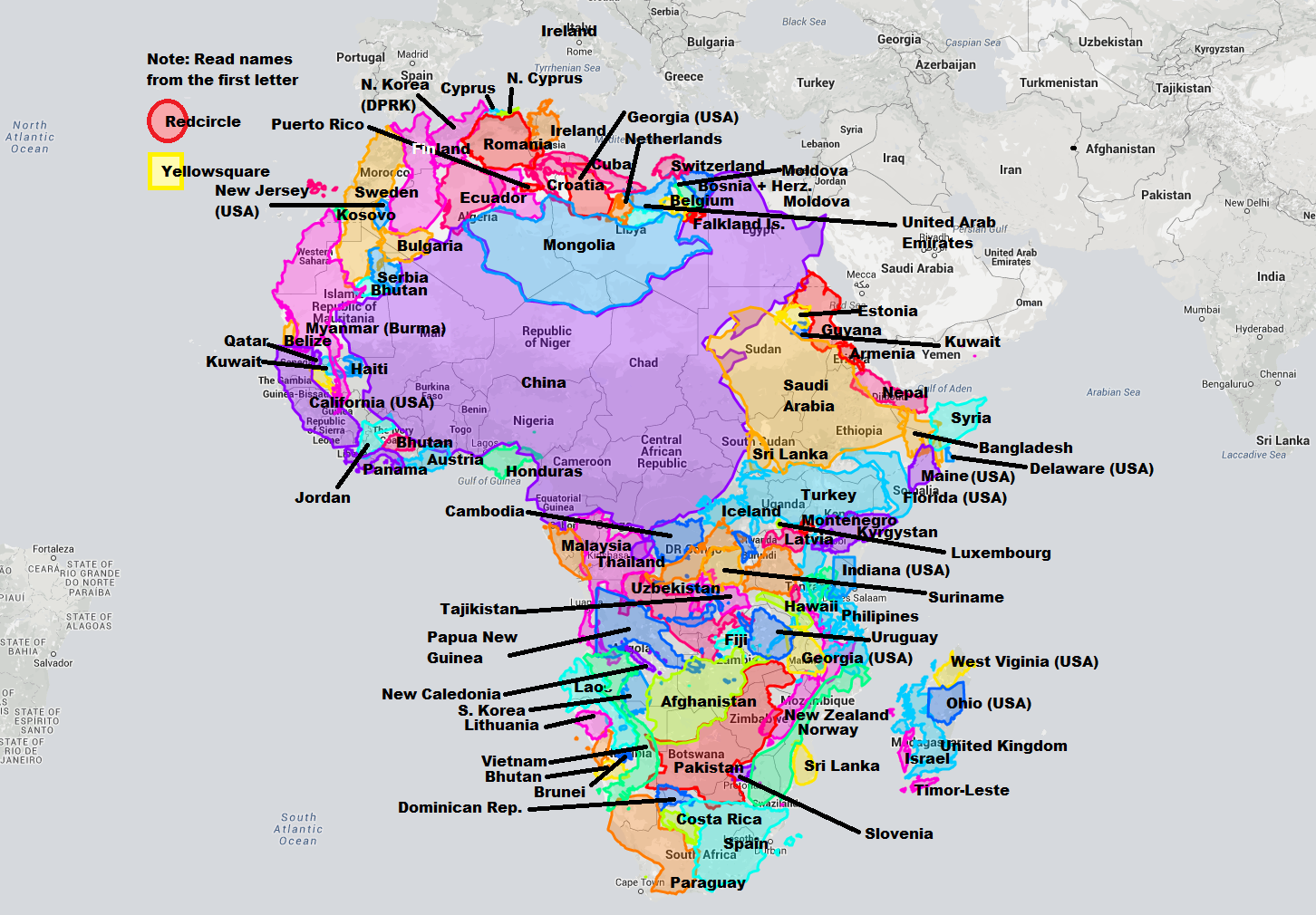
Interestingly, the problem with maps is not that Africa is sized incorrectly. Using the animation below, you’ll see that Africa is actually the most accurately sized continent using the common Mercator map projection:
The Mercator projection attempts to place the spherical shape of the world onto a cylinder, causing areas closest to the poles to be ‘stretched’. Africa, which straddles the Equator, barely changes in size — meanwhile, the countries furthest from the Equator become inflated from their true sizes on this type of map.
…. This means that the sizes of European and North American countries are distorted, giving us an inaccurate mental ‘measuring stick’ for judging the relative sizes of other countries. This has implications not only for Africa, but for the whole Southern Hemisphere: South America, India, the Middle East, and even Australia are “bigger” than they may initially appear on a map.”
What’s the real size of Africa? How Western states used maps to downplay size of continent
“On a typical world map, Canada is a vast nation. Home to six time zones, its endless plains spread from ocean to ocean…. But, in reality, three Canadas would comfortably fit inside Africa. Our world map is wildly misleading. It’s all down to the European cartographer Geert de Kremer, better known as Mercator, and his 16th century map projection – a common template for world maps today – which distorts the size of countries.
Now, schools in Boston are taking a stand against the tradition by introducing the lesser-known Peters projection from the 1970s (also called Gall-Peters projection) in classrooms, to teach children the real size of the continents. The move is part of a wider initiative to remove bias within education. ‘By incorporating the Peters projection maps – an equal area representation – into classrooms, we are opening the door for students to view the world in a different light,’ says Natacha Scott, social studies director at Boston Public Schools.
The initiative will see students comparing different maps. “By exploring geography, we also hope to increase an awareness of the relationship between themselves to other countries, communities, cultures and individuals around the world,” Scott adds.
Though a convenient way to chart the world, Mercator’s map distorts proportions, making some landmasses larger that they are in reality. “Somehow this map projection came to be used on most world maps, especially those produced for classrooms since the beginning of the 1900s,” says Menno-Jan Kraak, president of the International Cartographic Association and professor of cartography at the University of Twente, Netherlands. “Most of us have grown up with this world image.”
The 1569 Mercator projection was made for navigating the seas – drawing the meridians and parallels as straight lines that cross at right angles helped sailors to navigate some of the their first treacherous voyages around the world. Mercator initially made globes. Later transferring his map from a three-dimensional curved surface to a flat sheet of paper was problematic. Taking the equator as the logical map center left big, confusing gaps near the poles.
Mercator’s solution was to stretch out the northern and southern extremities of the globe to fill those gaps, producing an elegant and usable map. While a revolutionary tool for captains and explorers, the projection distorts the relative size of the continents, to the advantage of the West.
The repercussions of this are still being felt today.
A map made by Europe for Europe
On the Mercator map, Africa – sitting on the equator, reasonably undistorted – is left looking much smaller than it really is. But Canada, Russia, the United States and Europe are greatly enlarged. The distortion is largest near the poles: Greenland, which looks about the same size as the whole of Africa on the Mercator, is a classic example. In truth, it is no bigger than the Democratic Republic of Congo.
That European and North American countries are enlarged is no accident. This system provided more space for Western cartographers to mark towns, cities, roads etc in their part of the world, Kraak says. ‘If you would take a map projection with equal areas then there is almost no space on the map to display all [these details].’ There was, of course, much to map in Africa, too, but that mattered less to the cartographers up north, he adds.
A political tool?
One of the dangers of the Mercator map is that it can make enlarged countries seem unnaturally powerful and intimidating. ‘The term ‘power of representation and representation of power’ sums up quite well how maps and the rise of the Western nation-state system – and with that, empire and colonialism – are linked,’ says Marianne Franklin, professor of Global Media and Politics at Goldsmiths, University of London.
Was subsequent European imperialism perhaps spurred on by a map projection that reinforced the notions of self-importance held by those nations? ‘The world maps that prevail today have been embedded in Western imaginations since the British empire. They continue (to prevail) despite many challenges to their fairness and accuracy because they underpin the ongoing Anglo-Euro-American presumption that the world belongs to them, and pivots around these geo-cultural axes,’ Franklin says.
In more recent times, maps have been used for propaganda, adds Kraak. Take Russia, for example. ‘If you take the Mercator projection, where Russia looks huge, give it a bright red color and then compare it to the rest of Europe, you see how dangerous it can look,’ says Kraak.
No perfect map
Sadly, there is no such thing as a perfect map. Because the earth is a sphere …. it is impossible to map it on a flat surface without errors in proportion, explains Kraak. Also the Peters projection has its flaws. In order to show the actual size of land masses, their shapes are distorted. Boston Public Schools are rolling out the new maps in all second, seventh and eleventh grades for now, and aim to place them in all classrooms in the future. Other alternative maps are being introduced around the world too. In the US and Germany, for example, maps based on the so-called Winkel Tripel projection, which has a smaller skewness, started to replace the Mercator in the 1920s.
A digital boost
But the Mercator still dominates and the digital revolution has further strengthened its position. Today the Mercator projection is used as a template at Google Maps, OpenStreetMap and Bing, says Kraak. From guiding 16th century explorers on the high seas to helping people find Pokemons on their smartphones, Mercator’s work continues to influence how people see the world centuries after his death.”
Neenah Payne writes for Activist Post and Natural Blaze
Become a Patron!
Or support us at SubscribeStar
Donate cryptocurrency HERE
Subscribe to Activist Post for truth, peace, and freedom news. Follow us on SoMee, Telegram, HIVE, Flote, Minds, MeWe, Twitter, Gab, What Really Happened and GETTR.
Provide, Protect and Profit from what’s coming! Get a free issue of Counter Markets today.
Be the first to comment on "Africa Is MUCH Larger Than You May Realize: Why That Matters"