
Michael Synder
The Economic Collapse Blog
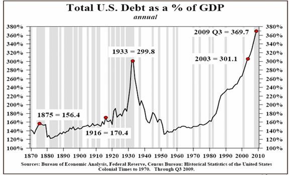
Today most Americans are completely obsessed with the silliest of things. They wonder how Lindsay Lohan is going to fare in jail and they agonize over who LeBron James is going to play basketball for. But when it comes to the things that really matter, most Americans are completely clueless. For example, while most Americans would agree that we are experiencing difficult economic times right now, most of them would also argue that our economic system is in fundamentally good shape and that things will get back to “normal” at some point. Those of us who are trying to warn America of the impending economic nightmare are dismissed as “doom and gloomers” and “conspiracy theorists”. But of course, as with so many things, the passage of time will tell who was right and who was wrong. Below there is a chart that I want all of you to burn into your memory. It is a chart of total U.S. debt as a percentage of GDP from 1870 until 2009. This chart clearly and succinctly communicates the horror of the debt bubble that we are currently dealing with. When this debt bubble pops, it is going to make the Great Depression look like a Sunday picnic.
As you can see from the chart below, the total of all debt (government, business and consumer) is now somewhere in the neighborhood of 360 percent of GDP. Never before has the United States faced a debt bubble of this magnitude….
Be the first to comment on "An Economic Chart You Should Burn Into Your Memory"