
Americans are waking up to some uncomfortable truths. One of these is the fact that government bureaucrats and the corporate media regularly lie about what is going on in the world.
They tell us the Federal Reserve Note “dollar” is strong and price inflation is completely under control. (We use quote marks because a true dollar is 24.057 grams of silver, whereas the Federal Reserve Note is a form of counterfeit.)
Millions of Americans now notice rapid price inflation and a good portion of them are pouring into physical bullion.
To illustrate just how much nonsense is baked into official inflation data, we are presenting three charts…
The first is a chart of the U.S. Dollar Index (DXY) over the past year. This one is a favorite of Wall Street and central bankers who want Americans to think the Federal Reserve Note is stable, or even getting stronger.
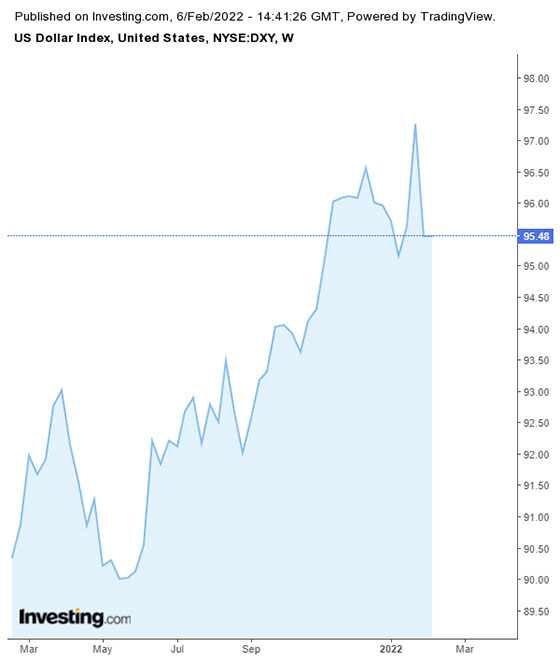
The DXY is very often cited in the financial press and incorporated in trading algorithms. Anyone who doesn’t dig deeper would have the impression the U.S. dollar got much stronger over the past year. They would, of course, be very wrong.
The trick is that the DXY index simply measures the dollar against other major unbacked fiat currencies around the world. It is not a measure of actual purchasing power. Not in the least!
Easiest way to get your first bitcoin (Ad)
The only real utility for this information is among currency traders and charlatans using it to convince people the dollar is much stronger than it actually is.
The next chart is more useful to ordinary Americans. The data is published by the Bureau of Labor Statistics and purports to measure the dollar’s purchasing against a basket of real-world goods and services.
While it is closer to the actual truth, this information has also been used to mislead. Bureaucrats have been busily modifying it over the years to hide the erosion in Americans’ purchasing power.
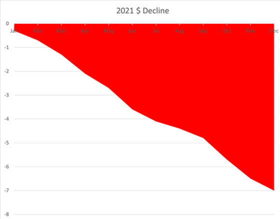
In times like these, officials would almost certainly rather people just focus on the DXY index. The first chart looks better than the second if you want Americans to stand patiently while being shorn by inflation.
Unfortunately for the political class, it is impossible to hide rising prices for virtually everything.
They developed novel ways to tamp down the inexorable rise in the Consumer Price Index, such as “hedonic adjustments,” geometric weighting, owners’ rent equivalent, and substitution. Government officials have baked outrageous claims right into the data. Ground beef is equivalent to steak and living in an apartment is just as good as home ownership — that sort of thing.
The real inflation numbers may be close to double what’s reported officially. Alternative data sets are out there, but, predictably, bureaucrats are quick to dismiss the information as conspiracy theories published by fringe economists.
John Williams of Shadow Government Statistics (ShadowStats.com) is perhaps the best known of these. How does this “fringe” economist calculate inflation? By using the same methodology the Bureau of Labor Statistics itself employed in 1980.
That’s right. It’s the same calculation minus all of the tricks deployed to confuse people over the past 40 years.
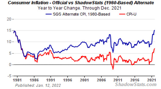
It isn’t a pretty picture. We are back to 1980 levels of inflation rates.
The only difference is most people don’t realize just how rapidly the Federal Reserve Note “dollar” is falling. We can blame the surging numbers on dishonest bureaucrats and unquestioning journalists.
Clint Siegner is a Director at Money Metals Exchange, a precious metals dealer recently named “Best in the USA” by an independent global ratings group. A graduate of Linfield College in Oregon, Siegner puts his experience in business management along with his passion for personal liberty, limited government, and honest money into the development of Money Metals’ brand and reach. This includes writing extensively on the bullion markets and their intersection with policy and world affairs.
Become a Patron!
Or support us at SubscribeStar
Donate cryptocurrency HERE
Subscribe to Activist Post for truth, peace, and freedom news. Follow us on Telegram, HIVE, Flote, Minds, MeWe, Twitter, Gab, What Really Happened and GETTR.
Provide, Protect and Profit from what’s coming! Get a free issue of Counter Markets today.
Be the first to comment on "Why the Federal Reserve Note’s Decline Is FAR Worse Than Reported"