Derek Thompson
The Atlantic
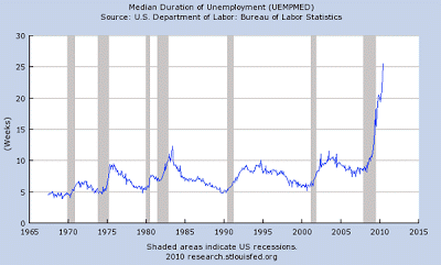
The median duration of unemployment is higher today than any time in the last 50 years. That’s an understatement. It is more than twice as high today than any time in the last 50 years.
OK, you’re saying, but what does this mean? Does it mean we must increase the duration of unemployment benefits to protect this new class of unemployed, or does it mean we need to stop subsidizing joblessness? Does it mean we need to expand federal retraining programs, or does it mean federal retraining programs aren’t working? Does it mean we need more stimulus, more state aid, more infrastructure projects, more public works … or does it mean it’s time to stop everything, stand back and let business be business?


Be the first to comment on "The Scariest Unemployment Chart I’ve Seen Yet"